Park / Silver Valley Theme Park
-
 25-December 08
- Views 11,341
- Downloads 2,455
- Fans 6
- Comments 27
-

-
 85.00%(required: 80%)
 Spotlight

Xcoaster 100% yes Steve 95% yes Evil WME 90% yes Milo 90% yes nin 90% yes 5dave 85% yes CedarPoint6 85% yes Fr3ak 85% yes geewhzz 85% yes RCTFAN 85% yes chapelz 80% yes FullMetal 80% yes Magnus 80% yes zodiac 75% yes posix 65% no 85.00% 93.33% -
6 fans
 Fans of this park
-
 Full-Size Map
-
 Download Park
2,455
-
 Tags
Tags
![park_3351 [H2H7 R3] The Hanging Gardens of Babylon](https://www.nedesigns.com/uploads/parks/3351/aerialt3058.png)
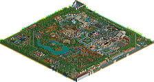
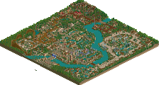
Buccanear Bay- I've never liked your habit of turning large chunks of land into buildings but the entrance to the park was quite nice. The show right at the start was a great idea although it could have used some entertainers to spice it up and add a little action. The stadium itself was nice although a little awkwardly placed with the coaster right behind it... nothing could be helped with that I guess. The lighthouse was cool and probably one of the better ones I've seen in any park. The rest of the architecture was pretty standard although again, really didn't like the chunk of land that made up the chairlift station.
Shanghai Province- Was nice in some aspects and not so great in others. As you may remember I had big problems with early versions of this and to be honest, while you improved it, this area kind of struggles to get off the ground. I think the main problem is the lack of any defining asian inspiration other than what has been done in the past for asian areas (woodie track rooves and pagoda style textures). A lot was fun to look at but in the end it never really pulls together to create a cohesive feel. The custom flat was pretty nice although a bit chunky. Dragon Inferno was had a decent layout and the dragon was probably the highlight of the area but in a way you sold youself a bit short on it. I always liked it but I still think that some sort of building section on the back end would have really helped it out. Just a straight up trackitecture sculpture as the station is a little off and bits of the layout (as well as the obj limit I guess) prevented you from fleshing out the wings and details on the body. The way it was shaped made it look more like a worm than anything. It was still really cool though and a lot fun to look at but the concept just wasn't quite taken all the way. Which is kind of the problem with the whole area. The rapids was nice but looking at it finished I question the idea of seperate pools and all the underground sections. Seemed a little off especially considering the name
Cannibal Island- Kind of an odd theme but I really took to this area. I don't think I ever really gave you much advice on it if I remember right. The two main rides are pretty great, as are their theming. I liked the texture choices as well as the trackitecture rooves. Buildings like the BBQ and chief's hut were well done and I liked the whole open feel to the area. It was a little small however and somehow just doesn't seem to stick out. It's an overall solid area but I think the small size makes it feel somewhat underwhelming.
Land Before Time- The first area of the park and it kind of shows it. Your style has changed a bit since this and again it's an area that leaves a lot to be desired due to such a small size. The main ride was pretty cool athough some things like bone supports to the lift (which always looked a little bare) would have helped it out. Other than that there's not a whole lot there other than some nice buildings. I liked the colors and textures used but there's not a whole lot going on.
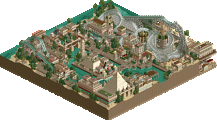
Babylon- Probably my favorite area of the park even with the lack of a major ride. The blue gate was a great entrance piece and I loved the attention to the walls. The Two Towers was a fantastic building, probably one of my favorite buildings of any park and really was a great centerpiece to the area. Little things like the market stalls and overhangs added a lot to the area. The mix of brick and medieval fences was very well done. While there's a lot I would have done differently, the gardens were also pretty cool addition, the pillars and waterfalls cascading down the levels really made for a cool building. It wasn't really functional though and I think if it would have housed a ride or something it would have made it so much cooler. The custom carousel was awesome though and probably a first in rct? The rest of the architecture was nice too, including the bridge to the next area.....
Transylvania- Imo the most 'stale' area of the park next to the asian section, meaning it struggles to convey its theme. It was all well done but there's not a whole lot to get into. Vampyre used the excellent landscaping to its advantage and is a great main ride. The custom flat and bumper cars were nice but other than that there really wasn't much I could sink my teeth into and enjoy. You really abuse your chunky landmass buildings here (sorry man but I just hate them
Goldshine Gulch- Had fun helping you with the coaster (I did the back half if I remember right) and imo is the best ride of the park. I really like how it sits in the area and the landscaping around it. The station is nice although I'm sure you wanted to add a more wooden texture to it (curse that obj limit!!). The flat was cool again although it would have been neat if it worked. All the merges on the flume weren't worth the trouble imo as they look kind of sloppy but it was a nice enough ride. The buildings were well done (my only problem was using woodie track so heavily because one of my major pet peeves with rct is using the same track of a main ride to theme it). The big problem with this area was lack of substance although things like the TNT boxes and wagon were nice little touches.
and finally Sherwood Forest- This version is so much better than that crappy first build you did
It's a great park and a lot of the work was very nice but I think the main problem was too many areas. 8 was just too many to really create fully fleshed out areas and the main problem with most of the park is that there just isn't enough there to hold your attention long. For some of the sections you also seemed to focus on centerpiece ideas and then kind of fill in the cracks between. The entire thing also lacked polish and you rushed some things a bit to send it in which is understandable. Would have been nice to see some staff and other minor things like that though. Hopefully you can finish another full scale solo because the next one is sure to be amazing. This almost was but picking so many areas just hurt the overall compostion. Nice job on completing it though, few can these days.
So what?
entrance- meh.
sherwood - very good.
transylvania - very good.
babylon - downright amazing. so much to love.
lbt- meh.
cannibal island- very good. <3 headhunter.
china- not a fan.
goldshine gulch - good.
whole park- Loopy does weird things with rooflines of large buildings that make them look like blobs.
The entire park is brown- there are maybe twenty tiles of grass in the whole thing.
why was the pirate show all up on the entrance, why were there only fastpasses in land before time, why wasn't there an attraction under the gardens, why is china so garish, and last but not least-
thank you Loopy for making such an incredible park. I'll have a blast exploring this thing for ages- LLLL.
Edited by ][ntamin22, 17 March 2009 - 10:36 PM.
Airtime Offline
I think the main entrance gate was too tall, it seemed to dwarf the surrounding area. But the rest of the area was awesome. I loved the ship. It was built awesomely and in positioned in a great spot, directly straight in front of the entrance. The target as a steering wheel was genius, I loved this touch all thought I'm not sure if it's been done in LL before... The disabled benches was also great in the seating area. The lighthouse was also nice but I feel it was out of place as well as Rum Rollers. The few pinic tables at the back had loads of atmosphere, I really loved them, lol.
The Chinease area was nice but I didn't like Warrior Disk. Just wasn't my taste, sorry it was alright though. Dragon Inferno had a nice layout and a nice station. I wasn't to keen on the Shiyoto Museum either, I don't know why I mean it was nice archy but just seemed, I don't know out of place? lol. The Rapids was awesome I loved rapids station area it looked awesome. And the Great Wall was also awesome, lol. But I also felt that the rapids was squished into that corner because of how it ended and how the lifthill was but it was still great. I like the burned down house in the area as well!
Cannibal Island was an awesome idea as well! Lol I know I've used this word alot but I really really love this park! The only thing I really didn't love, the in the whole area was the wild mouse roofing, it was nice but it wasn't too good. Headhunter was my favourite coaster in the whole park it was just so simple yet had an amazing layout, themeing and atmosphere.
The Land Before Time was another great area. The Bones every where cliche but added to the theme. The coaster layout was cool, really dominated the area well and and it was awesome how it flyed in and out the surrounding landscape.
Babylon's archy was the best amazing easly the best in the park and maybe the best LL? lol
Transylvania was an awesome area again, lol. I think Warewolf had too many cars. It looked to long. I loved Thunderstrike it was just great. The Well was cool as well and just fitted in so well, lol
Goldshine Gulch was my favourite area it was done so well and was amazing again, lol. I loved the Revolver flat. The TNT boxs was genius again. Commanche had a great layout, I loved that as well. I loved the station too. Goldshine Mining Co. was nice but seemed a little squeezed in, if you know what I mean?
Sherwood Forest was again an awesome idea, shame the same Sherwood Forest a mile away from doesn't have a coaster in it
I love this park, it never let me down!
Finally I think I've broken my o buttom
EDIT: Lol forgot to say congrats Loopy on this amazing spotlight! Well done in becoming a parkmaker.
Edited by Airtime, 30 July 2009 - 11:01 AM.