Park / Silver Valley Theme Park
-
 25-December 08
- Views 10,682
- Downloads 2,329
- Fans 6
- Comments 27
-

-
 85.00%(required: 80%)
 Spotlight

Xcoaster 100% yes Steve 95% yes Evil WME 90% yes Milo 90% yes nin 90% yes 5dave 85% yes CedarPoint6 85% yes Fr3ak 85% yes geewhzz 85% yes RCTFAN 85% yes chapelz 80% yes FullMetal 80% yes Magnus 80% yes zodiac 75% yes posix 65% no 85.00% 93.33% -
6 fans
 Fans of this park
-
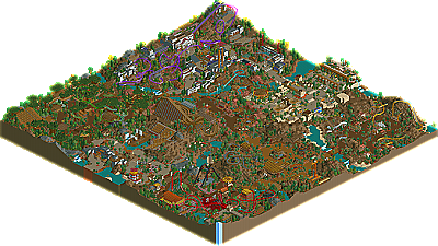
 Full-Size Map
-
 Download Park
2,329
-
 Tags
Tags
![park_3351 [H2H7 R3] The Hanging Gardens of Babylon](https://www.nedesigns.com/uploads/parks/3351/aerialt3058.png)
for some reason i feel the ne faith pouring back into me.
EDIT*
just looked at it, its amazing work loopy, the atmosphere is amazing, that entrance is so natural. i see so many inspirations from so many builders in here yet you made it your own an were still able to execute it with such originality, i dont think anyone here has seen this quality an style the past few years in ll works, with that said whats with the color on Vampyre?
Edited by rK_, 25 December 2008 - 09:18 PM.
Xcoaster Offline
And here's my earlier comment from the voting topic. A bit too harsh on all other parks, but the park took me completely by surprise with its awesomeness:
Also, I voted on this at the same time as JP: Rampage, and I'd have sworn they were by the same parkmaker. Both were very good.
this makes him a parkmaker now, gwazi. and it's really well-deserved. the reason i scored it so low, though, is because you really seemed to pack some of the areas in, and they didn't flow as well as the screens suggested. many of the areas seemed to be filler when they could have been expanded parts of another area. despite that, the park was still amazing and provided me with viewing pleasure for a long time. please keep building for the sake of LLer's everywhere.
Also, 295 years?! Loopy, you spent forever working on this park. Understandable with all the hacks, but really, that is a very long time.
Brilliant work, I was in awe looking at it.
It is mine.
Wow, this park was amazing, the only real problem I saw with it was that each area was just "there". In my opinion there wasn't much flow in the park, but still! This park has seriously inspired me to build more in RCT2 and (even though you guys havent seen anything..yet) RCTll. Wow, this park is a mazing, great job loopy.
that being said.. my jaw literally DROPPED when looking at babylon, especially the gardens. it's THAT good. how you could hack something like that up is simply amazing and i'm in love with how it looks. normally i hated the hacked, busy look but you make it look so NORMAL and .. not busy! lol, everything is so natural in the way it looks.. i was just flabbergasted, loopy. this area alone made my life, and i want to thank you from the bottom of my heart.
the rest were awesome as well
congratulations on a well deserved spotlight; we all look up to you now
What I loved about this was how it almost came out of nowhere, when it was released in the prep forums it was just the name of the park and I downloaded not thinking anything of it, it wasnt till I opened it and said 'fuck me, Loopy finished his solo!'
Every part of the park had details that could be explored for hours which I loved. All the layouts were fab and it was nice to see some fresh ideas in the way of theming.
Well Done on Spotlight and Parkmaker, you've most certainly raised the bar on LL which I never thought would happen again, congratulations.
The object limit was a real pain for me as there was much, much more that I wanted to do. I would have liked to have corrected the flow issue that a few of you have mentioned but with a lack of objects to do so it was really difficult to make it work right.
rK_, I wanted to try and give the coaster quite a bright looking colour to make it stand out from the darker earth and grey tones from the archy and landscaping. I tried to use as many bright colours as I could on all of the major coasters in the park to make them stand out.
Milo deserves a lot of thanks for helping me out with helpful criticism and advice throughout this parks construction and I doubt I'd have finished it without him. Thank you to all the management, accolade panel and all the release prep guys for making it a spotlight, the page and that awesome logo.
I'd like to think my current project is much better than this so you may see some more of it during the next fiesta. Hopefully it wont fall into the object limit trap again.
Again, thank you to everyone for voting this park as a spotlight and for taking the time to check it out. Its so nice to have finally won the highest accolade at the site.
I loved most of the map, especially the Babylon area. Congrats on finishing and winning, you did a great job!
Seriously, which one?
Congrats Loopy for this great archivement!
Def. one of the greatest parks I've seen in a while, so many nice details
(and I'm sure I haven't seen all of them yet), such great atmosphere and
finally a big LL release again!
So what else to say than congratulations again. =)
I wasn't quite a fan of Marriot's Marine World and Disney Sea.
The entrance:
Very classy. Right when opening this park the tower caught my attention. The area isn't "over themed" to a point where it is too much to take in. I like the small details such as the stacked barrels, the disabled seating, the skull in the mountain and the water flowing by the lighthouse. The lighthouse was very beautiful and detailed. It's buildings and ideas like this that made the park great. It may just be a pet peeve of mine, but I hate to see the benches facing backwards at the theaters. I'm not too keen on the red grid lines on the theater either. I'm also not sure what Security Guard 16 and Handyman 29 were doing there.
Oriental section:
Dragon Inferno was a great idea and brilliantly executed. The dragon was gorgeous, but got in my way of trying to start the coaster. I couldn't hit the test button because I couldn't find the beginning of the ride! The buildings throughout the area looked superb, and the great wall was really nice. I really liked the custom flat in this section too. Again, the clever use of raised scenery for the little touches added a lot. I have nothing negative to say here.
Cannibal section:
The warning sign telling me to keep out didn't stop me from checking out this section. I really liked the gold roofing here. HeadHunter made great use of the terrain, and I loved the custom flat ride yet again. The skulls on the poles was a nice touch, even if the sculls are massive. I can't think of anything negative to say about this section either!
Prehistoric section:
I liked the use of bones everywhere, as support for roofs and elsewhere, they were nicely placed and looked good. The kiddie slide was a nice touch also. The fall of Pangea looked like something that I would like to ride, if only for the first drop. Again, nice use of terrain on this coaster as well.
Babylon section:
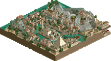
This section stood out as the best to me. The use of bright colors was great, and those diagonal buildings were probably the most impressive buildings I've ever seen in the game. And then the acrobat garden palace was incredible. I loved the stacked walls... I need to learn how to do that now haha. The massive carousel was really nice, I like that a lot. Back to the acrobat garden... the one column 2 to the right on the top was messed up. I'm sure you knew this, and maybe had some problems fixing it, but it did stand out to me. I probably would have left it myself though.
Transylvania:
The section was a contrast to the Babylon area, probably mostly due to the limitations of the game. The area was rather bland compared to the others, and the buildings were rather ugly throughout this area I thought. Again, the theater's seats facing backwards bothered me, sorry to be picky. This is my least favorite section. I did really like the layout of Vampyre, it had nice flow to it, and it also worked really well with the terrain - you do really well with that.
Goldshine Gulch:
Not my favorite section, probably followed only by Transylvania. I thought the woodie had a lovely layout, and the station building was really pretty. I think there was maybe too much red martian soil used for my taste. I again liked the flat ride, nicely executed. This section seems like filler almost, but I commend you for not putting a big lake here.
Sherwood:
Very impressive. I can see that this took a long time to get right. I loved everything about it (minus the benches facing backwards, haha sorry) from the shootout ride to the treetop flyer to the little picnic area, it was beautifully done. This section looked the most time consuming.
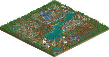
I don't understand this whole "no flow" talk, I thought it had wonderful flow for having 8 sections! Looking at the map, the park had a nice layout.
anyway, i looked at this for hours on the way to Florida. simply awe-inspiring
Buccanear Bay (The entrance) was decent and had some good details like the stage show (but no entertainers? cant forget that man) and the lighthouse would be annoying as you see it in so many parks, but you did it in a creative way I don't think I have seen before. 8/10 on this area.
Sherwood Forest kicked ass, I think I liked it the best. It was like a cross between Erwindale and nate's Earth theme from the PT(1). Also you did a great job making the area viewable unlike parks like BGS where Phatage covered to much. The forest flyer was sweet as was the shootout ride. The stage show was the best in the park, I loved the zipline. 9/10
Transylvania, sorry but I was not feeling it. Aside from some decent buildings I was disappointed, mainly by the B&M. It should have been the parks #1 coaster, but was just so basic. The layout was nice, but nice B&M layouts are easy and this one added nothing new. Werewolf was a good flatride, but again, nothing that new about it. 6/10
Babylon was nice. I really liked the custom carousel and the diagonal building I remember from your screens. Also you had a good blue gate which is a must. I like the garden, but for some reason the purple flowers looked wrong, kinda an eyeshore imo. Overall 7/10
The Land Before Time looked like it would be my favorite area from your screens, but I was a little letdown when I saw it in-game. I liked the fall of Pangea (not like that continent fell, it broke apart after millions of years, lol) and it's entrance was great. Other then that main coaster and more pretty nice buildings I felt the area lacked, however the highlight ride kinda makes up for it. 7.5/10
Cannibal Island was sick, I loved it. Headhunter and Sacrifice were my favorite rides in the park and you had the extras other areas lacked like the vending machines and the chiefs hut. 9.5/10
Goldshine Gulch was sweet, I liked the wooden coaster a lot and the wagon and TNT boxes were great touches. The flume was a bit standard, but I liked it. Nice area, I would not have minded if it was bigger 8/10
Shanghai Province was not my cup of tea. I thought the big custom dragon was dumb and poorly executed and it having the same color as the coaster was weird and did not help. The coaster itself was alright I guess, I liked the parts under the hat-top. The great wall was the wrong texture and the rapids seemed cramped. Warrior was alright, but I have seen that exact type of custom flat a few times. Like all the rest of the park the archy (buildings) were good. Sorry just guys like Turtle, Ed and SA have really raised the bar as to what an Asian theme should be imo and I think you fell short, was it the last area you did? it seemed rushed. 6.5/10
If I was on the penal id have given it a 17 I think as overall id say it was about an 8.5/10.
Congrats on winning NE Spotlight and getting a long overdue Parkmaker spot. I am looking forward to more releases from you