Park / The Exorzist
-
 22-October 10
- Views 2,591
- Downloads 790
- Fans 0
- Comments 13
-
 48.85%(required: 65%)
 Design Submission

K0NG 70% Roomie 65% Wicksteed 60% CedarPoint6 55% turbin3 55% geewhzz 50% robbie92 50% BelgianGuy 45% Casimir 45% Kumba 45% RCTNW 45% 5dave 40% nin 40% SSSammy 40% Liampie 30% 48.85% -
 No fans of this park
-
 Download Park
790
-
 Objects
134
-
 Tags
Tags
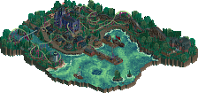
![park_4113 [H2H8 R3] A Year in Winkelheim](https://www.nedesigns.com/uploads/parks/4113/aerialt3858.png)
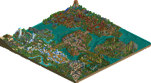
Nice to see some people thought that this deserved a design. I would've voted the same or at least significantaly higher than liampie.
@Dotrobot: in fact all voters, except Roomie and Kong (Thanks you two!), sad no xD
I didn´t thought this could win the design, but I didn´t expected 30%^^ Maybe (maybe!)It would be fine if somebody would tell me some criticism. But If not... who cares? It´s easier writing two pages of praise and tribute to the gods of rct2, than writing one word of critism to a 48% player.
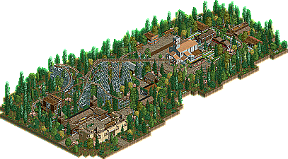
I can respect the NCSO a lot because I personally find that very hard to do. It's a good way to start out building, however I would suggest if you feel comfortable with it moving on to customs. I know it's not everyone's school of thought, but I've never enjoyed NCSO the way I can something with custom stuff. That said, I found this rather pleasing as a whole-- the structures came together pretty well in a way that wasn't too simplistic but didn't try to do too much with it. I think I would've liked to have seen a little bit of land variation-- I don't mean any big hills, but just a 1 or 2 height change to give it a little more naturalistic feel. I think you could also use foliage a little more to your advantage. Currently it's rather the same all the way through, so I think if you clumped trees and bushes more and left space to highlight certain features of the ride or landscape. You can also adjust ground covering in areas to create different and unique spaces. I think that's probably one of the biggest things you could do to up the quality of the design.
The ride itself was decent, although some of the layout seemed to be a little lacking in flow such as the ending helix off the side and some of that. The first part had some nice interaction with scenery although the middle seemed like it could have been spruced up a bit. Maybe some more straight airtime or just something to give it a little more flow in there.
All that said, I rather enjoyed this work. It was a bit short of a design for me, but not as low as it scored. I can see you having some nice releases soon.
That makes no sense...
Anyways, I thought this was really creative and pushed the limits of NCSO...but as said earlier, an NSCO design is extremely challenging to pull off.
Nice work!
I doubt that very much.
Unless is huge or near-perfect.
So basically you've justified that since this didn't get design, all others obviously can't unless they are huge and or perfect?
I believe the same argument has been made for LL, what matters is that you can execute good ideas and atmosphere.
I really don't want to hurt the confidence of MCI, but the coaster layout here is not design worthy, and the foliage is quite poor, but the buildings are very good.
So taking into account that designs are mostly focused on the coaster, and the coaster in this was fairly poor, why exactly did this lose? Certainly not because it's NCSO.
I also think making this park peepable would have improved the score. You had the basis, so just expand on them. :-)
This was border lining the "NCSO = boring, drab parks" outlook that may people have, with drab, dull colors, blocky building layouts, and a dry atmosphere overall. Not to worry though, as most go through that phase when starting out with ncso. My advice is to leave ncso for a bit, and improve with using custom scenery.
Custom scenery teaches us how to play the game imo. Unlike LL, where you don't have the option, and must learn to play with the same stuff as everyone else, RCT2 allows you an 'easy' option, where you can go and learn/improve every aspect of the game. You improve with building fundamentals, foliage, rides, etc. then later you can go back and apply those skill to ncso because you'll have a greater sense of unity and applying each object together, in turn finding new ways to create the things you've become so comfortable making with cso.
I did the same thing with my SFMM park. Started that, left, and came back with SFoT and now people praise it as one of the best ncso parks ever? The proof is in the results.
@CedarPoint6: I´m really not good in landscaping, but thats a point I must work on...
@That Guy: You dont hurt my confidence If your saying you dont like the Coaster.
@Nin: ok, I´ll try this. I had some CSO Stuff two years ago, but that wasn´t really good. xD