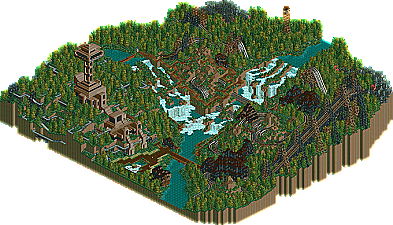
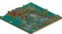
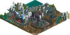
I'm gonna disagree with those who say Old Red is the best landscaper as well. Making a waterfall and covering the rest of the map with trees to me is not great landscaping. It's also become a bit predictable for him to do just that.
Old Red is a pretty good landscaper, but he doesn't hold a candle to, say, Titan (take a closer look at ArchAngel).
Anyway, I've looked through this, and...
Pros:
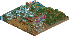
Those forest fires are cool. The coasters raced decently... and I liked the section going under the waterfall - neat detail.
Cons:
Treeing wasn't that great. IMO, you overused the oaks and firs... very dark colors. The architecture was just 'meh'... not much of it, and awkward looking.
Also, what was up with the support structures? :' />
All in all, a good entry, but deserving it's rank.
brown is a color moron! the most beautiful one of all, or close to it. blue, too. and green. and pink. yeah, what this park really seems to need is pink!
actually, i don't know that. i haven't opened it. i have other things to do. but i want to open it. and it's the first park in a while, that i know of, that i can say that about.
then again, i haven't been looking very hard.
i'll edit this post in, uh, 10 - 20 minutes, or so, with a real comment. bye.
edit: the landscaping and architecture are wonderful, to my taste, and the layouts of the rides are amazing, as are the stats (am i the only person who still cares about those? probably.) i didn't like the lag, though, or the use of non-protour scenery, or the out-of-synch racing towards the beginning. still, this is a very beautiful park, which is a joy to explore.
i suppose in a contest like this judges go in expecting to see something really unique and innovative, and, actually, when i judged contests like this i expected the same, but i still think this deserved a much higher score than what it was given.
Looked neat, but I see why it's ranked lower than the rest. The landscaping looked fine, i liked the waerfall and brushfire. The coaster raced really well, and I liked where they went under the waterfall. But what's up with the random wooden supports? Too bad the gokarts weren't riding. The entrance of it looked cool, with the pipes coming out of it it remembered me of a place in France.
Personally I would disagree that he's the best landscaper but he's definently up there and he'd get a hell of a lot more credit for it if he knew how to use his own landscaping to it's fullest advantage (NOT COVERING IT WITH TREES!!!). The architecture, lacking in color as it is, still works quite well IMO and the duelers were quite decent as well. Strange, unorthidox layouts need to come around more often just to remind us that there's more to this game than building by the same old formula.
Though personally I would've had this at last place right now because while it filled the map it contains even less supstance than Kumba's sliver of a park.
It was ok, i liked Kumba's entry more. I absolutly loved some of the lanscaping, you really nailed that but the archy had no character or life in it. It really did'nt appeal to me and was too bulky.
The duel wooden roller coasters were good but i was hoping for a more dueling woody with more symetrical racing pieces going here there and everywhere.
Like alot of others have said the forest fire was a cool touch, but it got boring and repetitive real fast. I liked the small flames though showing the after effect.
I thought the go-karts was a cool idea but it was pointless if people could'nt go on it.
Good entry. It was worth a download, i would'nt say you are "THE" best at landscaping but i'd be dam proud of some of the stuff you put in that park.
...Thanks ya'll...I hope everyone enjoys the park...
...sorry about the go-carts...I accidently flipped the entry point(blue arrow), so
no guest could enter the park...didn't know how to fix it...?...
...as for the park...I'm not to good at architecture or ride buildin', so I minimize my buildin' to the basics...I think i used about 60 pieces of scenery...landscapin' is all i have goin' for me...
...it was my first attempt at a double coaster...i tried somethin' different with the support stucture...it came out pretty good...high speed, good hills, under the falls,
through a small cave, and a crazy figure eight...not bad stats, either...
...I was saddened the go-carts didn't get to run...it would of been cool to see all those little carts flyin' around...if someone could get it to work, i'd be grateful...
...I'm not surprised by 13th place...it was where I expected to be...at least I beat the workbench...and Mr. Kumba...It was an HONOR to partcipate in the Pro-Tour2
with so many talented and accomplished parkmakers...I'd like to thank Mr. Iris for givin' me a chance...GOOD LUCK to 12th-1st...
I thought this was...well, bad.
Sorry to say it Red, because I enjoyed your Cave entry, and you've had some very creative ideas after that as well. But this one just missed the mark, in my opinion.
As others have stated, you're very good at landscaping. The land isn't overly smooth, but it isn't noob-ishly jaggad either, and that makes it very interesting to look at (I've never actually watched a landscape's flow before, except with maybe the landscape in Phatage's sig, made by Timothy Cross). But really, you managed a very surreal yet highly realistic terrain, what with the massive waterfalls, hills, valleys, etc. Landscaping is without a doubt your strongest point, though I don't know how much of a compliment that is, because the rest of your parkmaking abilities are severly lacking.
The coasters, for instance, lacked any real style at all. The lift hill had me excited, mostly because of it's absolutely mosterous size. But you didn't take advantage of that, and it would end up just being a really long (but suspenseful) let down for anyone riding. After that, the ride was basically just a few drops and some turns. 90% of the track was made up of the lift hill and plain ol' flat and/or straight track. Which, put simply, is boring to watch and to ride. Basically, I was really excited in the coasters' immensity, but I was really let down by their layouts. On a positive note, the coasters have pretty good interaction with the rest of the park, and I liked you had the path go up the hill/mountainside while the coaster went alongside it.
The go-kart track, while original, didn't really interest me much. There are some things that look good when done on a huge scale, and certain things that don't. In my opinion, go-kart tracks are not ment to be so huge, as it really just just...unrealistic. Imagine yourself in a go-kart track of that size...Actually, that'd be really fun. But in RCT, it doesn't translate well from the excitement of driving go-karts.
The more I think about this though, the less it bothers me... Interesting how supporting my view that it was unnecessary has changed my position to now supporting it... In any case, I still say that go-kart track does not look appealing on such a scale in RCT. I will say, however, that it would be very fun to ride the track in real life, especially around such cliff-esque edges.
Finally, the architecture and general scenery of the park was nearly as bad as the coasters. As mentioned, the whole area is highly overtreed, and many of the trees don't look good together. The architecture overall is interesting, but the color choices dull any curiosity I have. Notoriously bad buildings included the wooden structures near the coasters' entrances, and the peach-ish buildings near the go karts. The tower was alright, though a bit on the heavy side for such a tall structure. I wouldn't say anything was ugly in the park, just nothing was very appealing.
So overall, I was expecting better from you.
As iris mentioned, the creative spark we've come to know you for wasn't really here. The forest fire was good, but too contained and not really related at all to the rest of the park. Perhaps you could have had the coaster interact with the flames, having certain sections a different color track and make the scenery appear burned. As it is though, it just doesn't really compare to anything you've done in the past.
The scale is immense, but the quality is barely existant.
I hope you do keep playing though, becuase you have talent. Just needs refinement.
Whether or not this is a typical 'Old Red' park or not, I still liked it. After all, a lot of people don't complain about Steve, Artist, Turtle or anyone making the same 'pretty' parks all the time :' />
It is a Rugged Range; why should there be more architecture, or less trees for that matter? What you are really saying is you wanted a completely different park..
It would be nice to see something different but you do generally tend to make what you are good at. Old Red is good at making foresty, waterfall, rugged type parks and this was no exception.
This park had some really nice touches, like the forest fires, and the straight sections on the woodie over the waterfall, but as mentioned before, it was very flawed. The foliage wasn't horrendous, but very repetitive and boring. The park was very dull. Nothing sticks out, except a bunch of brown, everywhere. Brown is good if you use it in moderation but not if it's the entire park. To end with some positives, though, I liked the forest fires, the go-kart station, and the observation deck. Keep at it, Red.
It's great to see another park from you, as always. You played to your strengths and that's admirable. The falls looked great. The forest fires are one of the single best landscaping gimmicks I've ever seen. I liked the tower architecture. It could have used a little more color, I suppose, but that's not really what you were going for. Anyway, I'm really glad you qualified and got an entry in. Thanks.
While it had some nice touches (such as the aforementioned a million times forest fires), the park overall disappointed in the quantity/quality ratio. I think if you had a full park of details as nice as your structures or forest fires, it would have helped drastically. As it was, the whole park was essentially an oversized NE design. Unfortunately, that didn't impress me as much, so I'd actually have to rank this below Kumba's which had lots of nice details crammed into a lesser space.
32 Comments
Toon Offline
ACEfanatic02 Offline
Anyway, I've looked through this, and...
Pros:
Those forest fires are cool. The coasters raced decently... and I liked the section going under the waterfall - neat detail.
Cons:
Treeing wasn't that great. IMO, you overused the oaks and firs... very dark colors. The architecture was just 'meh'... not much of it, and awkward looking.
Also, what was up with the support structures? :' />
All in all, a good entry, but deserving it's rank.
-ACE
cg? Offline
actually, i don't know that. i haven't opened it. i have other things to do. but i want to open it. and it's the first park in a while, that i know of, that i can say that about.
then again, i haven't been looking very hard.
i'll edit this post in, uh, 10 - 20 minutes, or so, with a real comment. bye.
edit: the landscaping and architecture are wonderful, to my taste, and the layouts of the rides are amazing, as are the stats (am i the only person who still cares about those? probably.) i didn't like the lag, though, or the use of non-protour scenery, or the out-of-synch racing towards the beginning. still, this is a very beautiful park, which is a joy to explore.
i suppose in a contest like this judges go in expecting to see something really unique and innovative, and, actually, when i judged contests like this i expected the same, but i still think this deserved a much higher score than what it was given.
Edited by cg?, 18 February 2006 - 10:06 PM.
tracidEdge Offline
with that said, i might look at this later, i dunno. it doesn't seem very appealing to me, sorry.
Akasha Offline
Ride6 Offline
Though personally I would've had this at last place right now because while it filled the map it contains even less supstance than Kumba's sliver of a park.
ride6
J K Offline
The duel wooden roller coasters were good but i was hoping for a more dueling woody with more symetrical racing pieces going here there and everywhere.
Like alot of others have said the forest fire was a cool touch, but it got boring and repetitive real fast. I liked the small flames though showing the after effect.
I thought the go-karts was a cool idea but it was pointless if people could'nt go on it.
Good entry. It was worth a download, i would'nt say you are "THE" best at landscaping but i'd be dam proud of some of the stuff you put in that park.
Old Red Offline
...sorry about the go-carts...I accidently flipped the entry point(blue arrow), so
no guest could enter the park...didn't know how to fix it...?...
...as for the park...I'm not to good at architecture or ride buildin', so I minimize my buildin' to the basics...I think i used about 60 pieces of scenery...landscapin' is all i have goin' for me...
...it was my first attempt at a double coaster...i tried somethin' different with the support stucture...it came out pretty good...high speed, good hills, under the falls,
through a small cave, and a crazy figure eight...not bad stats, either...
...I was saddened the go-carts didn't get to run...it would of been cool to see all those little carts flyin' around...if someone could get it to work, i'd be grateful...
...I'm not surprised by 13th place...it was where I expected to be...at least I beat the workbench...and Mr. Kumba...It was an HONOR to partcipate in the Pro-Tour2
with so many talented and accomplished parkmakers...I'd like to thank Mr. Iris for givin' me a chance...GOOD LUCK to 12th-1st...
Old Red
hobbes Offline
Sorry to say it Red, because I enjoyed your Cave entry, and you've had some very creative ideas after that as well. But this one just missed the mark, in my opinion.
As others have stated, you're very good at landscaping. The land isn't overly smooth, but it isn't noob-ishly jaggad either, and that makes it very interesting to look at (I've never actually watched a landscape's flow before, except with maybe the landscape in Phatage's sig, made by Timothy Cross). But really, you managed a very surreal yet highly realistic terrain, what with the massive waterfalls, hills, valleys, etc. Landscaping is without a doubt your strongest point, though I don't know how much of a compliment that is, because the rest of your parkmaking abilities are severly lacking.
The coasters, for instance, lacked any real style at all. The lift hill had me excited, mostly because of it's absolutely mosterous size. But you didn't take advantage of that, and it would end up just being a really long (but suspenseful) let down for anyone riding. After that, the ride was basically just a few drops and some turns. 90% of the track was made up of the lift hill and plain ol' flat and/or straight track. Which, put simply, is boring to watch and to ride. Basically, I was really excited in the coasters' immensity, but I was really let down by their layouts. On a positive note, the coasters have pretty good interaction with the rest of the park, and I liked you had the path go up the hill/mountainside while the coaster went alongside it.
The go-kart track, while original, didn't really interest me much. There are some things that look good when done on a huge scale, and certain things that don't. In my opinion, go-kart tracks are not ment to be so huge, as it really just just...unrealistic. Imagine yourself in a go-kart track of that size...Actually, that'd be really fun. But in RCT, it doesn't translate well from the excitement of driving go-karts.
The more I think about this though, the less it bothers me... Interesting how supporting my view that it was unnecessary has changed my position to now supporting it... In any case, I still say that go-kart track does not look appealing on such a scale in RCT. I will say, however, that it would be very fun to ride the track in real life, especially around such cliff-esque edges.
Finally, the architecture and general scenery of the park was nearly as bad as the coasters. As mentioned, the whole area is highly overtreed, and many of the trees don't look good together. The architecture overall is interesting, but the color choices dull any curiosity I have. Notoriously bad buildings included the wooden structures near the coasters' entrances, and the peach-ish buildings near the go karts. The tower was alright, though a bit on the heavy side for such a tall structure. I wouldn't say anything was ugly in the park, just nothing was very appealing.
So overall, I was expecting better from you.
As iris mentioned, the creative spark we've come to know you for wasn't really here. The forest fire was good, but too contained and not really related at all to the rest of the park. Perhaps you could have had the coaster interact with the flames, having certain sections a different color track and make the scenery appear burned. As it is though, it just doesn't really compare to anything you've done in the past.
The scale is immense, but the quality is barely existant.
I hope you do keep playing though, becuase you have talent. Just needs refinement.
Buckeye Becky Offline
It is a Rugged Range; why should there be more architecture, or less trees for that matter? What you are really saying is you wanted a completely different park..
It would be nice to see something different but you do generally tend to make what you are good at. Old Red is good at making foresty, waterfall, rugged type parks and this was no exception.
CoasterForce Offline
cBass Offline
It's great to see another park from you, as always. You played to your strengths and that's admirable. The falls looked great. The forest fires are one of the single best landscaping gimmicks I've ever seen. I liked the tower architecture. It could have used a little more color, I suppose, but that's not really what you were going for. Anyway, I'm really glad you qualified and got an entry in. Thanks.
Corkscrewed Offline