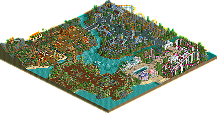
Park / Cinemagix
-
 20-February 06
- Views 6,845
- Downloads 995
- Fans 0
- Comments 28

-

-
 No fans of this park
-
 Download Park
995
-
 Tags
Tags
 20-February 06


 No fans of this park
 Download Park
995
 Tags
Tags
 Similar Parks
 Members Reading
I think the park wasn't that bad, but the movie themes were stupid. Sorry, Austin Powers? Seriously. What hurt this the most were the themes.... I think you could have had a lot more flexibility with your theming if you just had a better idea.
It was nice though. A BIG step up from the last two entries.
Xcoaster Offline
I actually really liked the urban music in that area. I thought it fit pretty well. And it's usually something I never use.
I'm probably sounding like a broken record here, but I must say the highlight of this park is the architecture. I pretty much enjoyed every building in the park. My only complaint about the architecture is that is wasn't varied enough from one area to the next. It seemed like you had the same textures and building forms, but just used a few different deco pieces and colors to differentiate to the next area. Still the best architecture I've ever seen from you SF. I won't drone on too much about what I didn't like, so I'll sum it by saying I didn't like any of the rides except the Desperado mine train and only slightly the Peter Pan ride. The rest just either weren't exciting enough or themed well enough for me to really enjoy.
So in the end, I have to agree with the judges scores, although I probably would've given it at least a 4 due to the quality architecture.
Can't wait to see this solo SF!
I really liked the entrance area and Mexico but I really did not like the other two so much. The futuristic area reminded me way too much of Titan's Arch Angel and the Austin Powers area was just way off for me. Art Deco for Austin Powers?? He's British
I suspect you will amaze us all with your new solo because your 'other' work is done now and you can concentrate on one thing!
So have a bunny.....
Edited by Buckeye Becky, 21 February 2006 - 06:45 PM.
Corkscrewed Offline
So I can understand why it placed where it did. It's not bad, but it's one of those parks that you look at, note a few nice things, and probably never open again. Credit goes to completing a full park and putting in decent content, however, I must confess to being disappointed as well, as I feel you've put in more quality in previous releases.
Edited by Panic, 26 February 2006 - 09:33 PM.