Park / Les Trois Mousquetaires
-
 03-November 10
- Views 6,415
- Downloads 1,446
- Fans 3
- Comments 17
-
-
 79.62%(required: 65%)
 Design

robbie92 95% Kumba 90% 5dave 85% CedarPoint6 85% nin 85% geewhzz 80% Liampie 80% Roomie 80% SSSammy 80% BelgianGuy 75% John 75% RMM 75% turbin3 75% Wicksteed 70% RCTNW 55% 79.62% -
3 fans
 Fans of this park
-
 Full-Size Map
-
 Download Park
1,446
-
 Objects
289
-
 Tags
Tags
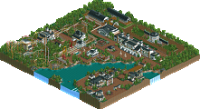
-JDP
I was waiting for this one for a while already, I liked it the first time I opened it.
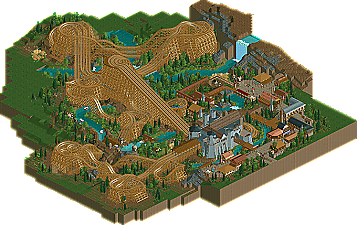
For those who hadn't guessed, this was to be the entry for the final of Unofficial QFTB. I build this in about five or six days, and i'm happy with the feel of it, although obviously there's only so many ideas you can incorporate in such a small time. There's a lot of things that are pretty raw, but the basic premise is there, and i'm really happy it won design.
I spent quite a lot of time getting the duels and pacing right, and i'm happy with it overall, altough I couldn't get it quite perfect. There seems to be a bit of randomness, as with most dueling coasters, which means that occasionally different trains will arrive first.. that's pretty cool, but I can't take responsibility for it.
Wicksteed Offline
Thats why I voted "only" 70%. It is still high quality though.
That station is pretty awesome too
My favourite touch was the water ride throughout the whole landscape. I've recently used those boats as well and I think they were incredible and I'm glad you've done them justice. The coasters were all very good and all duelled more than I thought they would
Only irks for me was the full ride with the negative grass square around it, black tiles following the diverse shape of the design would have given this the polish it deserved. Also the buildings just needed an hour or two more just to take them to the detail level the castle had which was an incredible structure. After that world class foliage, amazing atmosphere and your best design imo. It just goes to show you that massive themes like Starflight are incredible but sometimes just an epic atmosphere shines through.
EDIT - Also congratulations on getting into the top 10 in the Hall of Fame, Even now your one of my favourite players so please never stop building!
The drawbridge as an entrance to a castle themed station is something I had been meaning to do in old medieval design plans. You've executed this beautifully.
I really liked how you've used the stalls as part of the theming. I think this is something with great potential, too little done in general.
Your foliage sometimes is questionable to me. While it does its job well, I feel it struggles a bit to create a more intense atmosphere. Maybe it's not chosen carefully enough? I think you could do more with it. Also with terrain texturing which I feel is a bit too basic and missing sensitivity about what should go where.
Overall a great joy to look at. I'm totally happy you're active again.
I can only wonder how a big refined park by you will look like. I rated this rushed design 80%, and Toy Story which looked also rushed to me was just as good... Your upcoming park is going to be incredible.
Thanks very much, I think the first two turnarounds differ pretty significantly, the first is a bit of a free for all, whereas the second all go the same way... in fact, the second turnaround gives in my opinion the best part of the whole ride, if you rotate the view 270 degrees from the opening screen, I love the way all three trains sweep round in the same manner.
Yeah I wanted to black tile it, but just ran out of time to be honest. And then when I decided to submit this, I didn't want to work on it any more, I wanted people to see what i'd done for the contest, nothing more. Same with the buildings, most of them were the last things to go in, and were pretty rushed. And yeah, happy to have broken the top 10, some pretty epic names up here!
Wow, wasn't expecting this feedback from you, to be honest. Best triple duelers ever? What about Rampage by RRP? Those will always take it, for me. The drawbridge actually posed some quite interesting problems, and went through a few different guises before I settled on that one. Actually, I always wondered, does everyone have the same spacing problems as me? Maybe it's because I don't really plan things out totally, I always end up making lots of different things, and then trying to pull them together without ruining the individual parts..? To answer the foliage issue, I would normally put a lot more thought into the foliage, but here, it was done in an hour or so, for the most part, and as such I just repeated the same things over and over. I don't want the lack of time issue to be an excuse, as i'm still pretty proud of it.
Both this and Toy Story were rushed indeed, but maybe I just work really well when rushed! I am trying my best with my upcoming park, i'm pretty happy with it so far. I think it's a lot more refined and thoughtful than this, anyway.
The station building itself and the surrounding areas were very well done, though everything definitely felt a bit raw. I was really surprised to see your name on this just because it lacked the usual lush feeling I get from your work. That atmosphere just doesn't really reach out and grab you but if you look around a little there's really a lot to love.
Ride6