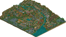
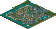
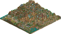
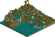
Park / Boomtown Amusement Park

20 Comments

  • Comment System%s's Photo
  • Cocoa%s's Photo
    holy shit, this thing popped up and scared me! NE live!

    anyways, nice park... but I feel sort of funny giving an unfinished park an accolade. I know big bear or whatever was the same, but still
  • scarywaffles%s's Photo
    This is the Style I've been lookin for in ages!
  • tdub96%s's Photo
    Wow so many release the past week, dang. Ill come back to comment more later.
  • Faas%s's Photo
    Great little park you have there!
  • Phatage%s's Photo
    I really like the coasters in this park. They do well by their real counterparts that inspired you yet they are distinct designs. The use of the volcano as a central hub was executed well, and it's something that I hope Kings Dominion could incorporate some day. The good thing about the coasters using the volcano was that they didn't spend too much time aimlessly twisting around underground, that they resurfaced at times that made sense to make the ride more exciting. I thought the mine train/wild mouse ride had a nice concept to it but the concept's thunder was stolen by the park's water coaster; kind of didn't make sense to have both of them. I thought you did a very good job on the Hades-like woodie, especially since RCT's momentum loss on woodies is pretty high, but you were still able to get some decent pacing on the ride and it's location was top notch.

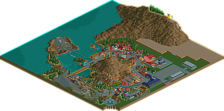
    As for the park itself, while some sections were nice and cozy, it's obvious that this submission was more of a collection of coasters rather than a fully developed land. Hopefully the unfinished-ness of it implies that you're heavily inspired on building something else, so I'm looking forward to seeing that.
  • Fizzix%s's Photo
    Wow, I love all the coasters in this nice little park. Vulture is awesome because it just dominates the area it inhabits. I love the woodie, it just flows so nicely. Great job on this little park, and congrats on the Bronze! :mantis:
  • Dotrobot%s's Photo
    Release "fiesta"!!!

    Nice. I've been waiting for this to pop up in the front page.
  • djbrcace1234%s's Photo
    Ehh, I was expecting eruption to be more aggresive, but it seemed very tamed. Most of your coasters, (with the exception of the woodie) Really had the pacing and deveolpment of a more family oreiented side IMO. If that is what you were trying to accomplish, then you did that well. Phantage sums up my thoughts more to say as well.

    It squeaked by, but you deserved this one. :mantis:
  • nin%s's Photo
    I'm sorry, but I don't see why this received an accolade. Yes, what's actually built is worth something, but then you seemed to have grown tired of the park and filled the rest with a huge, meaningless lake, mountain, and a bald spot which you labeled as a construction site, which in my eyes is nothing but a cheap excuse to finish something. I rarely finish something, but if I wanted an accolade bad enough I bet I could label half of my work as a construction site and still scratch by with a few bronze or silvers. I rarely finish anything, but unfinished stuff is just terrible imo. It simply kills whatever sort of story/concept you were going for, even if it is labeled as something else like this does.

    I know that's a bit harsh, but really, just black out half the map and you'd have been set.
  • Maverix%s's Photo
    Thanks for all the comments guys, it means a lot.

    As far as it feeling unfinished as many of you pointed out, what's there as far as the actual park goes is what I wanted to build for the park. I wanted the small sort of local park feel. The mountain, and lake were meant to help develop the overall theme/ feel of the park rather than just take up space. As far as the construction site goes, that was meant to be an "outside the park detail" rather than, again, a space filler. I do see how all this could come across as fillers, but this was really all I wanted to build for the project. I wanted to get a medium/ smallish park under my belt so I'd have the confidence to take on larger tasks. (Cheetaka for example, the map is actually close to the same size!)

    I'm not trying to come across as "this is how you should view it" but rather just as my point of view when I built it. That said, it means a lot to get the accolade and hopefully Cheetaka will impress you guys a lot more. :)
  • rK_%s's Photo
    pretty cool, i loved the pre-lift section for the woody, looked like a lot of fun. Seemed like you had a lot of fun as well with building this, i enjoyed it.
  • Cocoa%s's Photo
    ^I mean, that was a HUGE construction site. And just plain grass and sand, really... seriously, you could have put a little more of the ride in, or a few cranes, or something. and the transition to construction site was wierd, it went straight from path to a huge expanse of empty grass, a tan wall, and then a huge expanse of sand. I actually thought this was meant to be unfinished, there are just too many places that are just empty land or filler space (like the tan bridge, for example. Or the stadium) And then the mountains were completely bare? I understand this a little, but the huge one at the side is just unrealistic. and as far as feeling like a small local park, 3 big-company roller coasters seems a bit unrealistic... I can't help but feel like you're just coming up with excuses for it being unfinished.

    sorry, man, its just I feel that this shouldn't have won, I know it barely did anyway...
  • J K%s's Photo
    When I was doing the write up I actually believed you were going to go back to this park in half a year or so. I just have the feeling you're going to carry this park on and I think you should do a year-by-year kind of thing when you get bored with other projects.
  • tdub96%s's Photo
    ^yea, thats a great idea. The fact that CP6 is thinkin about that for SFC is awesome. I like seeing the year by year progession of realistic parks like this. its a great idea, something you should consider maverix. Like Enchanted Elements, that would be something really cool to see with this.

    As for the coasters in here...
    The floorloess beemer did seem a bit tame as mentioned before me, but it appears thats what you were going for...somnething like Daemonen. I sense the inspiration from Daemonen's layout on the helix before the drop and the sheer small size of the floorless coaster. Looks good.

    The GG woodie, very nice. Good pacing on one of the harder coaster types to pace in this game. I aslo liked the similarity to Hades, with the underground tunnel and section of the layout after the tunnel, nice work on that.

    Intamin impulse, yea, generic, but a nice addition to the coaster lineup.

    Eruption reminded me of the coaster in SRF's park, but a cool coaster none the less.

    Great work on this, I feel you deserved the accolade. Good luck with future projects, as cheetaka is looking great.
  • scarywaffles%s's Photo

    hopefully Cheetaka will impress you guys a lot more. :)


    count me! You have made me amazed because of that ride ^_^
  • John%s's Photo

    I know that's a bit harsh, but really, just black out half the map and you'd have been set.


    I complete disagree. Blacking out the map is infinitely lazier than trying to create a setting (no matter how bland it might be) for the park.

    As you can tell by my score, I really enjoyed this. Congrats on the accolade, Maverix!
  • SSSammy%s's Photo
    i thought, by and large, this was a very beautiful map to view. good work.
  • nin%s's Photo
    ^But see, when the setting is half-assed than it does no better than having nothing at all.
  • Austin55%s's Photo
    I dont know how some sand and a huge wall labeled "Construction" can be labeled as creating a setting...