Park / Diamondback
-
 27-October 10
- Views 6,795
- Downloads 1,206
- Fans 1
- Comments 29
-

-
 65.38%(required: 65%)
 Design

Kumba 85% RCTNW 85% RCTCA 80% BelgianGuy 75% 5dave 70% CedarPoint6 70% geewhzz 70% RMM 70% robbie92 65% K0NG 60% John 55% nin 50% SSSammy 50% turbin3 50% Liampie 30% 65.38% -
1 fan
 Fans of this park
-
 Full-Size Map
-
 Download Park
1,206
-
 Objects
279
-
 Tags
Tags
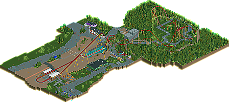
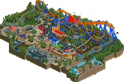
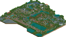

let me just make a general statement, if it is boring in real life, then don't make it in a game, and never claim its good cause it's real. If you make a recreation of a pile of shit, no matter how real it is, you have still a pile of shit.
as for the design, it was okay. The coaster had some nice parts, like the area enclosed by the woods and the big hills, however, i couldn't handle the scale. It was too big to work, which was the entire problem in the first place. Plus, having 20 plus tiles of straight track doesn't work for me. There are better ways to make a long brake run without having a quarter mile of brakes. The archy was nice, detailed and textured, but too sparse and too spread out. In short, this was too much of a recreation for me. If we make everything in RCT like it is in real life, ill stop playing now, too boring for me. its a recreation not a replica, you need to make some important choices as to what to keep and what to modify, then you will be there.
Congrats on the design none-the-less. I hope to see more work from you.
FK
That's the perfect example. Sure it was well executed and accurate, but still it's too huge, plain and boring. Look at Kumba - is it 1:1 in scale?
"MFG"
-JDP
Remove the large open space...
...as in don't even add that huge midway of nothing to the left of the lift hill if you're not gonna do things like Backlot Stunt Coaster. I don't wanna do a paint drawing but everything to a couple tiles left of that peach fence all the way up to the midway where the arcade is could've been done without
Anyway, overall it was good
I respect the effort
By the way, you kinda built the ride as if it had just opened a week ago, it's come a long way...
Splashdown
...and that midway I was talking about before is a little more narrow and shaded...
Midway
...and doesn't the exit lead into a gift shop
Exit Path
I can go on...
And haha yeah i was building off opening/construction photos :/ Would of been good if i new that now haha
I really enjoyed this design because I'm pretty sure Goliath123 knew this was going to get some negative feedback, this is one of the harder B&Ms to recreate on rct2 and even harder to get a design accolade on it. The main reason why there is so much empty space besides BSC is because the angle of the lift hill spread everything out. in real life, the green and black building is right next to the Q-line for diamondback and the lake and brake run arent that long and so on. but on a negative note, you shouldn't of spaced out the second hill, because it set a reaction for the hammerhead being butchered, and the final helix too. but the entrance/ station really appealed to me, like how you removed the station track, and on the entrance sign a bunch of other signs that were really on the sign such as "run for the hills!" too, the station itself i loved and same with the lines. and finally, the Trains. at first i kind of didnt like the idea of giga-looper trains on a b&M, but later i watched a raw pov on youtube while looking at it on rct2 and was impressed. also I loved the foliage- it kind of made up for the blank spaces.
This is an impressive recreation of my favorite B&M and favorite coaster of 2009 and I applaud you.
-Insanity