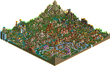
Finally, after being speculated to finish near the very bottom of the list, Jazz surprises the entire site with his impressive top 10 finish, placing ahead of some of the most talented newcomers at the site. Continuously improving his parkmaking, he's developed an almost nostalgic style of parkmaking, focusing on making actual parks instead of concepts, and seemingly feeling encouraged by the more of the map he gets, instead of scared away like most parkmakers in this contest (as evident by their lack of space usage). This park obviously has many ups and downs. A couple areas really impressed me, most notably the "Martin the Warrior" coaster and correlating theming, showing just how much potential Jazz really has. The suspended coaster "Salamandastron" was very nice as well, as was the shoot the chutes river flume right next door, giving off a very pleasent, welcoming atmosphere. While those two coasters were very nice, there were also very average, amateur-ish coasters like the inverted "Mathia's Quest" and the Arrow Looper "Legend of Luke", and even worse the nearly pointless "Cluny the Scrouge". While in my personal opinion, I don't think this entry was better than either DarkJanus's nor Magnus's, it managed to find a soft spot in the heart of our more LL oriented judges, Fatha' and Nate, both giving him a huge boost in their scores, whereas the more RCT2-oriented judges gave him much lower marks. Anyways, I'm sure there will be controversy over the placing of this entry, but congrats anyways to Jazz for not only getting an entry in, but surprising the hell out of everyone too!
I think it's a pretty good entry. The coasters didn't do much for me, except for the wooden one, like Iris said. The architecture is somewhat boxy, but I thought that Jazz would finish last or close to last, and that is certainly not the case! Well done, Jazz.
If HandyAndyG judged:
DarkJanus
Kumba
Jazz
Old Red
Six Frags
magnus
Edited by HandyAndyG, 25 February 2006 - 03:04 PM.
This park had its moments, you seem to have a recognisable architecture style now and its quite nice, there was lots to look at in this park and it kept me looking for quite a while. Some of the coasters were a little weird, but i really love the 'overgrown' mossy look the the area with the wooden coaster. Nice park Jazz, and congrats on getting into the top 10 and making everyone look like a fool!
Lovely logo, lovely park (from what I see )! Really like the left screen, very.. mossy . The right ones very.. Jazzy . You were kind of an underdog in this competition, and what a contrast in judging :' /> 13th by Turtle 3rd by natelox. Congrats on makin' it to the tpo ten! Very close to Magnus though, you beat him by one point . Unable to open the park unfortanately, my disc failed.
I know im non-existent at this site so feel free to ignore my pointless comment but i loved this park so much i felt i had to have my say. I've followed all the pro tour entries so far and im suprised this only placed 9th! I have great expectations for the next 8 entries (good luck X )
I won't go into great detail but it was definately the woodie that did it for me, everything from the track layout to the chosen colours made it great. Also a nice theme based on Brian Jacques Redwall books.
I tend to agree with Iris, Turtle, Panic and Toon rather than Nate and Fatha'. The park was ok, but I wasn't a big fan of it really.
The coasters let it down a lot. That invert was going reasonably well until you did that crazy thing into those corkscrews that was almost criminal. Also, the supports were extremely inconsistant with only a few parks custom supported, and areas that looked like they were floating (particularly around the corkscrews over the paths.
The wooden coaster was pretty cool and showed off the best theming in the park. The suspended was ok as well, not knowing which part of the mountain it will come out of next. That LIM was horrible mainly for the horribly constructed cobra roll. The water rides were generally pretty good in the park, and it was nice to see them used in abundance, so good job there.
The corksccrew coaster was ok. Generally good layout with a few awkward sections.
The architecture in the park was pretty repetative, often containing some bad colour combinations and mainly sticking to boring 2x2 structures that got repetative. There were a few good buildings though, particularly around the woodie.
The foliaging was pretty weak to with some areas that needed trees but were vastly over-bushed (if that's a word)
Saying that though, this is one of the only entries that I really got a sense of completeness from. There was a hell of a lot to look at which kept me looking at the park for a long time, and there were a lot of coasters without it looking particularly cramped.
Overall, good job on getting 9th, hight than expected. While I don't agree with such a high placing, it certainly puts you on the map as an upcoming parkmaker to keep an eye out for.
How I would rank it so far:
14. Old Red
13. Jazz
12. Kumba
11. Six Frags
10. Magnus
9. Dark Janus
Well, the coasters were a complete mess, and there was an attempt to try and get the most architecture into a map (every building didn't have a purpose other than fill the map)..
And I applaud you for that.. This is the way a contest park should be made and although the judging was crazy (like Akasha said Natelox put you 3rd and turtle 13th ?!?) you did what you can do best.. Fill the map..
I have no idea what the theme was about (why doesn't anybody do read-me's anymore nowadays?) I think I kinda like the way you played this.. It proves that you can do contests pretty well, so I'm looking forward to your next PT entry, the place you get in the prediction topic, and the surprise on what place you'll get in the end!
The theme is based around a series of books called "Redwall" by Brian Jacques, focusing around mice in medieval type times, based around a castle called Redwall. It would've been nice to actually have the castle in the park but whatever.
I am unfamiliar with Redwall beyond the fact that my son has read some of the books. So when I was judging this, he looked over my shoulder and told me what the theme was. Otherwise I would have had no clue. So I asked him if the park represented how he viewed Redwall and he said that other than the naming, not really. This did play into my judging a bit, but not significantly. I still feel that the map was over architectured and under themed. I am happy with my placing here.
Jazz shot for the two pointer and made it, wheras I feel the majority of what has been released so far has missed the 3. Same thing I feel with Prince's and Twisted's entries last time around.
The thing that I think nobody has done so far is gone for the shot, got fouled, made the shot, and 1 at the end. The end result is a 3 still, but its less risk and more hard work.
How this got an 3rd and 4th place is beyond me... I've been looking through the entire park looking for those mindblowing details and thoughtful areas that could make this park special and I found NONE. This whole park felt like giant clipboard to me: the copy/paste feeling. How did this end up above DJ....
Edited by tyandor, 25 February 2006 - 05:34 PM.
Guestking bob
Offline
wow...
i really liked this park, so much that i had to make an account and comment on it. i like how you themed it to the redwall books, its very original. i see some people disagree with me, but i thought it was a very nice entry overall.
In my opinion, one of the biggest things this park had going for it was that it was a full, complete park, and wasn't meant just as a concept piece or anything, but as a working park. So far, it's only second park that really does this. While I agree that it's important for a park to feel completed, it seems to me that two of the judges took this as almost the only criteria for a good park, because while it's complete, little about it is really extraordinary.
As Six Frags mentioned, the buildings are used almost entirely as filler, with little thought as to what would go inside of them. For example, there was a little 2x2 building with a sign on it labeled "Info/Food," which is about as generic as you can get when actually assigning a purpose to a building, while most buildings don't seem to be meant for anything. Similarly, no stalls of any kind were used. So while it does seem like one of the most filled parks we've had so far, what's there just isn't that great.
As far as the coasters are concerned, I wasn't particularly impressed by any. "Martin the Warrior," was certainly the best, but I'm not exactly in love with it. It had it's high points though. The colors did give a moss covered feel, which was nice. I felt about the same for "Salamandastron." It was pretty good, but not spectacular. Both were good at interacting with the buildings and theming, though. "The Legend of Luke" had a lot of potential at the beginning, but after it got past some of the turns after the corkscrews it died. The brakes that slowed it down for final flatspin were completely unnecessary. "Cluny the Scourge," though getting some points for an effective use of the word "Scourge," just seemed like it was taking the idea of Top Thrill Dragster, but lowering the speed down significantly, and replacing the record setting tophat with a cobra roll. And that was it. So it was basically an even shorter, launched Boomerang which doesn't go backwards. Which isn't good at all. It might've been OK if it was longer, or did something more interesting than a cobra roll, but it didn't. "Mathias's Quest" was about the same as "Luke." It had a decent beginning, but then you made that right/left unbanked turn thing and I didn't care for the rest. I did kind of like how some of the ending looked among the plants, though it lost some impact since most of the coasters tend to have a similar ending with lots of meandering turns and helices.
Overall, my sentiments closely reflect those of most of the others who have commented. It was by no means a bad park, but I just felt that in a competition of this quality, it placed higher than it should've, for reasons I don't quite understand, other than that it was complete. Essentially, as I think Phatage was saying, it felt like achieved good Runner Up quality in a competition where the aim should be to try for Spotlight quality, even if it isn't reached. Still, congrats on getting this far, and getting in a park that was as finished as it is.
I just looked over the parks again. My revised ranking of the parks so far would be as follows:
9: DarkJanus
10: Magnus
11: Six Frags
12: Jazz
13: Old Red
14: Kumba
I should mention that I'm still a little undecided on 10-12. I could see any of those shifting around a bit. For a little while I had Jazz at 10, Magnus at 11, and Six Frags at 12.
To be honest, I was scared to place this as high as I did, and thought that mine would be the highest placing of it. At the last minute I switched this and the park that I ended up giving a seven, and perhaps I fooled myself into thinking that I liked that park more because of the more renowned name attached to it. But I would associate myself with Nate and Fatha in my view of this park rather than those who gave it threes and fours, and in any comments on the judgings I would ask that I be viewed that way.
Even if this park was unrefined, no park was more cheerful or spirited in atmosphere, or looked as if it were as much fun to build. There are many entries in this contest - and you will continue to see them - that are based on some innovative overlying idea, in which a lot of the joy of building seemed sacrificed for the sake of refinement and consistency. This was the entry in which a sheer love of playing the game and the desire to build, build, build at the heart's content was most evident.
I really liked it. There some very nice aspects of it but some other aspects brought it down slightly. Still, some parts were very beautiful - just as an example, I thought the river moss(?) ride was fantastic.
Surprising entry/placing, Jazz. Congrats!
I liked it and i did'nt. You mixed some themes really well, but none stood out to me except the moss area. Also some buildings i thought were unnecessary and a few were not quite there.
I thought two coasters were fairly good (the suspended and the wooden rollercoaster.) They were excellent and going through the two themes were good and really effective. I loved the fact you added multiple water rides in and themed them well. A park needs a good mixture of different rides and you proved this by adding them.
Im glad you got placed higher than everyone expected, you deserved that alot. i would of said DJ's and magnus' entry were better and more creative. But the sheer fact that you used all of the map to your advantage, got you your spot.
A good park, probebly your best work. Good job i really enjoyed viewing it but its forgetable.
If i would of judged.
14.Old red
13.Kumba
12.Jazz
11.Six Frags
10.Dark Janus
9.Magnus
Im with Ty, its nice you filled them map, but you did not have anything frash to offer really and the areas are not even put togeter all that well, but congrats for surpassing what everyone expected of you.
A pretty, quaint and entertaining park to be sure but nothing about it really reached out to grab me. The whole area around "Martin the Warror" was by far the best. Good landscape use and the architecture has some good ideas on it (I think I saw a fire escape running up the side of one) and even the coaster wasn't terrible dispite being pretty awkward and helix-ridden. The supended coaster, Salamandastron was my favorite coaster of the bunch for it's pacing and some of the messed up turns and stuff. Even it though has a pretty demented layout and "pushing it" ratings for reasons that are wholly beyond me because I saw at least a couple turns that could've been changed that would've corrected both problems... The River Moss ride was the best ride in the whole park and fittingly medieval at that... Very enchanting really. The rest has it's moments, the area surronding Pearls of Luntra was alright and that grassy bit with the architecture on one end was very beautiful and uplifting despite being total blah under closer inspection. Some of the pink buildings around the invert were nice too, and those arched aquaducts running over the pathing were neato. But really I'm picking out all the good things because as a whole this was sloppy, rushed and lackeding in detail. It's obvious to me that most of it was built on "autopilot" and that system only works for someone of the highest talent if good results are to be expected.
I liked some of it but all the architecture forms were the same, the colors shifted wildly for no particular reason and the whole thing blazed with a cartoon-like atmosphere that Pyro surely would've ripped apart had he judged again. Personally I'd rank it well out of the top ten, just ahead of my personal 13th and you're there for the same reason Six Frags is, a complete park that just doesn't have any substance.
9) En Midvinternattsdröm- Dark Janus
10) The Genesis- Magnus
11) Memory Lane- Kumba
12) Mossflower Wood- Jazz
13) Cinemagix- Six Frags
14) Rugged Range- Old Red
To tell the truth, this is IMO the second worst park of the contest. Sure, you used the whole map, but it was simply packed with architecture. The coaster layouts were nothing special (and in parts, worse than that.)
The architecture and themeing were more of that: nothing special. That puts it behind DarkJanus for me...
Was it good as an RCT2 park? Hell, yes. As a PT2 entry, though, I would expect more from a top-ten placement.
41 Comments
iris Offline
Mossflower Wood by Jazz
Finally, after being speculated to finish near the very bottom of the list, Jazz surprises the entire site with his impressive top 10 finish, placing ahead of some of the most talented newcomers at the site. Continuously improving his parkmaking, he's developed an almost nostalgic style of parkmaking, focusing on making actual parks instead of concepts, and seemingly feeling encouraged by the more of the map he gets, instead of scared away like most parkmakers in this contest (as evident by their lack of space usage). This park obviously has many ups and downs. A couple areas really impressed me, most notably the "Martin the Warrior" coaster and correlating theming, showing just how much potential Jazz really has. The suspended coaster "Salamandastron" was very nice as well, as was the shoot the chutes river flume right next door, giving off a very pleasent, welcoming atmosphere. While those two coasters were very nice, there were also very average, amateur-ish coasters like the inverted "Mathia's Quest" and the Arrow Looper "Legend of Luke", and even worse the nearly pointless "Cluny the Scrouge". While in my personal opinion, I don't think this entry was better than either DarkJanus's nor Magnus's, it managed to find a soft spot in the heart of our more LL oriented judges, Fatha' and Nate, both giving him a huge boost in their scores, whereas the more RCT2-oriented judges gave him much lower marks. Anyways, I'm sure there will be controversy over the placing of this entry, but congrats anyways to Jazz for not only getting an entry in, but surprising the hell out of everyone too!
Ge-Ride Offline
If HandyAndyG judged:
DarkJanus
Kumba
Jazz
Old Red
Six Frags
magnus
Edited by HandyAndyG, 25 February 2006 - 03:04 PM.
X250 Offline
-X-
bernts matte Offline
Akasha Offline
$agie Offline
I won't go into great detail but it was definately the woodie that did it for me, everything from the track layout to the chosen colours made it great. Also a nice theme based on Brian Jacques Redwall books.
Metropole Offline
The coasters let it down a lot. That invert was going reasonably well until you did that crazy thing into those corkscrews that was almost criminal. Also, the supports were extremely inconsistant with only a few parks custom supported, and areas that looked like they were floating (particularly around the corkscrews over the paths.
The wooden coaster was pretty cool and showed off the best theming in the park. The suspended was ok as well, not knowing which part of the mountain it will come out of next. That LIM was horrible mainly for the horribly constructed cobra roll. The water rides were generally pretty good in the park, and it was nice to see them used in abundance, so good job there.
The corksccrew coaster was ok. Generally good layout with a few awkward sections.
The architecture in the park was pretty repetative, often containing some bad colour combinations and mainly sticking to boring 2x2 structures that got repetative. There were a few good buildings though, particularly around the woodie.
The foliaging was pretty weak to with some areas that needed trees but were vastly over-bushed (if that's a word)
Saying that though, this is one of the only entries that I really got a sense of completeness from. There was a hell of a lot to look at which kept me looking at the park for a long time, and there were a lot of coasters without it looking particularly cramped.
Overall, good job on getting 9th, hight than expected. While I don't agree with such a high placing, it certainly puts you on the map as an upcoming parkmaker to keep an eye out for.
How I would rank it so far:
14. Old Red
13. Jazz
12. Kumba
11. Six Frags
10. Magnus
9. Dark Janus
Metro
Six Frags Online
And I applaud you for that.. This is the way a contest park should be made and although the judging was crazy (like Akasha said Natelox put you 3rd and turtle 13th ?!?) you did what you can do best.. Fill the map..
I have no idea what the theme was about (why doesn't anybody do read-me's anymore nowadays?) I think I kinda like the way you played this.. It proves that you can do contests pretty well, so I'm looking forward to your next PT entry, the place you get in the prediction topic, and the surprise on what place you'll get in the end!
Congrats.
SF
CoasterCrzy Offline
Toon Offline
Phatage Offline
The thing that I think nobody has done so far is gone for the shot, got fouled, made the shot, and 1 at the end. The end result is a 3 still, but its less risk and more hard work.
tyandor Offline
Edited by tyandor, 25 February 2006 - 05:34 PM.
Guestking bob Offline
i really liked this park, so much that i had to make an account and comment on it. i like how you themed it to the redwall books, its very original. i see some people disagree with me, but i thought it was a very nice entry overall.
Edited by king bob, 25 February 2006 - 06:45 PM.
Xcoaster Offline
As Six Frags mentioned, the buildings are used almost entirely as filler, with little thought as to what would go inside of them. For example, there was a little 2x2 building with a sign on it labeled "Info/Food," which is about as generic as you can get when actually assigning a purpose to a building, while most buildings don't seem to be meant for anything. Similarly, no stalls of any kind were used. So while it does seem like one of the most filled parks we've had so far, what's there just isn't that great.
As far as the coasters are concerned, I wasn't particularly impressed by any. "Martin the Warrior," was certainly the best, but I'm not exactly in love with it. It had it's high points though. The colors did give a moss covered feel, which was nice. I felt about the same for "Salamandastron." It was pretty good, but not spectacular. Both were good at interacting with the buildings and theming, though. "The Legend of Luke" had a lot of potential at the beginning, but after it got past some of the turns after the corkscrews it died. The brakes that slowed it down for final flatspin were completely unnecessary. "Cluny the Scourge," though getting some points for an effective use of the word "Scourge," just seemed like it was taking the idea of Top Thrill Dragster, but lowering the speed down significantly, and replacing the record setting tophat with a cobra roll. And that was it. So it was basically an even shorter, launched Boomerang which doesn't go backwards. Which isn't good at all. It might've been OK if it was longer, or did something more interesting than a cobra roll, but it didn't. "Mathias's Quest" was about the same as "Luke." It had a decent beginning, but then you made that right/left unbanked turn thing and I didn't care for the rest. I did kind of like how some of the ending looked among the plants, though it lost some impact since most of the coasters tend to have a similar ending with lots of meandering turns and helices.
Overall, my sentiments closely reflect those of most of the others who have commented. It was by no means a bad park, but I just felt that in a competition of this quality, it placed higher than it should've, for reasons I don't quite understand, other than that it was complete. Essentially, as I think Phatage was saying, it felt like achieved good Runner Up quality in a competition where the aim should be to try for Spotlight quality, even if it isn't reached. Still, congrats on getting this far, and getting in a park that was as finished as it is.
I just looked over the parks again. My revised ranking of the parks so far would be as follows:
9: DarkJanus
10: Magnus
11: Six Frags
12: Jazz
13: Old Red
14: Kumba
I should mention that I'm still a little undecided on 10-12. I could see any of those shifting around a bit. For a little while I had Jazz at 10, Magnus at 11, and Six Frags at 12.
That was a long post. I need to stop doing that.
Panic Offline
Even if this park was unrefined, no park was more cheerful or spirited in atmosphere, or looked as if it were as much fun to build. There are many entries in this contest - and you will continue to see them - that are based on some innovative overlying idea, in which a lot of the joy of building seemed sacrificed for the sake of refinement and consistency. This was the entry in which a sheer love of playing the game and the desire to build, build, build at the heart's content was most evident.
Steve Offline
Surprising entry/placing, Jazz. Congrats!
J K Offline
I thought two coasters were fairly good (the suspended and the wooden rollercoaster.) They were excellent and going through the two themes were good and really effective. I loved the fact you added multiple water rides in and themed them well. A park needs a good mixture of different rides and you proved this by adding them.
Im glad you got placed higher than everyone expected, you deserved that alot. i would of said DJ's and magnus' entry were better and more creative. But the sheer fact that you used all of the map to your advantage, got you your spot.
A good park, probebly your best work. Good job i really enjoyed viewing it but its forgetable.
If i would of judged.
14.Old red
13.Kumba
12.Jazz
11.Six Frags
10.Dark Janus
9.Magnus
Edited by J K, 25 February 2006 - 07:52 PM.
Kumba Offline
Ride6 Offline
I liked some of it but all the architecture forms were the same, the colors shifted wildly for no particular reason and the whole thing blazed with a cartoon-like atmosphere that Pyro surely would've ripped apart had he judged again. Personally I'd rank it well out of the top ten, just ahead of my personal 13th and you're there for the same reason Six Frags is, a complete park that just doesn't have any substance.
9) En Midvinternattsdröm- Dark Janus
10) The Genesis- Magnus
11) Memory Lane- Kumba
12) Mossflower Wood- Jazz
13) Cinemagix- Six Frags
14) Rugged Range- Old Red
ACEfanatic02 Offline
The architecture and themeing were more of that: nothing special. That puts it behind DarkJanus for me...
Was it good as an RCT2 park? Hell, yes. As a PT2 entry, though, I would expect more from a top-ten placement.
-ACE