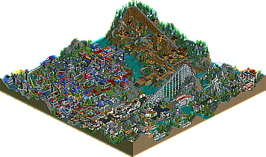
Thanks for the others who have responded too. I guess I expected a bit more feedback (this has least posts in all PT2 threads btw), but I guess its just symbolic that this park is nothing new from me. To be honest, I think I set myself up for failure by winning spotlight just prior to this. I'm still kinda disappointed in my performance. Oh well. I'm still really eager for these next 7 parks.
JKay, this is your best work yet. Original? Maybe not, but you took what you've done before and refined it. The architecture and landscaping throughout the park left nothing to be desired.
The only problem I have is, like always, your coaster layouts. While they are, IMO, a hell of a lot better than I've seen from you before, there are some awkward bits (turns that REALLY should have been banked, etc...) Though, they ARE the best in the contest so far. (Kinda sad, no offense.)
Overall, I loved this park. I won't say it deserved a higher rank, as I have yet to see the rest of the parks, but it's a great improvement over the results so far.
Great park. Still hasn't topped DJ's for me yet but this is the first one to really come close enough for me to think about it.
The Roman area is objectively the best but King Of Sparta was pretty subpar as a result of the CRAWL it did after the breaks and a couple issues related to turns, like the unbanked one that's taken at high speed and theres a high-back 270 that banks and unbanks at the top. BAD! But the colors and support work on it are beautiful. Really to be honest I like this area a lot, just not as a Roman one... It doesn't work... I don't know why. Maybe the round windows... If there's one thing I would ban you from ever using again it's round windows. They went out of style with Euroscape an generally look very beginnerish unless you're using them to represent something else...
The area with HyperTronix was my favorite definently. Sure it was uninspired but there was pleanty of little details that covered it up enough to keep my eyes stalking around. The use of height here really gives the whole sector a feeling of depth and epic size, even though the colors make it seem a little fake. The coaster I feel is your best yet and had only a couple small ungainly moments. The monorail was good too, though it doesn't go anywhere . The thing that really made my day here though was the tables and there were actually peeps sitting at because they were on the edges of the main path in spots. That just cracked me up, so cool.
Razorback's area was clearly the most rushed and probably the last one. The ride itself suffers from a couple really awkward moments but for once the unbanked turns worked right and the 2nd half was nearly perfect other than spending too much time out of sight (underground). Nice atmosphere but the architecture was a good deal smaller and less thought out than in the other two areas, or so it seemed.
The landscaping throughout helped keep things interesting and while you haven't quite gotten it nailed for realism or pure "OMFG" style in those hills you're getting better with each go-round. I look forward to your future works as you're truely one of the only rct legends that seems to be sticking around for the future.
ride6
ps- That should count as like 3 posts, RELEASE #7!!!! PLEASE???
Good point on the round windows. You've got to be careful where you use those, unless you're going for a modern or cartoony feel.
Another detail I thought was great and worth mentioning: the 1/4 tile cylinders in the water supporting the fountains. that looks great. I wish I'd thought of it.
One last thing: while the park is peep-friendly and the guests seem to enjoy the park at first, I left the game running overnight and by the morning the park was nearly empty except for about a hundred people trapped in the roman section trying to get out of the park. I know it's really tough to avoid that but it's something I always check.
^hahaha. I noticed that it wouldn't work so well when I discovered that the shops and stalls were all closed and that there was only one restroom in the whole place. Still it's nice to have peeps, I thought of opening my entry to them, and it should work with them but I make no garentees and that's why I didn't open it myself. Because if I opened it I think that implies that all the provisions had been made to keep the guests happy. Which may be true, but I've not checked to I can't say for certain.
Your comments are right on ride6, especially about the coasters. King of Sparta is the first giga I've ever built ( ) and it obviously shows. Maybe I should have waited to build my first giga. Looking back now, I see a lot of problems with the design, although I'm really happy with the supports. Good point about the round windows too. I think I'm done using them. Too cartoony now...
cbass, about the peep-friendliness. Good catch man. I never would've expected someone to go that extreme but I'm honored you did. Unforntunately, I really did not fully test the park to be peep friendly; I sorta just opened it, allowed them in and fixed things here and there to make the park somewhat functional. I did much more peep testing with RMM than I did with this, even though you've told me that even RMM isn't fully peep-friendly. Thanks for the insights though. Makes me feel a little better about the park.
Great job JKay. I feel a lot like I did when I saw SixFrags park show up. Did not expect to see your park this early and I expected to see more....
Of course, I love your work and this is not an exception. Your coasters were definitely better than I've seen from you and your colors were there. Peep friendly (gotta love that!) and a complete map. The trademark details kept me looking around for some time.
But as an American Idol review:
Paula: Oh, it wasn't your best performance, but you know you are a star!
Randy: I wasn't feelin' it tonite Dawg....it was just 'aight for me.
Simon: This is it now JKay, you can't do the lounge act, you have to bring it every time!
But seriously, it was a great park and I am amazed it didn't place higher. I hope Steve and X250 have strong finishes for da 'Fusion....
Late feedback -- sorry about this JKay, but hey, better late than never
I was very impressed by this effort. You are definitely a very talented parkmaker my man, and while this park was contained in a smaller map I feel it is your best work to date. Just by each area:
King of Sparta area -- This area did not feel Romanish at all too me, but that's probaly due to your style. Why, oh why did you slam the ride on the brakes where you did? When I was watching this in game, I sighed when I saw the ride come to such a drastic change in pace, and it brought the rest of the coaster down, with the train "crawling" over helixes and turns as it went through the layout. You could've done a lot more with it before you hit the brakes. But like others have mentioned, the turns and such were very well placed, I thought.
Hypertronix -- this area is a true "JKay-esque" area, and I found no problems with the coaster itself...infact, I was very impressed. This layout was on a completely different level than the rest of the coasters you have made thus far in your RCT career. Lots of speed and power, especially in those wonderfully placed loop segments. Great work, here. I wish there was more refinement to the theme though, and I got confused with some of your palm trees...but probaly my favorite area in the park.
Woodie area -- This coaster was pretty enjoyable and the first drop very closely mimic(k)ed the wooden coaster I was building in my PT before I didn't have enough time to complete it. Generally a solid layout, again, I donno about the break run placement. You could definitely have had more going before that, but the good news is it didn't slow down the coaster too much. the archy here was also fun; i really enjoyed it.
Overall a great effort JKay. I couldn't really find any major problems with this park that were holding it back other than a real unifying tie holding the park together, as I think others may have mentioned. You can see this espcially with cBass' entry as it is all unified with one idea. I couldn't see that here, which I think was the main thing preventing this park from a top 5 finish.
I can't wait to see the rest of your work, JKay, and you're definitely one of the most dedicated parkmakers on this site.
Wow, Jer, the thing that stands out most is not your typical off the wall but totally unique and groovy theming, but rather the coasters! They were EXCELLENT and definitely the best we've seen so far (excluding Zodiac Thrills, which I'll examine after this post. Hypertronix is my favorite, and the giga and woodie are pretty darn fun too! They'd be incredibly awesome if they didn't have a couple of segments that would rupture your rear end from the ejector air they'd provide, but all in all, some tremendous coasters!
Your eclectic style is fantastic as always, and I like how you've expanded your range to more "normal" styles. And even if they're more traditional, you never lose your touch. The architecture is deceptively complex, both in color and texture, and the theming is just wonderful. I absolutely loved this park, and in my book, you've disappointed nothing. The placement, I suspect, points not to any deficiencies you might have, but rather the quality of the rest of the competition.
Wanna know the fastest way to earn a reputation at New Element? Develop your own style of parkmaking that nobody could duplicate in a thousand years, build a string of runner-ups, dominate the QFTB-X up until the semi-finals, become a force in Head2Head, and top it all off with winning a spotlight.
wait? you mean jkay builds in a style different from everyone else? this park certainly doesn't show it, unless, i suppose, my cataracts are preventing me from seeing the subtle distinctions between this, and every other park entered in this years pro tour. they all seem the same to me, just about, and i don't like them.
i'm definetly too old, aren't i? 6 or so years ago some idiot released moonlight magic, and i hated it. it was boring, or something like that. now, i look at all this nonsense, and think of it fondly. maybe i'm just turning into posix...
33 Comments
Brent Offline
JKay Offline
Thanks for the others who have responded too. I guess I expected a bit more feedback (this has least posts in all PT2 threads btw), but I guess its just symbolic that this park is nothing new from me. To be honest, I think I set myself up for failure by winning spotlight just prior to this. I'm still kinda disappointed in my performance. Oh well. I'm still really eager for these next 7 parks.
Corkscrewed Offline
Kumba Offline
22 replys to a park like this is pathetic.
ACEfanatic02 Offline
The only problem I have is, like always, your coaster layouts. While they are, IMO, a hell of a lot better than I've seen from you before, there are some awkward bits (turns that REALLY should have been banked, etc...) Though, they ARE the best in the contest so far. (Kinda sad, no offense.)
Overall, I loved this park. I won't say it deserved a higher rank, as I have yet to see the rest of the parks, but it's a great improvement over the results so far.
-ACE
Ride6 Offline
The Roman area is objectively the best but King Of Sparta was pretty subpar as a result of the CRAWL it did after the breaks and a couple issues related to turns, like the unbanked one that's taken at high speed and theres a high-back 270 that banks and unbanks at the top. BAD! But the colors and support work on it are beautiful. Really to be honest I like this area a lot, just not as a Roman one... It doesn't work... I don't know why. Maybe the round windows... If there's one thing I would ban you from ever using again it's round windows. They went out of style with Euroscape an generally look very beginnerish unless you're using them to represent something else...
The area with HyperTronix was my favorite definently. Sure it was uninspired but there was pleanty of little details that covered it up enough to keep my eyes stalking around. The use of height here really gives the whole sector a feeling of depth and epic size, even though the colors make it seem a little fake. The coaster I feel is your best yet and had only a couple small ungainly moments. The monorail was good too, though it doesn't go anywhere . The thing that really made my day here though was the tables and there were actually peeps sitting at because they were on the edges of the main path in spots. That just cracked me up, so cool.
Razorback's area was clearly the most rushed and probably the last one. The ride itself suffers from a couple really awkward moments but for once the unbanked turns worked right and the 2nd half was nearly perfect other than spending too much time out of sight (underground). Nice atmosphere but the architecture was a good deal smaller and less thought out than in the other two areas, or so it seemed.
The landscaping throughout helped keep things interesting and while you haven't quite gotten it nailed for realism or pure "OMFG" style in those hills you're getting better with each go-round. I look forward to your future works as you're truely one of the only rct legends that seems to be sticking around for the future.
ride6
ps- That should count as like 3 posts, RELEASE #7!!!! PLEASE???
Edited by ride6, 28 February 2006 - 04:51 PM.
cBass Offline
Another detail I thought was great and worth mentioning: the 1/4 tile cylinders in the water supporting the fountains. that looks great. I wish I'd thought of it.
One last thing: while the park is peep-friendly and the guests seem to enjoy the park at first, I left the game running overnight and by the morning the park was nearly empty except for about a hundred people trapped in the roman section trying to get out of the park. I know it's really tough to avoid that but it's something I always check.
Ride6 Offline
ride6
JKay Offline
Your comments are right on ride6, especially about the coasters. King of Sparta is the first giga I've ever built ( ) and it obviously shows. Maybe I should have waited to build my first giga. Looking back now, I see a lot of problems with the design, although I'm really happy with the supports. Good point about the round windows too. I think I'm done using them. Too cartoony now...
cbass, about the peep-friendliness. Good catch man. I never would've expected someone to go that extreme but I'm honored you did. Unforntunately, I really did not fully test the park to be peep friendly; I sorta just opened it, allowed them in and fixed things here and there to make the park somewhat functional. I did much more peep testing with RMM than I did with this, even though you've told me that even RMM isn't fully peep-friendly. Thanks for the insights though. Makes me feel a little better about the park.
Oh and ace, thanks too.
Six Frags Offline
Oh wait, you're one ahead now
SF
Buckeye Becky Offline
Of course, I love your work and this is not an exception. Your coasters were definitely better than I've seen from you and your colors were there. Peep friendly (gotta love that!) and a complete map. The trademark details kept me looking around for some time.
But as an American Idol review:
Paula: Oh, it wasn't your best performance, but you know you are a star!
Randy: I wasn't feelin' it tonite Dawg....it was just 'aight for me.
Simon: This is it now JKay, you can't do the lounge act, you have to bring it every time!
But seriously, it was a great park and I am amazed it didn't place higher. I hope Steve and X250 have strong finishes for da 'Fusion....
CoasterForce Offline
I was very impressed by this effort. You are definitely a very talented parkmaker my man, and while this park was contained in a smaller map I feel it is your best work to date. Just by each area:
King of Sparta area -- This area did not feel Romanish at all too me, but that's probaly due to your style. Why, oh why did you slam the ride on the brakes where you did? When I was watching this in game, I sighed when I saw the ride come to such a drastic change in pace, and it brought the rest of the coaster down, with the train "crawling" over helixes and turns as it went through the layout. You could've done a lot more with it before you hit the brakes. But like others have mentioned, the turns and such were very well placed, I thought.
Hypertronix -- this area is a true "JKay-esque" area, and I found no problems with the coaster itself...infact, I was very impressed. This layout was on a completely different level than the rest of the coasters you have made thus far in your RCT career. Lots of speed and power, especially in those wonderfully placed loop segments. Great work, here. I wish there was more refinement to the theme though, and I got confused with some of your palm trees...but probaly my favorite area in the park.
Woodie area -- This coaster was pretty enjoyable and the first drop very closely mimic(k)ed the wooden coaster I was building in my PT before I didn't have enough time to complete it. Generally a solid layout, again, I donno about the break run placement. You could definitely have had more going before that, but the good news is it didn't slow down the coaster too much. the archy here was also fun; i really enjoyed it.
Overall a great effort JKay. I couldn't really find any major problems with this park that were holding it back other than a real unifying tie holding the park together, as I think others may have mentioned. You can see this espcially with cBass' entry as it is all unified with one idea. I couldn't see that here, which I think was the main thing preventing this park from a top 5 finish.
I can't wait to see the rest of your work, JKay, and you're definitely one of the most dedicated parkmakers on this site.
Corkscrewed Offline
Your eclectic style is fantastic as always, and I like how you've expanded your range to more "normal" styles. And even if they're more traditional, you never lose your touch. The architecture is deceptively complex, both in color and texture, and the theming is just wonderful. I absolutely loved this park, and in my book, you've disappointed nothing. The placement, I suspect, points not to any deficiencies you might have, but rather the quality of the rest of the competition.
cg? Offline
wait? you mean jkay builds in a style different from everyone else? this park certainly doesn't show it, unless, i suppose, my cataracts are preventing me from seeing the subtle distinctions between this, and every other park entered in this years pro tour. they all seem the same to me, just about, and i don't like them.
i'm definetly too old, aren't i? 6 or so years ago some idiot released moonlight magic, and i hated it. it was boring, or something like that. now, i look at all this nonsense, and think of it fondly. maybe i'm just turning into posix...