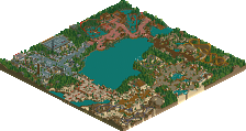
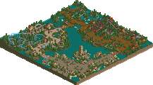
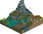
Park / Project TechFederation

Park_1649 Project TechFederation

38 Comments

  • hobbes%s's Photo
    This has been finished for awhile, but I don't have hosting for it. Can anyone help?

    Sorry for the bump...
  • Geoff%s's Photo
    AIM me @ keys of oblivion

    I can host it for you.
  • hobbes%s's Photo
    Download

    Thanks to dragonfly for hosting.

    Enjoy the park, and please comment. It's my first major themed park, so I want all the comments I can get to improve. :)
  • disneylandian192%s's Photo
    Really Great. Consider sending this in as a design.
    Cheers :scarface:
  • X250%s's Photo
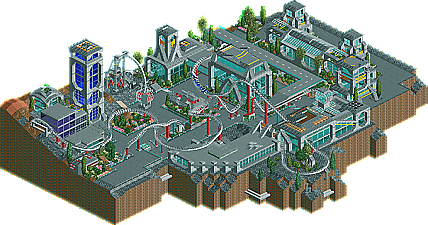
    Very nice Hobbes, the coasters layout was unique and the architecture was nice too. Glass was used frequently, but not overused. Not much i can fault really, so i aint going to!
    Certainly consider sending in for design...

    Now, i wanna see a park from you... ;)

    -X-
  • trav%s's Photo
    How did you get the land that shape.

    Nice coaster stats and nice theming!
  • hobbes%s's Photo
    ^cBass' black scenery tiles.


    Thanks for the positive feedback. :)
  • tracidEdge%s's Photo
    It's not bad. There are a few things that you could work on. Such as your landscaping and foliage. It seemed unfinished with all the empty patches. Also, the coaster was very slow at some points, so you may want to work on that. Other than that it was fine, with some pretty good architecture.
  • Geoff%s's Photo
    the coaster was really great how it interacted with the theming. Cool little park you got.
  • spiderman%s's Photo
    I'm gonna go out on a limb a bit...

    I'd have to say, architecturally and atmospherically, this is this the best RCT2 park I have ever seen. Even the ride complemented everything else very well. It all flowed so well with other and made a perfect city-looking atmosphere. However, the only that kept this from being completely awesome was it seemed like you forgot to fine-tune it at the end, so a few things were left undone...

    Otherwise, AWESOME job...
  • hobbes%s's Photo
    Wow, thanks everyone. I didn't expect this to do this well. :D
  • postit%s's Photo
    Yes, a few things were left undone such as benches, and other small things like that.

    Hobbes, very nice little park you got. I enjoyed the coaster a lot, it was unique. The only two things I didn't like were that it hit the barrel roll way too fast, and it slowed a little too much on the inward top hat. The foliage could have been improved a little. The glass buildings were very nice, I do think that the same glass and blocks and arches, etc., got a little repetative after a while. All in all, pretty nice; great atmosphere. I'm looking forward to seeing more from you.
  • hobbes%s's Photo
    There's no need for benches in space because there isn't any pressure on your joints in zero gravity.


    Actually, I just forgot them. Oh well.
    Thanks for the comment. :)
  • Titan%s's Photo
    Some new screens would be cool...

    ;)
  • hobbes%s's Photo

    Download

    Thanks to dragonfly for hosting.

    Enjoy the park, and please comment. It's my first major themed park, so I want all the comments I can get to improve.  :)

    Why would you need screens?
  • Richie%s's Photo

    Download

    Thanks to dragonfly for hosting.

    Enjoy the park, and please comment. It's my first major themed park, so I want all the comments I can get to improve.  :)

    Why would you need screens?

    He doesnt have RCT2 at the moment me thinks.
  • insert username here%s's Photo
    cool.
  • inVersed%s's Photo
    very nice park hobbes the archy was nice and had a good tech feel to it. The coaster lay out was very unique. Great Job.

    R.A.S.
  • Turtle%s's Photo
    The coaster layout was very strange indeed, and the architecture was mostly very nicely done.

    Made for an interesting atmosphere. Well done for finishing this!