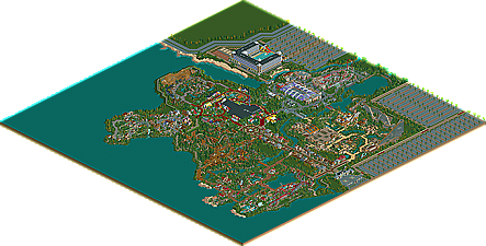
Park / Calypso Theme Park LA
-
 15-October 10
- Views 15,163
- Downloads 2,392
- Fans 7
- Comments 40
-

-
 75.77%(required: 70%)
 Gold
Gold

RCTCA 95% CedarPoint6 85% robbie92 85% K0NG 80% Kumba 80% Nokia 80% BelgianGuy 75% geewhzz 75% Liampie 75% nin 75% RCTNW 75% turbin3 75% SSSammy 65% Wicksteed 60% RMM 50% 75.77% -
7 fans
 Fans of this park
-
 Full-Size Map
-
 Download Park
2,392
-
 Objects
465
-
 Tags
Tags


congrats on finishing such a huge park and congrats on the Gold.
Here are a few things I liked and disliked:
+ kart-stadium
+ the green-flyer + surroundings
+ the GCI + surroundings
+ the hotel
- the gravity-group woody + surroundings
- lego area, I just didnt like it
- the main street, too many buildings in a row for my taste
All in all I can say, that most of the layouts were great, but the theming wasn't that good in all places. I know that most of the park is pretty old and that you were really limited in objects, but yeah, some area's didn't impress me.
But nevertheless respect for finishing such a huge park and congrats again.
Yannik
Dave, I found this to be quite lovely, and I had an extremely difficult time choosing whether or not this deserved spotlight. Some areas, like Shady Bogs and Toscanium soared, featuring an atmosphere that outshone the outdated qualities of the park. However, the Main Street and Egypt areas weren't as up to the same standard, which I understand. Still, seeing this finished is amazing, especially in its way of tracking your skill's progress.
+Shady Bog
+Toscanium
+Rapunzel Mouse
+Western Area
+Blox Area
What's next?
@Posix: Haha, thanks. It's good to hear that I have some kind of own style, as I don't really think I'm cohesive with it... Glad others do, though!
@Liampie: Yeah, Coffin Run was an idea for a design, but it fitted in this park very nicely imo. Next will be a design hopefully. Layout and ideas are down, but I don't have much time for RCT recently unfortunately...
Thanks again!
"MFG"
The shear scale of Calypso Theme Park LA is, uhm... Daunting. It's very easy to see why it smashed head-long into the object limit.
Overall I found that this park showed it's age, but very much in a good. Like if Fantastic Wonders was released today... Object use throughout was very creative and unconventional and made for visually interesting areas in ways we haven't seen (at least in a while). The toy area was particularly appealing in that department with custom trees and bright colors popping off the screen. I wasn't a big fan of the coaster layouts, though a lot of the ideas were definitely solid ones. The bog area was incredibly well done and very original. I really liked L'Arabique because of the color and texture selection. A lot of those tans and marble textures have kinda been swept away in the latest generation of parks and I miss them dearly. The supports for Horus also a really unique take on Gravity Group's steel structured wooden coasters, which works nicely enough. Similarly (across the park) the supports for Texas Longhorn, while being much more conventional, really added to the imposing nature of the ride while doing so very naturally. The booster bike was also amazing, and though the layout was nothing to write home about the overall execution and thinking was really solid.
A great park... a little dated in it's objects and textures, but that kinda makes it refreshing in today's environment. And it's certainly a MONSTER.
Ride6
What things did you dislike at the coasters? I'm trying to get better layouts done, so hopefully you could point out the flaws in those...
"MFG"
First of all, wow, it's finally released. I've been waiting for this for years and years. Congratulations on finally finishing it, and well done on getting gold (although could have been higher IMO if released a few years back). It must feel like such an acchievement to finally getting it done.
I loved the atmosphere it had, partly because of your style and your genius, but partly because of the older objects, I was astounded that something that had been started 5 years back could carry on feeling the same 5 years later, even though you have improved in skill and had dropped it and picked it back up etc.
I was even more impressed that you managed to carry on constructing with objects that nowadays people rarely use, and use these objects to your advantage, still creating unique themes like Shady Bog and Blox World.
Shady Bog was an incredible theme, really well put together, everything in that area fitted perfectly in it's setting, especially the smaller scale layout of the GCI. Definately the best area of the park, and so inspiring.
Blox World was also fantastic. The little things like It's a Blox World and the Bloxervation tower etc, added a real charm, whilst the archy in this area was simple, it fitted completely, because of the theme.
I also find it interesting how no matter how many times you do a Wild West theme (I know you havent done it that many times) each time it looks different and you portray it differently. I did feel this area was similar to Firwood (with the Dive Machine etc) but still it was done in a different enough way that it still felt like something completely new from you.
The worst area was definately the Roman area, but this was mainly due to age. Even though you did update it, it still showed the strengths you used to have, not the strengths you have now, but it was still a decent area, and the newer Invert layout is much better and flows a lot better. The rapids ride was fantastic, the aqueduct idea you played with had a lot of interesting ideas and ways to interact water effects with the riders, so well done on that!
The arabian area was another interesting area. The GG woodie had an interesting layout, although 2 MCBRs and an odd layout from the 1st one onwards. The supports were nicely done, and the way it imposed over the area was quite spectacular. The theming in this area, whilst being repetative, was decent enough and was one of the stronger areas.
The USA area was well put together, I thought the entrance from the hotel was quite simple, but I guess realistic in the fact that it only needed to be simple as it only takes in the Hotel Guests. Each structure in this area clearly had a lot of thought go into it, and I thought that it was incredible that you managed to create these brilliant structures with the objects available in the bench. The layout of the accelerator was also a strong layout and nothing really to fault on it.
The Fairytale area was really nice. The Rapunzel coaster reminded me of the Mack Wild Mouse at Europa Park with its massive first drop, the architecture in this area was something special. An interesting array of textures used, and that little restaurant right on the upper edge of the area is beautiful. The flyer's layout wasn't amazing, but was a solid addition to the coaster line-up, it would have been interesting to see some inversions in there other than inlines though.
The Main street wasnt anything spectacular, and wasnt on par with the rest of the park, however it was a nice way to introduce the other areas, and the entrance structure was very pretty.
Overall, a great park. Maybe not worth the whole 5 year wait
I'm also suprised at how little response this has gotten. C'mon guys, 5 years this has been in construction for, it deserves a lot more than just a page of comments.
Glad you liked the park that much. Horus actually has only one MCBR, the other small flat part only contains trim brakes. I had to put them there because otherwise the ratings would have been too extreme. Funny thing is, I redid the coaster so many times because of the ratings and only a slight change of it and they will turn red again.
Thanks again for your kind words. Oh and I dunno what my next park will be. We'll see
"MFG"
I like your style, I wish I could make this!
Your bench is also great!
Can I get your bench please?
Thanks for the reply, glad you like it!
I'm afraid I don't have the original empty bench anymore, but it's pretty outdated anyways... I suggest using the PT1 or PT2 bench for old-school-ish parks like that!
"MFG"
Looking forward to your little things-thingy (considering you've got the time of course...)
Thanks!
"MFG"
It's great to directly see the reactions on a park I built and the duration of the vid is even more impressive! Great work.
"MFG"