Park / ILMENITE
-
 03-October 10
- Views 8,471
- Downloads 1,458
- Fans 0
- Comments 30
-

-
 78.85%(required: 65%)
 Design

robbie92 90% 5dave 80% BelgianGuy 80% CedarPoint6 80% chapelz 80% Kumba 80% Liampie 80% Milo 80% nin 80% posix 80% RCTNW 80% turbin3 80% SSSammy 75% geewhzz 70% Loopy 65% 78.85% -
 No fans of this park
-
 Full-Size Map
-
 Download Park
1,458
-
 Objects
292
-
 Tags
Tags


On another note, thanks to gee/posix for fixing the sleep-deprivation mistakes I made in the initial writeup.
Don't get me wrong, I still liked this and looking through it there are tons of things to see and enjoy, but just not the greatest thing ever and something that could easily be improved upon.
EDIT: actually, on another look through, I find that it is growing on me more.
Not that this is a completely groundbreaking release or anything but it just uses all the current styles that seem to be going around. For example the peepability, the diagonal custom paths, and those crazy big trees for foliage
It just has a whole new look scenery wise compared to a release from say 1-2 years ago
Definitely is impressive what you guys are doing with the game and I'm looking forward to getting my hands on one of these benches and hopefully trying it out sometime in the near future
One question concerning the design though, why did you use that blue queue for the space shot? Just seemed completely random and out of place
Its great seeing parkmakers continue
As for the design, good job JK. I still don't think you've nailed the layout fully but you did a really good job with the theming and attention to detail.
As for things i didn't like. The paving surrounding the ride was just to chaotic for me,no matter how suitable. I think the blocks of crazy paving spoiled the lines you were creating with the 1/4 path objects more than anything else.
everything else was really quite amazing.
Congrats on another design
Congrats on the design-win!
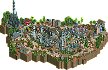
I like how you had the whole layout dug into the ground like that with the paths raised up.
And I particularly liked the cage kinda things around the bridge going to the station.
The atmosphere was much more than the sum of its parts. To me one thing that really made this stood out was the setting of the ride itself. Somehow having the whole coaster lower down just added a whole lot to it and really turned a kinda meh layout to something special. There's something really appealing about the abrupt elevation changes to me.
I'll post in depth feedback when i've decided!
Coupon - Thanks, I'm quite proud of the station for what it is, I always struggle with them to make them have an effect but I'm definitely getting better.
Robbie - Cheers for the writeup, you captured the design really well. Also thanks but you know the next project is gonna top this one by far
Cocoa - I agree it was slightly cluttered but I think the busy path really commented to that which is something I didn't want to change because I wanted to do something different. Thanks for mentioning the atmosphere, it's paramount in anything I build. Ok concerning the layout the paralell inversions were based off of Anubis at Plopsaland De Pann and the tight turns are a common thing on Gerstlauer's models so thats why it took a few tight turns up into the brake-runs. I think it did really well to move around the landscape how it did and I really really like the look of it so I disagree that it's awkward.
I do agree however it can be improved on. I will be going through my next design with a keen eye to make sure everything is up to scratch.
Comet - I agree with you, I feel like Dreamports bench is ok but I've been waiting for a while to try some different things out and Kumba's objects really inspired me to go for it. I stand by the fact that I think new objects and scenery is the future for parkmaking as it will ensure people are building different things and giving the community something new to look at. Concerning the blue que, I agree it looks ugly but I was really close to finishing the project and I was just excited to get it submitted and see what happened. Invisable ques are definitely the way forward as it just looks so much more aesthetically pleasing.
Goliath - Parkmaker for life. Glad you enjoyed it.
RRP - I believe you did a lot with different objects in Castle Howard, that was also really good to see and set that design away from the pack. I knew the path was going to be marmite to some people but hopefully pretty soon I can improve on the shapes with some new objects or smoother landtiles. Thanks for the layout advice, I really enjoyed the talk we had on Gerstlauer and what current coaster companies were doing. If your online soon I'll get in touch with some new ideas I wouldn't mind some feedback on.
Sssammy - Looking back I got excited when I just had Blast Furnace left to theme so I wish I spent a bit more time on it but it's something I'm gonna sort for my next release. Glad you liked everything else, I'm thinking a bigger landscape would have helped sort the messyness out but I'm glad it gave everyone something to look at.
Kumba - Thanks for the new objects, loved them and this design is proof of that. Now hurry up with my rooves!!!
Turbin3 - Yeah my fourth design! lots more to come from me very soon. Glad you liked all the details.
Jag - Thanks, as I've said above it's what I aim for with my work.
Dr Dirt - I've always wanted to do something like this and from a guests point of view I think it would be really exciting to see a ride like this in the middle of the whole area. Glad you like the evolution of style, I have so many ideas and things in my head that I want to try but after project glimpse is done it's back to dreamport I go
Milo - Agreed the elevation changes changed the appeal of the ride. I don't think it was exactly a meh layout but I can say Gerstlauer's are never going to compare to the look of a B&M Invert or a flyer simply because the naturally have more dominance in the look of this game. I'm not dissing Gerstlauer's here as it's one of my favourite coaster types but it was something I wanted to recreate and put my spin on in the game.
rK_ Glad you liked this, your current work is really impressive and on seperate ends of the spectrum from this lol. Glad you could appreciate this.
Fizzix - New one is on it's way very very soon. I have a full day off tomorrow so I'm going to dedicate a few hours to it. Glad your a fan, there is plenty more where that came from.
RCTMASTA - But what is going to compare to Kumba this year? Lol it was incredible. Glad you are pro-paths as I really like the messyness of them as well. Thanks for your comment.
Cedarpoint - I didn't actually look at that till you mentioned it. I based the first version of this off of Lynet and then when you and I talked about the fact it was very one-dimensional I switched the inspiration to Anubis as it had a more dominant feel to it and something that would appear design-worthy. Yeah I agree I need to get into the habit of putting transfers in me but the semi-realist never remembers to do it, or incorporate it into my ride design. The mine train is on it's way very very soon, I'm sure you'll like that one too.
Turtle - Ah sorry to hear you weren't so keen on it, it's very different from what I've built I agree. Hope to hear that feedback very soon.
------
So yeah as I said in the read-me anyone thats posted feedback would receive a special screen of my next design (project glimpse). It's at 70% now so I will be sending a teaser out very soon to all the people that took their time to give feedback. All comments have been taken on board to help me up my game for the next design.
Initial impression was very impressive and I enjoyed the look around and still feel this is a quality design and well deserving of the accolade. I could easily see this in a real park and would love to ride it. Like Milo, I loved that this was kinda dropped in a hole.
Great job and looking forward to seeing you next release!
James