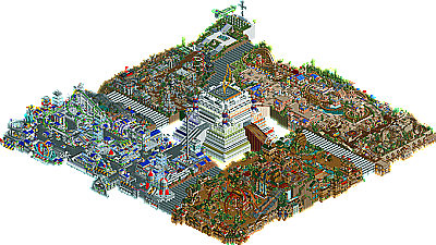
Park / The Time Machine
-
 03-March 06
- Views 11,378
- Downloads 1,210
- Fans 3
- Comments 58
-

-
 75.50%(required: 70%)
 Gold
Gold

Jaguar 85% Cocoa 80% csw 80% G Force 80% RWE 80% Scoop 80% Camcorder22 75% bigshootergill 70% CoasterCreator9 70% Faas 70% posix 70% saxman1089 70% 75.50% -
3 fans
 Fans of this park
-
 Download Park
1,210
-
 Tags
Tags

Whoa, whoa, relax. I ment as an overall theme I liked it as much as Erwindale, even tho its atmosphear was not as good as Erwindales. Really it was more like battlefeild RCT tho. Still IMO its just about as good as both those parks.
Finally weekend and having time to view the latest parks, though with parks like these latest ones I´ll need 3 more weekends, for they keep me wandering through it for hours!!
This "Time machine" of yours is so full of ideas that are so skillfully and beautifully executed, and so full of creativity that I cannot stop going through it again and again. Still I think I just have "seen" half yet of everything there is to be seenand explored! And though I am a fervent lover of "beauty" and "flow" in a park (which this park has less because it indeed is somewhat too full, with ideas as well as with rides/buildings), it is like in RL: a beautiful building or part of town is a pleasure as such, but will get boring rather soon, while the same thing with some flaws but with a creative/intriguing content can keep your attention for decades without ever getting boring . That last thing is what you certainly created in this park for me!!! (Thanks!)
The war theme (my favourite so far) was amazing! With that very convincing memorial, the awsome plane and of course that unbelievable spitfyre! , etc. etc.
Those bumper cars (like Iris said: "Yes!! bumper cars"
All your hacks had a function and were integrated into the park/rides/whatever in a superb way and adding to the park (instead of "just being there for the hack").
Lovely architecture everywhere, and a beautiful "finishing touch" to have it go around most parts of the edges of the map.
The invert is my favourite coaster so far (though most were very good or at least "special"), the idea with the "keys" is great fun and a very, very nice addition also (have not yet found them, but certainly will) and to list everything I like/noticed will need another weekend. (but that will come!)
Can imagine your creativity is a bit too much and overwhelming for some people, especially when you try to fit it all on one, not very big, map (so yes, learn to spread it out a bit more), but RCT's future seems bright as long as parkmakers like you exist !!.
Great park X, congrats!
(and remember that judges are just "average" people like everyone, with their skills as well as their personal limitations/flaws and preferences (and like Nate said their/"his own goals")
a good thing to have judges for this contest that don't look all through the same glasses though, and the fact that they vary so ridiculously much in their judgement only prooves that there is not any real "professional" standard for this ).
My rankings so far:
14 Old Red 6.2
13 Kumba 6.3
12 jazz 6.4
11 SixFrags 7
10 Magnus 7.8
09 JKay 8.2
08DrkJanus 8,7
07+06 X250 + cBass (both for different reasons) 8.8
Thanks again for making such an exciting park to go through.
Corkscrewed Offline
Doh! Fixed. Dunno why I keep calling it that. Maybe it has a better ring to me.
Hehe...you basically hammered 2/3 of the judges!
I really think you need to go back and check those parks out again. The ideas were all there in this park, but to reiterate, the parks overall impact was nothing close to either of those parks. The war theme would have been 10X better if he'd not tried to fit so much in the park. Maybe the 'Time Machine' theme would've been better served in a full park as opposed to such a limited map. Spitfyre could've been so much better if it had been given some space and flown over battlefields, or a war torn European village. As a matter of fact, if he'd taken this one theme and expanded his ideas over the whole map, he easily would've found his way into my top 5. That said, I feel so strongly that parkmaking has to be about more than cramming as many great ideas into one park as possible, that I just can't love this the way I've loved the parks you compare it to. Don't get me wrong, I recognize the amazing imagination and creativity involved in creating this park, but it didn't reach me. As with many parks released these days, I once again felt like I was on the outside looking in. The parks that I truly love, suck me into them and when I look at things, I actually can feel like I'm there. I would say that all of the parks still to come did a better job than this one at doing just that.
On a side note...next time you build a park relax with the smoke puffs. I find they really add very little in terms of atmosphere and end up looking repetitive, not to mention slowing your park down signifcantly.
As for the great variance in judging. I attribute not only to the differing viewpoints of the judges, but also to the fact that the parks submitted in this competition have a very high overall quality. This means that it is not as obvious as in previous years which parks are the best leaving it more open to the individual judges subjectivity.
Finally...to X250: Don't take any of my comments personally. I didn't hate your park as it may sound. More to the point, I really enjoyed it, but as I was exploring it I couldn't help think about what kind of parkmaker you would be if you took these ideas and presented them on a better presented canvas. From Turtle's comment, we obviously had very similar feelings about this, so I'm not the only one that feels this way. That said, there are many people who probably appreciate how you presented this park more in this form (see Kumba) than if you took my advice. So in the end it's up to you how you choose to build and you should take the path that brings you the most joy.
P.S. I really love when these type of parkmaking discussions happen
My favourite part of the park was the Bone Yard area, skillfully pulled off (so much detail!) and very well executed. The dueling coasters put a lot of life to the area, and were amazing. Defineatly the best coasters in the park.
The Warzone area was also excellent, though what brought it down was the peace area. I didn't like that very much, although really creative. The area was pretty hit or miss, but I thought it was pulled off well. Really great flatrides and the Spitfyre coaster was really cool too.
The only thing I liked about the Rialto Digita was the color and Digiforce. The area was too random IMO, and the dodgems were creative but I didn't like them that much.
The Roman area was O.K., I liked the arches a lot. The coasters were pulled off well, the loop on Sphinxinator was great. The archy was lacking in this area though, and that brought down the park a bit. The Eclipse colors I really didn't see to fit the area, and the ride name didn't either.
And lastly, the Time Machine. It was cool, but it had its flaws. There was too much white, and it looked really boxy. It didn't really remind me of a time machine either. I liked those energy coils, those were cool.
The power cables seemed really strange. I didn't understand how they fit into the park at all. I felt that if the park was actually connected it would've flowed better.
I've always... admired... your work X, and this is defineatly great. Good luck in getting the park maker slot.
CCrzy
I really liked all the areas except Rialto Digita which seemed forced and lacked substance and atmosphere, inspite of having the most normal complete coaster and one of the best support rides in the whole thing.
The Time Machine itself doesn't look slick at all; more like bulky and due to it's massive size it blocks out certain angles of the other 4 areas. I think the machine itself would've been far more impressive if it was more of a domed structure or just smaller, in general.
The Bone Yard is probably my favorite area. It contains very smart and careful use of colors, textures and landscaping to create an amazing atmosphere and if thought about from the view of the guest, probably the best coaster(s) of the bunch too. In general it was the feeling this area radiates that pulled me in though.
Kingdom Of Zeus was very pretty and I really like it but I feel like the wooden coaster was such a waste and though Shinxantor is my favorite coaster in the place for the moment I would've rather seen the whole egyptian micro area removed in favor of creating a proper wooden coaster, with a lift hill and a layout that would actually be amazing to ride. The archiecture and pastel colors were indeed very beautiful though and some of the detailed bits on the buildings were wonderful.
Warzone probably ranks as my 2nd favorite area thanks to its downright moving atmosphere and some of excellent ideas here. The Spitfyre was excellent and the memorial is stunning. The buildings covered in plants, looking very forbidding and hostile really work here. Unfortunently this area really lacked any signature ride at all.
As a whole I feel the whole concept would've been better off if you had shrank the time machine itself both in footprint and in height and lost one whole area. From there I think you would've gained enough room to really develope the other areas to at least a more acceptible extent, you know, like a REAL wooden coaster, something impressive in the war zone area, maybe a flyer or 4D and some better planned and more expansive vertical coasters in the Bone Yard. I also think the time machine itself could be a ride, kinda like what I did with the Pyramid Connection.
The other thing that really hurts this park is too much animated sceanery. I would think by now someone of your experence would know better than to use some much of it X... It wouldn'tve hurt a damn thing to loose a few fog puffs, fires, water features, etc. here and there. Except the frame rate would improve dramatically.
Overall I'd say you basically tried too hard. The results are fantastic for sure but the lack of negitive space (except for footpaths really) and the overload of movement really hurt the whole thing. It's still either my #6 or #7 so far though so congradulations on that.
ride6
Anyhoo...on to the park...
I loved it! That bumper car ride was cool...loved all the hacks in the park. The best thing about the park is that it was designed to be interactive...hunt for the keys, great idea!...although I haven't found any yet! I'll be exploring the park for many nights until I do though
I agree with some of the comments that it is packed to the brim, but honestly, it works for X250...it IS X250! Everyone has their own style...I guess I don't understand why so many 'only' like parks a certain way. I like these kinds of parks, colorful crazy, and I like simple beautiful parks. I just enjoy all the differences parkmaking gives us.
Still...makes me anticipate even more what is to come yet!
Anyway. I'm amazed Fatha's #3 park hasn't shown up yet. The other judges must have thought very highly of it for it to be doing this good. I think it could be next.
i will be looking at all the pt2 parks when i get back to me rct2 computer in a month so i will comment then
good job simon
cg?: do you like anything though?
Kumba: thanks, glad you liked the war area.
ACEfanatic: the links are broken? Damn, and they took ages to hide aswell!
The Hive: erm, yeah.
laz0rz: thanks.
SixFrags: glad you liked the ride guide, as for the 'inspirations', i dont see how using water-slide track as tubing is copying anything but okay. and as for the lighthouse, i knew i had seen it somewhere before!
JKay: Woah. Great comment, very useful. The fact that 4AM is your 'peak' time for commenting is a little creepy though...
Turtle: I don't believe there is such thing as 'trying too hard'.
Corkscrewed: I honestly don't see how my style can be a mix of jkay, wme, Kumba and artist. I wish it were, then i would be some sort of super parkmaker... (and a damn ugly one at that
Gutterflower: Cheers, glad ya liked the mine train.
HandyAndyG: Yeah, ive never been good at naming. You can probably tell because i named my signature coaster in the future area after a font in microsoft word...
RMM: Less ideas? But that would make it boring!
Geoff: Thanks.
TracidEdge: Cheers, yes i did have a lot of fun building it, after i built it i actually played with it for a long time and beat the scenario task! Something ive never done before lol.
Emergo: Thanks!
Toon: I had no idea that the game lagged at all, must note that down for future reference. Thanks for your comment, its obvious you really get into parks when you see them, glad you enjoyed it.
CoasterCrzy: Cheers. Gotta love that bone yard!
Ride6: Thanks for the mahoosive comment, pyramid hack wud have been a good idea.
Becky: Thanks Bek!
Steve: eek, yeah i thought i was the one Grinched when i saw my name here this morning. Guess someone got unlucky in the top 5.
iris: Thanks, look forward to working with everyone.
JK: Thanks jkay#2, don't get addicted to it now. hehe.
artist: omfg hes back again! and what are you doing without rct2 on your computer? tsk tsk...
By the way, that wont be the last you will be seeing of the small Egyptian area. The theme will play a big part in my solo, and will have a similar coaster, but on a much, much larger scale.
-X-
This park had some magnificent ideas and some of the execution was spot on.
Some of the ideas I loved were those dodgems...they were actually amazing. The kinda ice kinda jaggedy things around void were a really cool idea somehow, though I hate the superlooper ride in general. Some of the ideas in the war section we pretty damn awesome too, but here's where I agree with Toon, it was all so hectic and cramped that it was hard to look at without getting a headache. A whole entry based on this war section would have been awesome or something.
The coasters:
The jurassic dive machines were pretty good with a cool 4 way drop thing that was neat, but I didn't really like it that much apart from those drops. Hard to put my finger on why though.
The woodie was pretty damn good...i really loved how it hugged those buildings and went in and around them without making them look awkward.
The mine train just worked magnificently and looks really cool somehow. A really nice...somewhat realistic touch.
Spitfyre was ok. Loved the hanging from the track concept and the launch, and the crazy noise it made, but it was really hard to follow and was a little too manic, though that was probably what you where aiming for.
Digiface...apart from having quite possibly the worst coaster name I've ever heard, was pretty darn amazing. The theming was equisite with some really tight gaps that the coaster wound around almost effortlessly.
This definately shows your best work...without a doubt. However, there are 2 things I disliked.
One is definately the centrepiece which was just large and ugly. I just generally didn't like it, though others seem to agree as well.
The naming, which has always been your weak point. It was pretty atrocious to be honest.
I also can't decide if I would have liked this better if you hadn't cut of the edges or not. It makes it seem less like a park and more like a concept which I guess you were going for, but I can't decide if I would prefer it as a park or not. Unsure so far.
Definately a park I will look at more closely in due time. Fantastic work X
Really can't decide which I prefer out of this and Zodiac Thrills...I'll sleep on it. I think I'm slightly swaying to Zodiac.
Congrats on #6 and the parkmaker spot.
Metro
Fully deserved I think! (as I said, RCT future looks bright with parkmakers like you
I didn't really like KINGDOM OF ZEUS / OSIRIS at all. That was probably the worst part. THE BONE YARD was an alright area but it just wasn't as quite as amazing as the other two areas. I loved RIALTO DIGITA and THE WARZONE.
The details that you used in those areas were great, i loved the hacks and the architecture, imo they were astounding. Congrats on being the first park to make me actually comment on
The central piece does however lack the details that the individuals carry. My favourite ride was Digiface, I don't know why but it just was. And I also love Spitfyre that was great. The Spitfire you made was incredible and the bumper cars are class. Congrats on 6th. Blah188's current rankings:
#6 - X250
#7 - Jkay
#8 - cBass
#9 - Jazz
#10 - Six Frags
#11 - Magnus
#12 - Kumba
#13 - DJ
#14 - Old Red(can't open)
oh and congrats on the parkmaker spot too X
and i got all 4 keys
Edited by blah188, 04 March 2006 - 10:06 PM.
Congrats X! Yay!
X as usual I'm impressed, your work is in a whole different league than people like myself and most here at NE. Congrats on the parkmaker spot and keep it up!
I'm only nearing 20 but other than that, i completely agree. Absolutely hideous parkmaking, i did notice some nice touches and ideas but hey, if you cram that much onto a map and probably try to fit in more, well, then some things are bound to look fancy and cute but the overal effect is still something pretty close to absolutely horrendous.
Really near jkay's entry in terms of quality, though imo jkay's edges this because it's generally a whole lot calmer. This seems to be what jazz would have wanted to make, there's probably some credit to be given, but you won't be getting much from me. Cbass' entry remains the only one to have captured my interest, alongside a few of Janus' buildings.
blah: Cheers, I am so glad everyone loved the bumper cars, its been something i have been trying to do for a while but didn't really have the know-how to pull it off, the thing that took the longest with it was the queue, really tricky to form a cover for it.
Coasterforce: Yeah, i was kinda forced into a launched woodie though, its hard to get a decent sized lift hill when you divide the map like it did. Now go finish your solo!
EvilWME: "Absolutaly Hideous Parkmaking", wow, thats a deep cut man. I'll keep that in mind for whenever your lazy ass decides to do anything. Wanker.
-X-