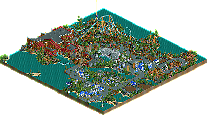
Park / Sea World Brisbane
-
 05-March 06
- Views 18,586
- Downloads 1,343
- Fans 9
- Comments 81
-

-
 79.38%(required: 70%)
 Gold
Gold

G Force 90% Liampie 85% Sulakke 85% trav 85% CoasterCreator9 80% posix 80% bigshootergill 75% SSSammy 75% Jaguar 70% ][ntamin22 65% 79.38% -
9 fans
 Fans of this park
-
 Download Park
1,343
-
 Tags
Tags
Irony?
I understand his reasoning, but still. I can't see why 3rd was more suiting to Fatha' than say 6th or 7th.
Corkscrewed Offline
Anyway, having looked at it, I hold onto my original position of "wow, what a nice park!" However, I must admit that I was slightly disappointed--by the incompleteness.
Steve has already addressed this, so part of what I say may be moot, but oh well.
First off, the bad. And really, it was the incompleteness that hurt it most IMO. I think the final 5th place placement is about right, so you might say that Fatha balanced it out. The empty exhibits were disappointing, and I definitely wish you'd gotten around to them. The smaller size was the other issue. This park was very close to being truly elite: flush out the areas so that you have another major coaster and finish the exhibits and you've got something that very well could have taken home the gold.
The good? Well, dayam, the park's gorgeous! I'm a sucker for this particular "pleasant" style of theming. It's been done before, but it never gets old, especially when it's done this damn well. The architecture is an exquisite mix of complex enough forms to be interesting but not too much ornamentation to look overly busy, something that only slob, Turtle, RRP, SA, and Schuessler have truly mastered (I might have forgotten a couple of names). Hurricane is a solid coasters (makes sense; it IS Kraken), and Search for Kidd was very, very nicely done.
I was particularly impressed at how you dressed up the flat rides, positioning enough buildings around them to create a space but not completely covering the rides up. This balance is your greatest strength: you know where to leave terrain blank and where to cover it up. That's something that only the most disciplined possess (something I admittedly do not). So huge props to that.
Overall, if there's such a thing as "incompletely Spotlight quality," this is it. YOu make a full park like this and I guarantee it will win Spotlight.
So Steve, you've proven that you have the skills to make a great park and go down as an RCT legend. Now you just have to actually do it, or risk joining the "John and Slob This Damn Close to Legends Status if It Wasn't for Zero Full Park Production" Hall of Fame.
Fatha' Offline
Like Cork said, every entry had good or very good architecture. Yours was not special in that regard. It was weaker than Mossflower Wood, Time Machine, and Zodiac Thrills. It was stronger than En Midvinternattsdrom (Even tho his city buildings were pretty cool) and Exctasy Summit. Any entry I did not mention has architecture that is on par with your entry's (Minus Rugged Range and Kumba's).
Since nobody's architecutre was overly spectacular and didn't blow me away, I judged on a different basis. Creativity got more points then the architecture. And as far as creativity goes, your entry is well, frankly, uncreative. Its pretty and all, but so is everyone elses. You had no landscaping, no elevation changes, made the park look like an island when id really didnt have to, and had the same centerpiece coaster that Sea World Orlando had (And SWA, and Nev's rec). Add that to the fact you basically cloned Kraken and you lose points. The Pirate ride was cool, it was, but it reminded me too much of JTA. It was like, oh, this is a river ride, its next to Kraken...ive seen this before.
What you did do well was create a good atmosphere....not as good as SWA's, but it was good. You also did a great job on the coaster supports, but then again nowadays everyone does so that doesn't get you extra points from me (plus one entry not shhown has ridiculous support work).
Im sorry if you feel badly about my comments, but frankly I dont see why everyone fell in love with this entry. It didn't show me anything new at all in RCT, was a flat park, rehashed ride types, rehashed architecture (not in a bad sense, because it was good). It didn't show me anything special, which every other entry I ranked above yours did.
If anyone else would like me to explain their number, feel free to ask.
steve,
overall, wonderful work. my thoughts...
maybe the path layouts are a little wacky. i can't really explain why but they don't flow enough for me.
your landscaping. it's amazing. you get such a strong warmth in colours. makes for an amazing atmosphere.
it was very cool to see shops everywhere but the buildings didn't show what they had inside. they looked repetitive and any shop could've had them. i think it's much nicer when the buildings give a clue what purpose it has. like the ticket counters. with the fences around them, they made immediate sense.
the nautilus theatre, downright amazing. trackitecture looking good. you're a genius.
appearance of hurricane was almost magical. a very good kraken recreation.
the queue line was a little bit disappointing but again your landscaping here was so polished and refined that the whole coaster really made for a good wow-factor. (and toon said you left that out? seriously...)
the ability to make an impression like that has become so rare these days. i love you for that.
search for kidd, well, how fantastic was that?! such a huge drop so well worked in. very impressive. all out very convincing. one of the best rct2 water rides ever.
again the inside, by that i mean the queue, was a little disappointing.
parks like this make me want to play again myself.
i would have been delighted to find myself in the park as an entertainer or secutiry guard
if you get some queue line making skills like slob showed them with his solaris design you'll be a killer.
i can only hope you'll keep on playing and that ciel might actually happen.
thanks for this entry.
I believe if you reread my quote, you will find that I did not say the park didn't have wow factor. I said he did not make an attempt to achieve wow factor.
Very different things really. I can expand on what I mean by that if you need. Quite obviously I thought very highly of this park. Please be careful about the misquotes.
I looked at this and my mouth fell open.
I'd like to gather together a few words I've seen here to describe this park because I think they collectively capture what I like about what you've done:
eloquent
classy
beautiful
tranquil
gorgeous
pleasant
exquisite
imaccualate
clean
blissful
sophisticated
What seems so difficult for me when making parks is apparently 2nd nature to you. I am envious in that regard.
Of course I wish there had been more.
positive detail: "baskets" and "barrels"
negative detail: the back end of the train in the family coaster gets screwed out of the airtime on the last little hill because it's too close to the brakes.
Oh, and congratulations!
Corkscrewed Offline
LOL, typical German Phil.
Just kidding on the German stereotype part, but I don't think that response was warranted, since Fatha explained himself in a well mannered and reasonable way. You can disagree, but try to be a bit more... um... understanding.
Anyway, I agree with Toon in saying that if it had been more complete, it could easily be first. In fact, when I first saw screens of all the parks, this was my dark horse pick to finish #1, and I was quite surprised to see it this "low." Looking at the park, as I've mentioned, I can understand now. But it wasn't the "noncreativity" that disappointed me, just the "nonfinishedness."
I would disagree with Fatha that Mossflower, Zodiac Thrills, and Time Machine featured better architecture. Steve's theming and stuff is probably the most beautiful of anything we've seen so far.
On the other hand, contest parks are generally judged under more creative-wanting guidelines.
And now of course, you've fixed it.
Edited by postit, 07 March 2006 - 11:26 PM.
I'm just full of surprises
Corkscrewed Offline
I have no idea what you're talking about...
dudes, (toon, fatha', cork, ...) i'm not that dead serious when i pick on you, OKAY?!
i need to say this "he copid nevis" is utter bullshit in my opinion.
of course you could say it, no doubt, but i think it's just so freaking ages ago that it seems inappropriate, and therefore almost ridiculous, to pull this point out.
i mean, people from today, at minimum the majority, don't know who rrp was, do they? you come up with nevis?
so my point is you have to judge from today's point of view. and, you have to put away your amazement and admiration for nevis from back then and look at this in a neutral way and value what the park offers, without getting defensive saying "he copied the legend, my legend, what a lamer. off you go with a silly 3 points score, tehehehehe"
i won't go into explaining what i think makes steve's work totally different from nevis' or rrp's. you have your opinion, that's fine. i think it's wrong. that shouldn't be a problem either.
what i really loved was the wow-factor bit.
so we eventually found out there are two kinds of wow-factor. the "wow, this is so immense" and the "wow, this is so beautiful!".
and i tell you, latter is the more skill-taking and more impressive. these parks get remembered. reading over people's post tell you we want to see realistic parks. parks that are stylish and beautiful.
i mean slob never even finished a solo. something that was a standard back in the day. and still he's a legend that everyone knows.
look at the download counts for iceman's parks. that's like spotlights from 3-4 years ago.
so like handyandyg very wisely said...
fantasy vs. realism. i can never get enough of it. can you?
ed, get out from where you're hiding and do me.
Edited by posix, 08 March 2006 - 07:35 AM.
it's because i believe that "beauty", as in rct, goes along with natural looks. so in our case, realistic looks, because these are "park-natural".
Edited by posix, 08 March 2006 - 11:58 AM.