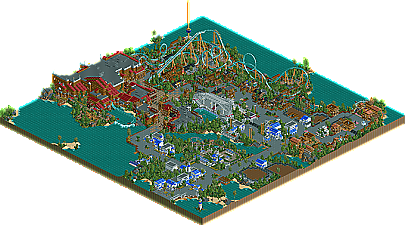
Park / Sea World Brisbane
-
 05-March 06
- Views 18,585
- Downloads 1,343
- Fans 9
- Comments 81
-

-
 79.38%(required: 70%)
 Gold
Gold

G Force 90% Liampie 85% Sulakke 85% trav 85% CoasterCreator9 80% posix 80% bigshootergill 75% SSSammy 75% Jaguar 70% ][ntamin22 65% 79.38% -
9 fans
 Fans of this park
-
 Download Park
1,343
-
 Tags
Tags
Corkscrewed Offline
The park was really really good. Hurricane was a gret Kraken inspired coaster. It had an excellent layout and some really cool realistic touches. I agree with Phatage on the naming though.
The search for Kidd building was awesome. I was going to have the backs open in the dark rides in Boscastle heights, but decided against it. It works well and gives us a view of what the inside would be like.
The architecture in the park was really nice, exactly what I have come to expect off you. Loved the intergration of the rounded blocks.
My favourite part of the entry was probably the stadium. It was really really well done with the fantastic roof. I also loved where the guests went into it which screamed realism at me somehow.
I (again) agree with Phatage that you could have done a little more with the exibits to make them more believable as they seemed bare and didn't convince me that animals would be living in there.
I didn't like the Junior coaster, way too short and pretty dull. Nice colours though.
Overall, great park, though I can't decide where I would place it. cbass', X's and yours are all pretty damn close in quality IMO despite them being 2 totally different parks. I'll have to look at them all again.
Well done Steve.
Metro
I love the way the vertical loop is done with the grass underneath, i also think the theatre was skillfully done with the wooden track. I think the architecture could be slightly more elegant in places, and since i do think i remember seeing some architecture by you that appealed to me more i think you're capable of it. I think the problem is too many details at places for me, i really like what you did with the big brown building for the water ride with the red roof. the more quarter tile pieces start to play their part the more architecture seems to lose some of its elegance.
I do agree with fatha' that the sea world choice is a little dissapointing (i don't agree with putting this below god knows what parks he put it below..) It would have suited you better to make a park with a different theme, i'm hoping we'll get that one later ;P.
Definitely not the best park ever, but definitely one of the first that strives more towards the same ideals i set in parkmaking for myself. If i had judged:
Old Red's Rugged Range. ---------(2.0)
Kumba's Memory Lane. ---------(2.6)
Jazz' Mossflower Wood. ---------(3.4)
Six Frag's Cinemagic. ---------(3.5)
Magnus' Genesis. ---------(3.7)
X250's Time Machine. ---------(5.9)
Jkay's Ecstasy Summit. ---------(6.1)
Dark Janus' En Midvinternattsdröm. ---------(6.6)
Steves' Sea World Brisbane. ---------(7.3)
Cbass' Zodiac Thrills. ---------(7.4)
Can't wait to see what's above this...
Steve I'm glad you remembered my ships
I just wanted to give a quick congrats on the parkmaker spot steve. You've had it a long time coming.
I'm pretty impressed by what I see so far with the park. Much more in-depth analysis tonight.
The park i thought was good, a little bland in places though, and a little confusing. It seems that you were a little pushed for time maybe, because there are quite a few little mistakes in there, just small stuff like the odd floating object or an unamed sign, nothing really 'terrible' lol. I really enjoyed the piratey ride, and Hurricane, yeah it was a bit too much like Kraken but that certainly aint no bad thing. What confused me was what were the blank areas with fences around for?
Overall a pleasant entry, but for me there was not enough to capture my interest for too long and i just thought the whole park was too 'safe', if ya know what i mean. Well done though, its certainly a major improvement to your past works.
-X-
Congratulations on the parkmaker spot Steve
The coasters were solid, though I wasn't really a fan of Hurricane. Not because it's a Kraken "recreation" (BTW, folks, that's not a recreation. Take a look where the dive loop should be), but some of the elements just looked awkward, especially the cobra roll.
Still, best yet, and looking forward to the rest!
-ACE
The pirate area was a total orgasm for me. Search for Kidd was amazing.
I couldn't have asked anything more from you Steve. The architecture, foliage, color schemes etc. were all on par. You're an absolute perfectionist when it comes to this game.
I just wish it were bigger. Definitely had the quality... but not the quantity. Still though, shouldn't it be quality over quantity? I certainly think so.
Lovely, lovely stuff. Completely lush, and exquisite. This is Steve at the top of his game!
Congrats on the parkmaker spot!!
Well Steve I really think my park will desirve every honest negitive comment it gets after this, because though I filled more of the map my entry can't touch this in beauty and refinement.
ride6
Edited by ride6, 06 March 2006 - 04:34 PM.
Anyways, it looks excellent from the screens. I'll give a full review later if I get the chance.
Congrats on the Top 5 finish/Parkmaker Slot BTW Steve, well-deserved.
~Jazz~
Eek....I'm agreeing with Fatha'...somewhat anyway. I certainly would not have given this park a 3
I agree with eman here. Quite frankly, it looked to me like it was done in a couple weeks....I may be way off base there, but if I am, then...whoa...it took awhile to do that? Sorry if that sounds harsh...
I agree with that too...why in the world were there so many blank exhibits? If you weren't going to 'do' something with them...then don't have so many...just was odd.
OK...same here, as said before...yes, the other flat rides were out of place. Like I said earlier, was this done last minute? Was there not very much thought put into it?
I echo that comment too...I congratulate you Steve for making parkmaker spot, but now I think you still need to prove you deserved it, because based on this entry and your collection of work (no large maps), I'd say you are still a great potential parkmaker.
I'd also say that things in the park seemed way off scale to me...the lighthouse seemed dinky in comparison to the grandstand..the grandstand seemed dinky compared to that humongous splash boat building...
The grandstand show...looked like a puddle in front of it....
You've got it, no doubt....I love your style and you are obviously talented, I'd just like you to put something with some substance and thought together!
Edited by Buckeye Becky, 06 March 2006 - 06:17 PM.
It still ticks me off that last year after barely beating me out and getting a parkmaker spot John never replied or said thank you, maybe it goes hand and hand with making sea parks
The park is imaccualate and asthetically gorgeous on almost all levels for me. The architecture is just astoundingly good. I just loved how the front half of the park had a more ordinary 2x3 and 2x2 approach to architecture while the back half of the park just kinda melted into a perfect conglomeration of buildings. I still don't know how you get so much detail yet keeping such a clean look. Even the litter bins were placed with extreme care.
I found very few deficiencies with the park. Objectively, I found very few flaws on the surface except for maybe a few out of place objects and some questionable foliage choices. I did get a feeling like this belonged on a much larger map. While the entrance area was great, it took up a lot of the map and didn't really have any defining rides like the back half did. A bit too much water too, imo. The Hurricane area was really nice, although nothing really fresh with such a traditional coaster. I didn't get the "hurricane" theme either.
If this thing was expanded in to a full-scale solo, it would own. Strangely enough, its almost like this park was too good for me not to see more. I still find cbass' park slight better, just because it has a better level of substance imo, but just above X250 because this entry is much more composed.
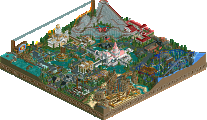
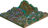
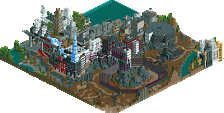
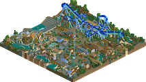
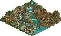
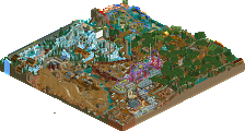
Also, for fun, I've posted screens of my 3 favorite details. I hope you don't mind Steve. Maybe some others will agree with me on how astounding these are.
#1 - The whole foundational archtecture of the Nautilus Theatre was just amazing. These columnal flower planters shown here are just godly.
#2 - Easily the best station I've seen from you, ever. The use of glass here keeps the Sea World feel into this without ruining the theme.
#3 - My favorite snippet of the entire park. Easily the most convincing indoor ride I've ever seen and one of the best ever.
If I were a judge (10-scale):
Old Red [4.0]
Magnus [5.0]
Kumba [5.2]
Six Frags [6.0]
Jazz [6.5]
X250 [7.5]
darkjanus [8.0]
Steve [8.3]
cbass [8.5]
*thanks emergo...
Edited by JKay, 07 March 2006 - 08:11 AM.
Am I mad at Fatha? No, not at all. In fact I would agree with his placing because I'm just so modest it kills me, but there is a side of me that wants to disagree. First thing I want to get out of the way: I rushed. There was probably a good month of work done, then two month break, then another couple weeks to finish. I guess I lost intrest in between. The main goal of this was to get something in because it was looking like this contest was going to flop so I wanted to get something in. Hence it feeling very empty and tons of water. I also know that the park is pretty inconsistant and not that interesting. I was pretty much trying to just finish something for a change. Secondly, the exhibits were meant to get themed, have animals, etc. This also got taken over by the "Steve-procrastinated-so-he's-not-going-to-bother-theming-them" ordeal. I didn't think the emptiness hurt the park TOO much and I was hoping other things in the park would simply gloss over them but I guess not. Wishful thinking on my part. The Hurricane coaster is also not a Kraken recreation. It's just a very poor one. Ha.
I would love to hear what you have to say Fatha. I think everyone would. I just hope iris is wrong in his assumption of you getting tired of Sea World parks. Sounds kind of hypocritical to me. But even still, please post.
Thank you all for the wonderful comments too. I know it's pretty hit or miss for some, not so much for others. But I set out at what I wanted to do, and that was to build an elegant entry - albeit a very rushed one. I'm also really happy to hear that you all enjoyed Kidd. It was the last thing I did and I put the most thought into it along with Hurricane.
Glad to hear I'm finally a parkmaker now. Hopefully it won't be too long before I start that double-spotlight winning park, huh?
Thanks again, guys. iris especially, and Cork for the very cool logo.
now go do a solo!
Corkscrewed Offline
This post will be edited after I shower and then finally look at your park, but Fatha's comments centered around the following (and I hope I don't misquote him in any of this).
Fatha's Opinion (Summarized by Corkscrewed):
The biggest thing that turned him off was what appeared to be a copycat of things he's seen numerous times before. The initial impression was that Steve copied RRP, who had copied Nevis. The unoriginality had an immediate and drastic negative effect that was heightened when Fatha noticed that Hurricane was virtually a track-for-track clone of Kraken--once again something he's seen way too many times. Search for Kidd was nice, but it also seemed like a rehash of similar rides that had been done before. The park was pretty bare, and there were some parts left undone.
The architecture and theming was indeed excellent, but here's why Fatha didn't think it was enough to redeem Sea World Brisbane: pretty much all the other parks featured equally good architecture and theming. Maybe not as technically skilled, but the range of the top 12 entries were all relatively the same in the architecture department. In that sense, this category sort of canceled itself out. Thus, when Fatha saw the "unoriginality," he thought "oh great, I've seen this a hundred times before."
So basically, he got bored pretty quickly, and as he further explored the park, there was little to dissuade him from his initial opinion. It's definitely nice, but it did absolutely nothing for Fatha. Essentially, this was a recreation. And if you're gonna do a recreation, it better be so amazing that it makes Fatha forget that it's a recreation. Otherwise, it's Grinching time!
In retrospect, this park would have remained around the same area, maybe jumping a couple of spots up. Fatha mentioned, last night, that this is better than Cinemagic, but from there, SWB doesn't challenge much else.
So I can understand his reasoning, altho I still disagree. Hopefully, this clears some things up, and hopefully, I didn't skew anything he might have meant (since I just typed all of this up from memory). So there you go. WHY STEVE GOT GRINCHED.