Park / Sea World Brisbane
-
 05-March 06
- Views 16,910
- Downloads 1,228
- Fans 9
- Comments 81
-

-
 79.38%(required: 70%)
 Gold
Gold

G Force 90% Liampie 85% Sulakke 85% trav 85% CoasterCreator9 80% posix 80% bigshootergill 75% SSSammy 75% Jaguar 70% ][ntamin22 65% 79.38% -
9 fans
 Fans of this park
-
 Download Park
1,228
-
 Tags
Tags


Corkscrewed Offline
OUCH!
Great park. The architecture is great and the Hurricane was pretty good too. I'm getting tired of having so many fantasy parks.
If HandyAndyG judged:
5th: Steve
6th: cBass
7th: JKay
8th: DarkJanus
9th: X250
10th: Kumba
11th: Jazz
12th: Old Red
13th: Six Frags
14th: Magnus
Edited by HandyAndyG, 05 March 2006 - 09:12 PM.
Xcoaster Offline
Also, I haven't looked at the park yet, but I'm guessing you got the 3 because you had a lot of unused space (ala Kumba) and a lot of landscaping as opposed to archy (ala Old Red).
EDIT: Ok, just for clarification, I looked at the park (I'll comment more later), but the second thing, about not enough archy vs. landscaping, was not the case.
Edited by Xcoaster, 05 March 2006 - 10:14 PM.
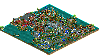
First, the positives. I was very realistic in comparison to most of the others. Also, the archy in the entry area was very nice and sophisticated. I also liked the layout of Hurricane, with the exception of the element after the loop, the steep twisting drop just seemed a bit out of place IMO. The station for Hurricane was quite nice as well, very unique but still somewhat realistic. Also, the general pirate area was very nice, and the atmosphere as well as details were magnificent.
Now for the negatives. First, the obvious. The park was quite small and contained a lot of empty space. While in some cases this added to the realism of the park, I felt some areas just seemed empty due to lack of foliage and archy. Also, I didn't like the area on the right side of the park. It was very empty, and the archy was somewhat lacking in this area when compared to the rest of the park.
I'm sure I will revisit the park to enjoy some of the smaller details, and I wouldn't be surprised if this park grows on me as have the previous few entries. Overall, this was a great park, but it didn't quite stack up to some of the other entries IMO.
Edited by eman, 05 March 2006 - 09:35 PM.
Very nice park here. The thing that held it back for me, although not quite to the 11th spot, was that the area that contained the blue and white buildings that all looked alike with the brown ones that followed in suit took up half the map. Don't get me wrong, it was a nice area, and the calmness really hit a nice chord after seeing such business in the other parks, but the fact that there was so much water and half the land being taken up by this really drew it back. It would have been nice in a full mega park though. I understand how you couldn't put anything living in the exhibits, as I know putting entertainers would be cheesy for this style, but I really do think you could've themed the exhibits a little such as putting some foliage in there and a little man-made waterfall here and there.
The hurricane section, like Kumba's in Bayfront, was not committing to the theme. Honestly, your area looked like an ancient civilization that had foliage growing around it, instead of buildings that got the crap knocked out of it by 100+ mph winds. If the Katrina incident had anything to do with how tame this area looked, which is highly understandable if it was a factor, then I would recommend to not have the area at all even if it was a good theme choice for Sea World. If that was the case, then I would recommend you do something like the tropical Polynesian islands, or even better continue that fantastic pirate area you had there. The coaster was ok, I would have preferred that you didn't use the cross braces on the support to be more like B&M, and now come to think of it, I would have preferred a smaller B&M floorless i.e. BKF without an mcbr as the park is too small to get enough guest to warrant a B&M that sits 1500 per hour ideally. Either that or an exact replica of Kraken would have been better.
I absolutely fell in love with the pirate area and its atmosphere right from the entrance. I love being greeted by the water ride's first drop across the water, and how you have to navigate though a narrow ally with slapshod buildings surrounding the path. Kidd's building is probably the best ride building I have ever seen, surpassing anything in Titled Acres, Fantastic Wonders, the Natelox Disneys, everything! It was just so mighty yet not repetitive yet not overly diversified. The colours and that tad of variation worked wonderfully together, I never thought I could like a building so much. Not meaning to be insulting, but I expected a big building from you to have so many roof direction changes and quarter-tile windows and things like that, but this was by far the best thing I have seen from you! I was a little unsure if that opening in the back was supposed to be there in real life or only a cutaway for us to view however.
I liked the stadium too, you could have used at least one more in place of all that water! Great job on this park, my second favorite so far in the contest, and again sorry about that 3, even though it says a lot when you made it this far with it!
The B&M itself was nice, but a bit odd with that cobra roll that looked like it melted and fallen foward and the 180 turn to the station was to wide, but other then that it was a really good coaster, Kraken clone or not. The B&M also had the part I liked the best in the whole park, the walkway under it with the buildings for the mech. controls, just awsome, I loved the atmospher back there.
Now I was disapointed by just about everything on the other side, the white and tan archy types did nothing for me, tho you did scatter some nice things around. The part I probaply disliked the most was the zoo when it would not have been hard for it to be my favroit part. What the hell was in each exibit? I keept looking for a sign, but found none. No point even doing it if your not gona put some thought into it. Also I hated the color on both flat rides in the park, you have this buteaful sea world theme with 2 flats mixed in that look right out of a shity county fair, that just confused me.
Overall I think it was a great park, but the deadline hurt you and weakend the park. I think you can end up being much better then slob coz you got much more skill with creative detail, just finish something building at 100% Great entry and congrats on getting the parkmaker spot, you should have long ago, but I did sorta get in the way
If I judged:
5. X250
6. cBass
7. Steve
8. JKay
9. DJ
10. Jazz
11. Magnus
12. Me
13. SF
14. Old Red
Up next
4. ride6
3. Xcoaster
(Literly flips a coin: Phatage = Heads/Cork = Tails)
Tails
2. Phatage
1. Corkscrewed
Phatage, on Mar 5 2006, 08:31 PM, said:
Fuck that, where the park is set they don't have Hurricanes, they have Cyclones
There will be a small part of my next solo with a Hurricane theme, i'll get feedback from you to make sure it works, ok?
Kumba, on Mar 5 2006, 07:36 PM, said:
You on the shit dude...yeeaahh...The theming was top notch, as was the architecture. The coasters and foliage were terrific as well. For some reason, though, it really felt empty. I couldn't point my finger on it. I really don't know how to explain my feelings. The technical aspects were near perfection, but it just was missing something. Congrats on the parkmaker spot and on the finish.
Edited by CoasterCrzy, 05 March 2006 - 11:11 PM.
Way to take a hit man... Ouch. I hope Fatha can come out with a real solid explination because this entry is fastastic.
Generally it's the atmosphere, it's just so blissfully perfect and as much as everyone seems to be complaining about those white buildings that is what the real enterence zone to Sea World looks like (or at least did at the on in Cleveland back before Six Flags, then Cedar Fair, bought it). The power of perfect color combinations, folidge and textures really came together in this place. Like Toon said on the main page though it did seem to be a bit lacking the exhibits, even though the rides were HOT. I personally thought Hurricane's station was brilliant, not at all too wide or tall. I could even imagine being on the path and looking up at it, or being in the station, about to board and looking over at people on the path.
Excellent work Steve, I'm thinking my park will be one hell of a let down at this point but that's alright.
I'll give a better (more specifics) review tomarrow after I take a good long look.
ride6
Corkscrewed Offline
Panic, on Mar 5 2006, 09:09 PM, said:
You're almost right... on one of the things you said.
Fatha' Offline
Corkscrewed Offline
Yeah, I think we definitely wish.
My quick comment is that while your opinion is valid, I don't think it justifies knocking him down that low, because the quality is definitely there, and very few people (really, RRP and slob) could pull off such a convincing work.
So I would like to know stuff like why it's ahead of Six Frags and Jazz (for example), since they both did "theme parks" that have been "done before." JKay's work has been "done before" (albeit by himself). This is playing devil's advocate and is not at all a knock on any of the mentioned parkmakers.
That's all.
Beautiful.
It felt really empty, and kinda proves to me you will never be able to finish a full scale solo park (prove me wrong
Like phatage, I thought you could've themed the exhibits in one way or another.. Like phatage mentioned, some waterfalls, maybe little mountains, rocks, shelters, play areas for the animals... The possibilities are endless, just play a bit Zoo Tycoon to get some ideas.. Now they are just bare pieces of land with no appeal at all..
I also felt the coasters were a bit weak.. I didn't see ANY themeing on 'Hurricane' or the kiddie coaster (Shamu's WaveCoaster).. The judges gave me one of their last places for not themeing my areas (and feeling bare), but I can't see where your coasters are (apart from their stations).. Sure, the splash boats ride was well themed with the big building and the look-inside.. But apart from that look-inside it wasn't themed, nor was the other indoor ride... If you're going for realistic, like you did, I think these details should be incorporated..
On a more positive note, it was an entry with a style that I liked..
And it wasn't cluttered, not trying to fit as much architecture into a map and not trying to 'wow' us with a concept.. So therefore it's on top of my list..
I'm not sure yet if it's any better than cBass' or DJ's entry..
Congrats on the Parkmaker spot too (does that mean ride6 and XCoaster get Parkmaker too?)..
SF
Edited by Six Frags, 06 March 2006 - 03:52 AM.