Park / Euphoria City
-
 07-March 06
- Views 10,474
- Downloads 1,159
- Fans 4
- Comments 40
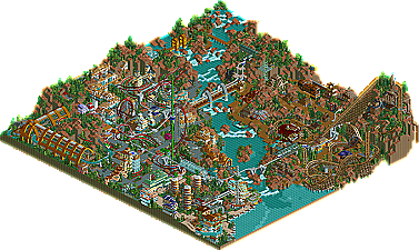
-

-
 81.50%(required: 70%)
 Gold
Gold

robbie92 90% no Xeccah 90% no Liampie 85% no RWE 85% no Scoop 85% no Cocoa 80% no csw 80% no Jaguar 80% no Ling 80% no CoasterCreator9 75% no Faas 75% no posix 65% no 81.50% 0.00% -
4 fans
 Fans of this park
-
 Download Park
1,159
-
 Objects
358
-
 Tags
Tags
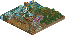
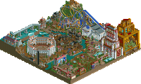
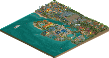
I loved that building too. However, your architecture is a bit unbalanced. It's like you spent time on some buildings and just threw some others together.
I can see some Mala-esque touches of course, but I get the feeling you are still experimenting with your style (as we all do, I suspect) and I think this is the first park you've made that I've really liked. You have improved a lot and I'm hoping we will see more and more of your evolving work. Congrats on the parkmaker spot!
Edited by chapelz, 07 March 2006 - 09:18 PM.
Overall I think it tops all, but cBass' and X250's (who imo is still head and shoulders above the rest.)
Congrats on the NE Parkmaker spot, you have been well worthy since the end of H2H3.
Corkscrewed Offline
I expected the Mala allusions when I put the overview together, but I hoped that this would only be a superficial comparison, and I was right. This is not Mala-copying at all. Instead, it is heavily Mala-influenced, which is a major difference. ride6, you've taken an effective style and expanded upon it, putting your own twist on what you think it should be and infusing your own style on it. And frankly, I really enjoyed it.
Now, the architecture was actually better than my initial impressions. It's definitely spotty overall, but the quality is still magnificent. Coming off the heels of Steve, obviously most people will feel that the architecture and atmosphere drop off a bit, but it doesn't fall that far. In fact, what you've created here is absolutely adventurous and bold. I adored the integrated building/landscape areas, where you dug your buildings into the surrounding cliffside. To be honest and uninentionally egotistical, I think you've pulled it off better than Aviara Cove (where I had the same sort of idea).
The negative is that because you showed you could build at such a high level, at areas where your work falters, it becomes quite noticeable. Still, all of that is comparative, because nowhere can I really say your stuff is "bad."
And the rides... what can I say? A nice, solid lineup. I enjoyed the duelers very much and overlooked JKay's more negative comments. He probably has a point, but they weren't an issue with me. I really liked how the ride was twice as long as it "should" have been. You get to the part before the vertical drops and you're thinking it's over, but the train's got plenty of momentum and takes advantage of it. Wonderful job there.
The woodie IS fantastic. The elegant yet fierce manner in which is swoops and dives in and around the landscape provides some dramatic head choppers and G-forces and all around fantastic thrills. And if the judges say it's the best--even better than Phatage, for example, then dayam!
The spiral coaster was nice, tho cBass's definitely trumps it. It suffered several lulls and didn't seem to receive as much attention as the other two coasters (understandable), but it was still well done.
So all in all, way to surprise the hell outta everyone with some fantastic work! Iris is right; your days as an asshole who rivaled Kumba for most idiotic trash talker are long gone. Now you're just kicking his ass everytime you meet him!
Hope to see more! And congrats!
14. Old Red [5.0]
13. Kumba [6.2]
12. Six Frags [6.6]
11. Jazz [7.6]
10. Magnus [7.7]
9. Dark Janus [7.9]
8. X250 - The Time Machine [8.3]
7. JKay - Ecstasy Summit [8.4]
6. Steve - Sea World Brisbane [8.5]
5. cBass - Zodiac Thrills [8.6]
4. ride6 - Euphoria City [8.8]
Don't forget that that also means better than you
Once again, Great park, ride6!
....although I could wake up tomorrow liking steve's more....
It was a nice park and all, but just way too much was going on, hated how you put 23 boats on the river ride (looked horrible with all the boats stuck on the drop, next time perhaps click the box so that the boat will leave if another arrives at the station). The steel coaster layouts were Danimation spotlight/early RCT Master park like, which isn't pretty at all (but back then we all thought they were great). The woodie was pretty nice, like it was typed up as. The entrance was really boring, and that hideous tree just was a precurser to really the rest of the park. Nothing really looked that great other than what was briefly mentioned above. There's at least 3 parks that have been released so far that are far superior to this.
I've built many "parks" before and this was not intended as on, it's a metaphoric world... If I intended it to be a park I could've easily have made a "park".
Though I guess the river ride thing you've got pleanty of ground to stand on, I didn't take the ten minutes to check that before sending it in...
Ride6
Camisado was only explaining how he perceived the park, right?. He obviously didn't perceive it as a metaphoric world like you did...and therefore he's a fucking moron?.....come on now, you know that doesn't make sense. IMO, the only entry that truly doesn't fit under the "park" category is darkjanus', maybe magnus'......
I guess it's a matter of looking for what's there Vs. what you want to see. You're right Jkay, no one is a moron here, just looking for things other than the intention of the parkmaker. It's like opening something by Posix and then being angry at him for not using complex buildings and vivid colors. Clearly those things are not his intention.
ride6
Corkscrewed Offline
awesome, awesome park. congrats again on the parkmaker spot, i can't wait to see more work from you.
Oh and tracid, it's not because I love contradicting you or something.
Edited by Panic, 08 March 2006 - 09:26 PM.
Sorry about my conflict creating earlier, and though I would like to use the excuse that I hate people judging things by criteria that aren't filled ON PURPOSE, however that's not the important thing he. I often over-react to minor things. Sometimes I don't know why either...
Ride6
Overall I liked it.
Edited by Majix, 08 March 2006 - 09:36 PM.
I don't really get the concepts of it and how the rides were named, though this naming didn't really influence the look of the park. Some of the architecture forms were fantastic, and some really weren't. The woodie was very nice indeed, a fantastic layout, and those duelers were quality, i just wish they could have been perfectly timed. The spinning coaster was very cool and how you used though curved tall things without it looking cheap or anything.
All in all, a very good park, though nothing totally outstanding. Great job though Ride6, and well done on the parkmaker spot.
Metro
Anyway I thank you for taking the time to comment (all of you).
Ride6
Metro