Park / Euphoria City
-
 07-March 06
- Views 10,534
- Downloads 1,166
- Fans 4
- Comments 40
-

-
 81.50%(required: 70%)
 Gold
Gold

robbie92 90% no Xeccah 90% no Liampie 85% no RWE 85% no Scoop 85% no Cocoa 80% no csw 80% no Jaguar 80% no Ling 80% no CoasterCreator9 75% no Faas 75% no posix 65% no 81.50% 0.00% -
4 fans
 Fans of this park
-
 Download Park
1,166
-
 Objects
358
-
 Tags
Tags
4.Euphoria City by ride6
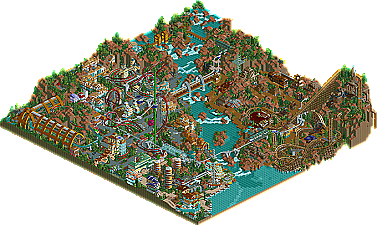
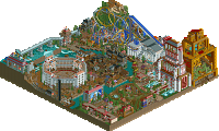
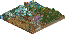
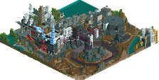
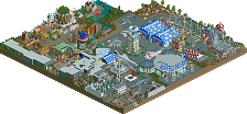
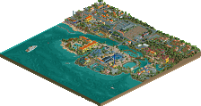
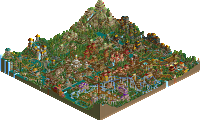
Only a year ago in last year’s Pro Tour, ride6 was scraping the bottom of the pile with his confused entry “Poplar Grove”, and was known as one of the more irritating members at the site. Well a lot can change in a year. Now he’s surprised everyone with a dramatic top five finish, placing ahead of some of the best parkmakers at New Element…and to top it off has become one of the nicer, more knowledgable members of the site in my opinion, making his pain in the ass days a distant memory. With his new entry, Euphoria City, ride6 lets his imagination run wild, with obvious influences from Mala, giving us drastic landscaping, coasters to take advantage of said landscaping, and improved theming and architecture from anything else I’ve seen from the sixer. The coaster line-up in Euphoria City is by far one of the strongest of any entry submitted this year, starting off with my personal favorite ride in the park, the terrain hugging, custom-supported wooden coaster “Crime Lord”. Easily the best wooden coaster of the competition in my opinion, though rides from Jazz, Old Red, etc. were still nice. Then there’s the set of launched, dueling Beemers “Blind Faith: Ignorance vs. Determination”. Great speed, pacing, layouts, use of the landscape, the works. He balances the two extreme machines off with the slightly less intense spiral coaster “Twisted Logic (Us > Them)” as it twists around the small urban sub-area of the park. Finally there’s the intriguing water-tour-ride, “Cultivation Canal” which instantly reminded me of Mala…and considering he’s one of my three favorite parkmakers of all time (along with RRP and Nevis), that’s added bonus points. Congrats to ride6 for not only finishing in the top 5…not only finishing about 15 spots higher then he did last year…but also finally nabbing that parkmaker spot that’s eluded him for months now.
Corkscrewed Offline
this was a very nice entry. congrats ride6!
Edited by newk, 07 March 2006 - 02:15 PM.
Edited by tracidEdge, 07 March 2006 - 02:29 PM.
Layout wise was very cool, put me down in the park. My only dislike was the lack of a formal entrance, I was very lost on that one. I feel the ride selection and placement was done in a very mature way, something that your experience has no doubt granted you with. The coasters were refined and exciting, although with those duelers the same goes as with the atmosphere comment I left above. I also think you should be more careful when placing scenery on top of blacked-out tiles, those glitches ruined the professionalism that the rest of the park had.
It was a very nice park, I had fun looking at it and navigating the walkways. Very solid, no doubt, but not too much of a leap from your recent trend of work. I'm also still not clear on the themes of the park, I guess there was industrial, free choice, and money?
The reason the enterence seems informal and thrown on is that it really is... But of course there are very few cities that have an "enterence" to their down town area.
I'm trying to move forward and I think this shows it, unfortuently parts became rushed and certain things fell apart a bit as a result. There's still certain things like the factory on the hill with Crime Lord (the one with the gitches...), the station for the duelers and the one sorta art deco-y building in the "rich" area on the river front that I'm happy with.
ride6
I like this park because its daring, and different. Congrats on the parmaker spot!
-X-
- First off, this reminded me of Epica in a way. I think it's because you made the illusion that this is a bigger park than it really is, like Phatage did in Epica. Everything was larger than life.
- I loved the area by the water. Not only were the colors bright and happy, which fit with the architecture, but the little touches on the boardwalk really added to the feel.
- The structure over the boat ride (which was also well done) made up for the lack of a station. This was great 1/4 tile work. You're starting to get as good as JKay with 1/4 tile work.
- The supports for all the coasters were also very well done.
- I liked the effect with the rapids ride hanging between the two tunnels and over the black space on the left side of the park.
Overall, this is definately your best work to date and you deserve the Parkmaker spot.
Corkscrewed Offline
4. Steve
5. cBass
6. JKay
7.DarkJanus
8.x250
9. ride6
10. Kumba
11. Jazz
12. Old Red
13. Six Frags
14. Magnus
It looked like it was trying to be a mala-esque park.. With the dueling B&M's, the terrain hugging woodie, the architecture, the landscaping, heck even the land colours.. It failed to deliver the quality and enormous atmosphere Mala delivers with his parks.. I would REALLY like to see what you can do with your own creativity, skills and style Ride6, because I know you have a lot of determination to create an original piece of work..
Because of that and the non-existant theme (what's the park/rides about?) it's nearing the bottom of my list.. Don't get me wrong here, what was there was pretty good, but I just expected a lot more from #4 in a competition that seems to be the best in RCT-World.
I have to give you props for getting your architecture up though, much better than your last PT park..
And congrats getting Parkmaker!
Finally one (along with both X's) that I think could produce a full scale solo release!
SF
Corkscrewed Offline
I'd highly doubt that.
Also, I've never seen you do anything before which was actually beautiful, so well done for that.
Corkscrewed Offline
Truthfully I think Jkay's entry is a good deal more "Mala-esque". Sure this has many elements that Mala also uses, nevermind Fatha using them in BGSS or X-Sector, Toon and Mantis in City of Dreams... But of course I knew my entry would be a major let down to most everyone after Steve's because it's very easy to see that it lacks the same sort of level of refinement, a certain parts of this were major victoms of rushing.
I guess I'm trying to be defensive of my work here without being terribly arguementive about it. I certainly cannot justify my placing, I'll leave that to the judges, they placed it here. I figured when Jkay's entry came out that mine was next and was thinking that for every entry from there on out.
ride6
Edit: Though I do tend to make that one particular influence kinda obvious...
The park had a lot of substance but also didn't seem cluttered. Impressive land management skills, I must say. Really good landscaping to boot, with loads of interesting elevation changes. The park really benefited from a nice attraction lineup with not too many, yet not too few rides. Foliage, pathing, colors were all solid yet nothing mind-blowing. My favorite thing in the whole park was the woodie layout. Definitely the best woodie of the competition, just beating out cbass' imo. I'm a sucker for terrain-abusing woodies anyway. I also really enjoyed Cultivation Canal, as I think you did a superb job of pulling off the "greenhouse effect" (
Now, the criticisms. The jungle bushes, marble textures and the dramatic red-sand landscapes, the so-called Mala-esque touches are nothing new from you Ride6. I'm just hoping you change up future projects a little. Another major aspect I didn't like was that there wasn't any hint of any entrance to a themepark and guests were just kind of dumped into the middle of dense jungle and rides. That took a little away from the amusement park atmosphere. The next issue I had were the two bits of downhill monorail just as it came across the main path bridge. Not only did the transports barely creep up those, but the tracks looked really bad there and I would've preferred the elevation change occur under ground. Other faults were more minor. I didn't understand the purpose behind some of the themes. The ride names pointed towards some type of junkie, drugged-out theme, but the theme looked more a sloppy mix of jungle, industrial and martian themes. The last complaint I'll mention here is that I thought the duelers were too sparely supported and I wasn't fond of the idea "hoop" they jumped thru (gimmicky).
Right now, the park belongs just behind cbass and steve in my book.
If I were a judge:
Old Red [4.0]
Magnus [5.0]
Kumba [5.2]
Six Frags [6.0]
Jazz [6.5]
X250 [7.5]
darkjanus [7.9]
Steve[8.1]
Ride6[8.3]
cbass[8.5]
I think this is some of your best work ride6, although a lot of it didn't work for me.... your style has really been hit or miss for me. I would have liked to see more coherent themes, ie: uniform color schemes, etc. It's a bit all over the place, and sometimes I don't know what I'm looking at.
Overall though, I thoroughly enjoyed it, and do agree on it's placing. The more I look at it, the more it grows on me. Some of the architecture, in spots, is wonderful--the teal/tan building. The coaster lineup is strong. That woodie is FANTASTIC!!
Congrats on getting that parkmaker spot!!