Park / DisneyAir
-
 09-March 06
- Views 22,406
- Downloads 1,657
- Fans 11
- Comments 80
-

-
 83.75%(required: 70%)
 Gold
Gold

5dave 95% no Kumba 95% yes Austin55 85% no disneylandian192 85% no Ling 85% no geewhzz 80% no Liampie 80% no Pacificoaster 80% no Xeccah 80% no Poke 75% no 83.75% 10.00% -
11 fans
 Fans of this park
-
 Full-Size Map
-
 Download Park
1,657
-
 Objects
396
-
 Tags
Tags
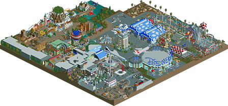
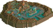
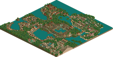
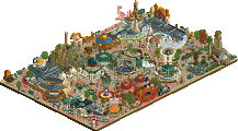
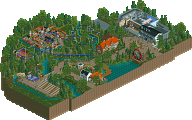
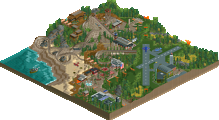
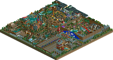
Congratulations on the parkmaker spot. Way to represent the Disney Mafia.
Fatha' Offline
Damn good job. Had me into it 100%. Refine the themes a little more and you win this contest.
Simply amazing work Xcoaster. This park had me looking for more than an hour, just fascinated by every little detail. One thing I loved was the murals that you created on the buildings.
Really great work. Congrats Xcoaster on the parkmaker spot, and the 3rd place!
Anyway, when I first looked at this park, I didn't really think it was as good as some of the lower placing parks. Sure, it was excellent work, but not very refined.
Then I opened it again and took the time to look around. Holy shit, this park is cool. I'm not going to go through all the details I found, because I don't feel like sitting here for five hours, but some of the cooler stuff:
- The murals on pretty much all the large buildings
- Those pistons in the Open Skies area
- The rockets in Starry Skies are the coolest thing I've ever seen (once I figured out what they were)
- The oversized windows on the buildings under the Laputa castle... never thought of doing that
All in all, a little unrefined, but a kick-ass park, to be sure.
-ACE
Corkscrewed Offline
Hmmm... come to think about it, "DisneySkies" has a better ring to it. But DisneyAIR looks better on text, so it's a wash.
"On behalf of the captain and crew, I'd like to welcome you to Miami International Airport, and once again, thank you for flying DisneySkies."
Corkscrewed Offline
Anyway, here it is, a whole lot of small details!
A nice little arboretum-ish area within the space area, very, very disney-ish as well.
This screen just shows how much X took into consideration the ride experience for the peeps as he deliberately placed the aliens at an mcbr of the coaster where it would be going slower and thus the aliens would be easier to view.
I don't even have to explain this. This is the best themed sign ever created.
This was a little hard to decipher at first, but upon closer inspection you can see the two stone figures holding up the emblem for the entrance to the ride. (although from that screen you can see that the queue line obviously isn't connected all the way to the entrance!)
Only crazy people go to this much effort for bench placement!
I don't know why, but I love how that cloud is supported, it really contributes to the realism that this park exudes (except for the flying coaster's launch!) Its also a shame that you couldn't finish that ride there and the rest of the park.
Supports for an indoor coaster in rct = commitment.
This is just a cool screen. From what look like standard blocky architecture at first, you then see those windows, the path that connects to the doors, and the subtle differences between adjacent buildings.
I love this right here, "painting" the earth and stars on the side of the building is really something Disney would do to help the atmosphere. Great idea, great execution.
The elevation of Condor Flats is shown to people outside the park; brilliant.
Where are you uploading these pictures? Try www.imageshack.us/. What you're doing now isn't a URL, its a FTP path... and that shouldn't be working period, to my knowledge.
Edit
Ah, I see what you've done.
Gimme a second and I'll have them working for you.
Viola.
Alright, to use an image from Camisado's host, this is the "prefix" if you will:
http://www.fulleffec...com/newelement/
Then the directory of the image, and the image name.
For example, say you create a folder "My Folder" in the root directory (the highest up you can go). Then you upload
"my image1.jpg" into that folder. The URL would be:
(%20 is used to indicate a space character in the URL.)
That help?
Anywayssss...
Each quadrant of the flying saucers has its own elevator that brings guest up from below, and not to mention a suspended control panel as well.
I first noticed this building because of the giant door, which is a great idea with great execution, and then I noticed the creatively made lobby-area-type shop on the corner.
We have here suspended lights, racing lights, and everything you would see at an auto race.
Again, x's attention to detail and practicality is evident here, the transition between tracks is ingenious.
I like how the building looks a tidbit dilapidated as well as the stairs leading up the tower.
This is underneath the entrance, I'm not sure what it is.
Nice attention given to the ground-arch over the door and that stall there.
This one's a little more obvious, the scenery inside the coaster's building.
The sign and compactness of Mission Space is brilliantly executed.
All that theming is for one drinks stall.
Not one detail small enough to slip through x's watch.
Its hard to notice, but 80 Days' station is out in the open under the restaurant.
I like how right from the entrance you can see the trains on this ride depart from the station from outside.
There's a shop under that loading platform!
This sign display was pretty cool, I'm guessing its displaying which rides aren't open or something along those lines.