Park / DisneyAir
-
 09-March 06
- Views 22,378
- Downloads 1,656
- Fans 11
- Comments 80
-
-
 83.75%(required: 70%)
 Gold
Gold

5dave 95% no Kumba 95% yes Austin55 85% no disneylandian192 85% no Ling 85% no geewhzz 80% no Liampie 80% no Pacificoaster 80% no Xeccah 80% no Poke 75% no 83.75% 10.00% -
11 fans
 Fans of this park
-
 Full-Size Map
-
 Download Park
1,656
-
 Objects
396
-
 Tags
Tags
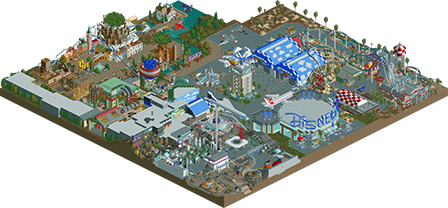
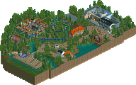
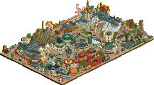
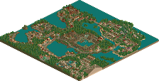
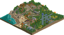
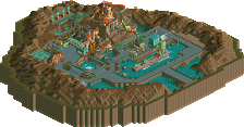
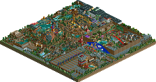
The "congrats" I posted previously is now multiplied times ten after I just spent a good 40 minutes looking at the park. This goes as some of my favorite Disney work ever and has already shot up the list with DTA, DSS and DLR. That should say enough about the level of talent I see in you now. Like Steve's park, I'd love to see you either expand this into a solo or even just finish a large park.
The strongest aspect of the park is the concept, imo. By far the most refined and polished concept of contest so far and therefore extremely convincing in that same right. Its something that I could actually see Disney doing and you obviously did your homework to be dead-on balls accurate. Thats very commendable, I must say. (I didn't have time to read the whole readme, but I will try to sometime)
Onto to more positives. I think the trackitectured Disney sign is my favorite touch anyone has ever put into their park, and not just in this contest, but amoung all Disney parks. Yup, it is, no doubt.
My next favorite would be the entire DiscoveryLand area. I loved virtually every ride, feature or attraction in this area. So many mind-bogglingly good ideas and details here all brought together with extreme precision. Examples being those working pistons, sun/moon sculptures, launch tube for Discovery Mountain and the entire Lunar area. I could write a novel about how good just that area is, but I won't because theres too much else to discuss about this park.
Besides DiscoveryLand and wonderful entrance sign, the remainder of the park was just "really good" imo. The most noteable of the other rides was Laputa. A great fantasy ride that just screams Disney beauty. The Rockateer was decent. Now I'm no expert, but Rockateer seemed to stray away from the stereotypical Disney being a full-fledged outdoor coaster.
As for negatives, I had very few, but enough to drop the park just behind cbass' as the best thus far. Man, these are getting hard to judge now. First the obvious unfinished areas and mysterious "missing corner".
Tremendous park, but I'm still in awe of cbass'. So second place right now.
If I were a judge:
Old Red [4.0]
Magnus [5.0]
Kumba [5.2]
Six Frags [6.0]
Jazz [6.5]
X250 [7.5]
darkjanus [7.9]
Steve[8.1]
Ride6[8.3]
Xcoaster[8.4]
cbass[8.5]
Simply amazing work, and probably will end up being my top park near the end, pending the other two entries. But still, I second Turtle's 14 for now, and look forward to your future projects.
Phatage, I would love to see a 'little things' post. I want to see the things I missed, because I'm sure there are tons.
Wow, the ideas! The detail! The Hacking! all out of this world, or at leased off the ground
I loved the entrance building with the Disney Air spelled out, you managed to used track better then I have ever seen anybody in RCT2, you understand how much it can express, its really the only way to add text without a banner and that is really huge. The greatest details imo were the facade on sorain, the area of discovery mountain with that amazing shop under it, the modle airplane centerpeice moble, the hacked clouds, ect... so much its hard to remember.
I think its this years Butter's Paridise, witch would be fitting as it is his
I will be commenting on this more in another topic as soon as the contest is over. I wish I could say it made my day, but I saw the prom queen from my senion class naked and got a Heat press pass and interviewed Pat Riley, Dwayne Wade and Shaq, so you make third
Congrats on the parkmaker spot.
Corkscrewed Offline
Honestly, sometimes I have to park my ego at the door and tell myself that even people who are pretty bad at the game have the right to be critical. But it still irks me sometimes.
Which PT2 parks did you like again? (seriously; no sarcasm) Seems like you've been pretty critical of everything.
Dude knows his stuff.
-X-
First of all, once I opened the park I was disappointed with what I saw..
It felt kinda amateurish, with all the big blocky buildings, awkward rides and bare spots of land.. Admittedly, the details made kinda up for the lack of content (every structure took some time to look at) but overall, I was bored pretty quick..
So I thought I might have missed something, and started to explore the read-me... Next I was kinda confused; I read about 1000 times you didn't have the time to put all sorts of things into your park and you wanted to actually make a solo out of this(?)..
Apart from the looong read (admittedly I didn't read all of it, because I either didn't have the motivation nor time to read it) it still wasn't clear to me what this was all about and why highly admired Parkmakers such as DarkJanus were drooling all over this park.. Ok, it's about Disney and about movies, parks and ride ideas from them (I think) but I didn't get that Disney feeling all over me when I'm looking at Iceman's and Meretrix' parks.. It actually got me thinking that both Iceman and Meretrix are some truely brilliant Disney 'Imagineers'...
I think, especially when attaching a name as Disney to a park, the park should at least feel like the actual parks (yeah, I've been to DLP).. While the structures may be a perfect recreation of what they are suppost to be, it didn't appeal to me at all and, like I said, didn't feel Disney..
I hope you can give me a short desription of what is so special about this park, because I don't get it..
Props on the structures though..
SF
Edited by Six Frags, 10 March 2006 - 11:12 AM.
Corkscrewed Offline
To me, it's a different, more modern type of Disney. It's not overwhelming in terms of atmosphere, but it has the same enthusiasm, details, and creativity.
My opinion, of course.
#1, congrats on the parkmaker spot, I look foward to your posts in the staff forum, just now you need to prove this park was no fluke
I just figuered out that the seemingly custom path was a compass legand, damn your good! The only falut I really see with the park is the layout, I hate when the path is so narrow you can't see the base of buildings, sure it is realistic, but its not good to do in RCT. Also for the great little speedway cars doing go krats and not the single cars mite have been better, I don't think that hack is very hard, oh and speeking of hacks, maybe now that your a parkmaker I'll let you know how to never have your rides brakedown again and still be able to change the car
Overall I give this a 9.5
Im on the fence over it or X250's park being the best yet, I think i'll just save my final rankings till the contest is all over
I have yet to delve into the park full force though, so perhaps that is the problem.
I wish you would have included that Reliable thing in the download, if it was there, I'm sorry, but I don't think it was. It was annoying with all the breakdown messages while I was looking around the park. Its always a great park when it takes you two nights to go through it! I think you did an excellent job overall.
Congrats on the parkmaker spot!
I'm gonna guess that Cork got the 9, so he will be next with Phatage winning...either way, I can't wait to see both parks!
Xcoaster Offline
Metropole-
"Great work Xcoaster. Well done on coming up with an excellent idea and pulling it off well.
That said, i didn't enjoy this quite as much as some seem to have. Yes, there were some great ideas including the pistons, some lovely block work to make various flying machines and some pretty damn good hacks. However, i found it pretty hard to explore the park. There were loadsa huge buildings, an on the most part they were really good, but after a while got too much and needed to be broken up with smaller buildings I think. Some areas I had to switch the view a hell of a lot to make sure I saw all the details. I do understand that disney does buildings like this etc. but it was hard, especially in a small bench size.
That disney sign upon the entrance was really really good, and some of the trackitecture was awesome, especially some of the domes etc."
Thanks. Yeah, you hit on one of the problems that I thought would knock me down a lot.
First, was that a lot of the buildings, usually show buildings, were really big, and often pretty ugly. Steve really showed us how those should be tackled with his "Search for Kidd" building. Second, is that some of it is far too cramped. "Open Skies," "Starry Skies" and the mine portion of the "Laputa" ride, and a few other things (such as the poor entrance to "Nausicaa's Secret Garden") can be very hard to view.
"I liked the flyer quite a bit, especially the vertical part."
Thanks. That one took me a really long time too. Several years in fact, as it's an idea I've had brewing for about four years (the big side view sketch of the coaster, though a different design, is from then). But even in the park, I started it almost right away, but didn't finish it until about a week before it was due. I was really happy with the beginning almost the entire time, but after it went up on the roof I wasn't sure what to do with it. I had another design that was completely different after that point, but I like this one a lot more. I wish I'd built that watertower just one more block in, so that I could've worked it into the layout. Anyways, thanks for the comments.
Jazz-
"Very impressive work, Xcoaster.
I loved the idea for the park; very original and creative. That DisneyAir logo was awesome though, and "The Rocketeer" had an amazing layout. The only area I didn't like much was the "Laputa" area and some of the stuff around there. It was a bit of a mess and some things seemed a bit confusing as well. But it only brought it down slightly for me, because the architecture is so unique. Infact, the entire theming of the park is unique, and Discovery Mountain had a great layout. The Lunar Base was interesting as well, all of these wonderful ideas are executed so well."
Yeah, as I mentioned in my other post, the Laputa area could've been done a lot better. For one thing, it just lacked substance, and was a bit cluttered and such. BTW, for people who don't know what this area is about, CartoonNetwork is supposed to be showing four Studio Ghibli films this month, specifically "Spirited Away," (a fantastic film, which I didn't really use, though I'd planned to) "Laputa: Castle in the Sky," (which I used a lot) "Nausicaa of the Valley of the Wind" (some of the entrance of that area was taken from this), and "Princess Mononoke" (also an excellent film, but it really didn't fit the theme of the park, and I didn't have any ideas for it).Thanks for the rest of your comments, too.
Ride6-
"I thought X might end up being a black horse. Amazing effort, though it seemed pretty unrefined somehow. Maybe it was that there was always so much going on and there was never any areas where there wasn't some tracked ride or anther to distract you...
The ideas that the theming were top notch, the rides were solid but too numerous. The architecture seemed pretty poor in spots and brilliant in others.
I think you could've spread things out more and broken them up better but it's amazing none the less. I have no idea how to rank it because as a park it's perfect, as an entry I don't know. The style just sets it completely away from everything else."
Well, if it helps, it was meant as a park.
HandyAndyG-
"I ought to win the funniest round next contest and build a Disney Space park."
Well, uh, that's just a plain silly idea. No room for such foolishness here...
"The ideas are absolutely brilliant. The coasters, however ingenious, didn't quite cut it for me. They just seemed to be a bit too slow."
Bu..Bu...But... It's a Disney park? Maybe it was just the lag from all the stuff going on. "The Rocketeer" is hauling butt for most of it's course, until near the very end. "Laputa" was pretty slow, but that's also because it's supposed to be more like a mine train or a dark ride for a lot of it (I would've liked to have had some more fast sections though). Anyways, thanks for the comments. And yeah, I was just kidding too. (hehehe, now I have the power of personal post deletion!)
Turtle-
Thanks
Corkscrewed-
"Whoa, that logo turned out better than I remembered.
Yeah, thanks for that. Airship... *drools*
"In regards to the lack of landscaping, I don't mind that. This park strikes me as a WDW Studios type of park (except like fifteen times better), so the flatness it fine."
Ok, that's how I was hoping people would take it. I personally think having theme parks with a lot of different height changes are overrated. Probably 80% of all real, major theme parks are flat, or mostly flat. Not that they couldn't be hilly, but I don't think it's necessary for a good park.
"What I love is the intense (and I mean intense) creativity with the hacking and trackitecture (I love that term; then again I claim credit for inventing it). The pistons, for example, were awesome. The "paint spray" of walls to get that mosaic texture (where you used different colored 1/8th blocks) was very cool."
I had a lot of fun with the trackitecture. The mosaic facade type stuff was actually something I came up with fairly late into it, for the most part. I did the one in "Condor Flats" about midway through, but the very large one in "Starry Skies" wasn't until the last night of working on it. It added a lot to that area, IMO. Before all that area had as a backdrop was the grey ugliness of the "Discovery Mt." building.
"The Mission Space, though lacking compared to everything else, is probably the best you can get it given RCT's constraints, so even where you "disappointed," it wasn't your fault!"
Funny you should mention that, as when I was first reading that through, I thought you said I was disapointed with it. Which was the case (though I must sound like a broken record with how I was disappointed with this and that). I actually mentioned that a few times in the park and in the read-me. It's just a very hard structure to really do justice to in Rct2, and I would've liked to have redone it with a design from scratch, but I figured what I had was decent enough, so I just let it slide, rather than sacrificing another days work.
"I loved all the signs and the words made from the blocks. Love the entrance sign, which I would never have the patience to do."
It actually didn't take long at all. That, and the various sculptures, were some of the easiest stuff for me to do. It's the architecture and rides that killed me. Thanks for the rest of your comments too.
Phatage-
"Needless to say, this was brilliant, and I feel another one of those little things thingies coming along soon..."
I wasn't sure what you were talking about here until Steve replied. I'd definitely be up for seeing one of those for this park. I could do it, since I arguably know the park better than anyone else (
"But until then I would like to point out what contributed to the biggest flaw of this park as Toon pointed out, and that was that it did not fully achieve that atmosphere. Honestly, a big thing that affected that I think was your choice of music. Space style, for example, I think, should rarely be used in an amusement park, even less in any Disney. Its a very intense and mysterious track that really isn't family oriented; its uses are for things like the queue line to Space Mountain and things like that, and with rct you can't confine the music to a queue line. Instead I would have found something closer to the star trek or star wars themes, as I think you would have to import a custom track to get the atmosphere needed for a Disney space area. I feel the entrance was perfectly suited for modern-style, and maybe some summer style or toyland for the back of the park."
Yeah, I didn't think about the music that much (aside from that I had been compiling some tracks that I'd hoped to use for custom music). I think that was the last thing I did, besides fixing a couple dumb mistakes I noticed. The music I chose for "Magic Skies" seemed like the closest to the Laputa music (which I found on my network today, yay). I couldn't decide on anything for the entrance, so didn't do anything there. I just went with space for "Starry Skies" cause it seemed to fit the theme. Meh... I guess I should listen to my parks more. This is the second problem that has come up because of that.
"Another thing as rhynos pointed out is the landscaping. Those open fields on either side of the entrance could have been filled with beautiful flower arrangements that I'm sure the person who made a painted earth in space on the side of a building could do. The park, besides the centrepiece, was practically devoid of flowers, and I feel that they could have helped for the Disney feel."
I'm kind of undecided on flowers. I definitely feel I could've made the park greener, but I don't know that flowers are the answer. I actually left those little spots mostly uncovered because I felt the park could've used a few more green open spaces. Flowers might've worked, though I have a few reservations about them. Aside from a few things related specifically to the placement of those two green spots, I don't know that Disney parks have as many flowers as everyone always seems to claim they do. Though this book seems to point to the contrary, it didn't seem like either of the parks at the Disneyland Resort had that many flowers. Maybe I just didn't notice them, but the areas that were closer to what I was going for ususually didn't seem to have them.
"I also would have wanted you to do something like a little museum-ish row of famous individual airplanes, things like flyer 1, hindenburg, Spirit of St. Louis, etc. I think this could've been done had you taken out one of the jumbo jets."
Hmm... I like the idea. Sort of an outdoor expostition of scale models and life size representations of different important flying machine. In my ideal version of the park I had planned on including museums for some of the different themed areas, and just having that sort of historical stuff spread around the park (for example, Flyer 1 would've been at the corresponding restaurant in "Open Skies," hanging above the bicycles), but what you're suggesting definitely would've worked as well in the airport area. Plus, it would've been a good showcase for more landscaping, and if I'd needed some indoor stuff it would've been a good use of a hanger. I had planned on having a greater variety of flying machines in that area though. I'd hoped to have some smaller, older style airliners (one would've been for shade over the Soarin' queue), the Spirit of St. Louis, etc. Anyways, thanks for the comments. They'll be helpful if I decide to expand on this.
JKay-
"Like Steve's park, I'd love to see you either expand this into a solo or even just finish a large park."
Haha, well, I've been working on trying to finally finish a large park for about six years now, but I figure I'll get one done eventually. I'm pretty busy at the moment though, but hopefully I'll be able to get back to one of my projects sometime.
As far as making it into a solo, I've definitely thought about it, as was mentioned in my read-me (which Six Frags brought up), but I doubt it'll happen. I'd enjoy it, especially since everything has already been planned and I'd just be building and refining, but I'm pretty sure it's response would be along the lines of "been there, done that." But I'll think about it.
"The strongest aspect of the park is the concept, imo. By far the most refined and polished concept of contest so far and therefore extremely convincing in that same right. Its something that I could actually see Disney doing and you obviously did your homework to be dead-on balls accurate. Thats very commendable, I must say. (I didn't have time to read the whole readme, but I will try to sometime)"
Thanks. That's what I was going for. As far as the read-me, like Six Frags mentioned, it's largely just "what could've been's" and that sort of thing, but you might find some interesting stuff. For the most part, it's just me going into more detail about everything.
"The Rockateer was decent. Now I'm no expert, but Rockateer seemed to stray away from the stereotypical Disney being a full-fledged outdoor coaster.
Yeah, it's quite a bit different from the norm. My idea for the ride, where it would have a gentler beginning (that's why I wanted to figure out how to do the vertical lift, BTW), would probably be more suitable for Disney, but it's still pretty unusual. I think it'd work though. Even though it's out in the open, it's not without precedent, as "California Screamin'" and "Expedition Everest" both spend a lot of time outside without a lot of dark ride style theming (though EE has an advantage because it can stop occasionally for show elements). Actually, I think the closest real Disney ride to compare this to would be "Rockin' Roller Coaster," because they'd both have some kind of preshow, and with not a whole lot of theming during the ride just because the ride is going so fast, but still enough to make the experience story driven.
"Next for me was, how should I put it, the "lumpiness" of the park. I know that may sound silly, but don't how else to put it. It didn't subtract too much for me, but I really thought you maybe spent too much time on certain areas and not nearly enough on others. I reiterate, however, that that took very little away from what I did like about the park."
I know exactly what you mean by the "lumpiness." I probably have ten-dozen back-up copies of the park since I started, and if you were to go through them all, one at a time, you'd see that a significant portion of my time was spent on "Open Skies," "The Rocketeer," "Condor Flats Racing Team" (mostly just staring at it and trying to figure out what I was going to do with it), and making all those rockets in "Starry Skies" (which is why I didn't destroy half of them to make that area look less cramped, though the trees could've gone). The rest of the park actually went fairly quickly. I'm not kidding when I say that it felt like I spent half of the time just on "Open Skies."
"Tremendous park, but I'm still in awe of cbass'. So second place right now."
Though I do like my park and everything, since I've spent so much time on it, I do admit that I think cBass' park is technically more proficient. But I still like my park. Anyways, thanks for the extensive comments.
Ruiz-
"I like this park. It's different from the other Disney ideas and has originality. Of couse, more landscaping would help."
Thanks. Like I said later in this post, I was going more for an original Disney park, and I agree I could've used more shrubbery and a bit less tarmac.
Steve-
"Remember what I said about the DCA recreation Xcoaster? Well, forget about it, this is more than enough to keep me (and probably the rest of the community) occupied until you release a full scale piece."
Haha, I was wondering when you were going to post and bring that up. BTW, this was what I was hinting at when I kept saying I had made use of some of the DCA stuff. Anyways, thanks.
Camisado-
"Amazing. Loved just about every aspect of the park, especially the DCA recreation stuff like the Condor Flats sign, the hangers cafe place, and Soarin, among other things. Did I read right though, you're recreating DCA? If so, holy crap I cannot wait for that."
Thanks. I don't think I'm doing DCA though. I started it a few years ago for the Recreation Expansion Set (RES), but the RES got cancelled shortly after and I lost interest in the recreation, though it was going well. I pretty much lifted the "Condor Flats" sign and "Taste Pilot's Grill" from that, though both were changed a fair amount. That was all I had done in my recreation of "Condor Flats," though I added a few more things in this.
Kumba-
"The greatest details imo were the facade on sorain, the area of discovery mountain with that amazing shop under it..."
For the facade, you mean the part on the front, right? I'm glad you liked the "Astronomer's Club." It was a lot different from what it was based on, and I would've liked to have included a much larger telescope, but I think that was still my favorite part of my park.
"I will be commenting on this more in another topic as soon as the contest is over. I wish I could say it made my day, but I saw the prom queen from my senion class naked and got a Heat press pass and interviewed Pat Riley, Dwayne Wade and Shaq, so you make third
Sounds like you had a fun day. I had to study all day for my midterm.
laz0rz-
"Eh, didn't do much for me. You can't just be innovative; you have to look good doing it, which IMO you didn't achieve here. Still, there were a couple interesting structures, like the Soarin' California buildings and the model airplane at the front.
Congrats on the parkmaker spot."
Thanks. If you have any suggestions, aside from the others that've already been mentioned (landscaping, cramping, too big of buildings, "lumpiness"), I'd be interested to hear them.
Six Frags-
"First of all, once I opened the park I was disappointed with what I saw..
It felt kinda amateurish, with all the big blocky buildings, awkward rides and bare spots of land.. Admittedly, the details made kinda up for the lack of content (every structure took some time to look at) but overall, I was bored pretty quick.."
I thought I could've used more bare spots of land (outside of the barren "Condor Flats," of course)...
"So I thought I might have missed something, and started to explore the read-me... Next I was kinda confused; I read about 1000 times you didn't have the time to put all sorts of things into your park and you wanted to actually make a solo out of this(?)..
Apart from the looong read (admittedly I didn't read all of it, because I either didn't have the motivation nor time to read it) it still wasn't clear to me what this was all about and why highly admired Parkmakers such as DarkJanus were drooling all over this park.. Ok, it's about Disney and about movies, parks and ride ideas from them (I think) but I didn't get that Disney feeling all over me when I'm looking at Iceman's and Meretrix' parks.. It actually got me thinking that both Iceman and Meretrix are some truely brilliant Disney 'Imagineers'...
I think, especially when attaching a name as Disney to a park, the park should at least feel like the actual parks (yeah, I've been to DLP).. While the structures may be a perfect recreation of what they are suppost to be, it didn't appeal to me at all and, like I said, didn't feel Disney..
I hope you can give me a short desription of what is so special about this park, because I don't get it..
Props on the structures though.."
Thanks for the comment, but I'm really not sure what's so confusing about it. I admit my read-me probably should've been titled a "Read-Me if you're really bored, don't mind possibly being more bored, and want to know more about my thoughts behind the park and its construction," as it really isn't as explanatory as it could be, but that's mostly just because I felt the park spoke for itself. So, I don't know that I can really give a short explanation. What follows is a lot of speculation on why you might not like it, but it's still not quite short, and it might not answer your question.
My best guess at why you dislike it is that it has something to do with your expectations of a Disney park. Cork and Iris basically said how I felt about it (so you can skip all this if that's why, or maybe even if not). It sounds too much like you were looking for a Disneyland/Magic Kingdom style park, and that was actually exactly the opposite of what I wanted. I mean, I still wanted it to be a Disney style park, but the whole idea was that it wasn't going to be yet another "Disneyland, Insert Disney-less area here" park. I don't mind seeing them, especially when they're done with new ideas like what Iceman and Meretrix do so often, but I felt that there was still plenty to be done with Disney parks that didn't involve the typical DisneyLand/Magic Kingdom formula. Like Cork said, even in real life the DisneyLand style parks aren't the only ones that they've made. It's the majority of them, but they've also made Animal Kingdom (which has never been done in Rct), Disney Studios (hasn't been done very often in Rct), DisneySea (probably the second most popular after DisneyLand in Rct, but the ratio of DL to DS is still probably like 50:1), Epcot (I've never seen it done), DCA (done a few times), DisneyQuest, and various water parks. Plus, there are several unmade Disney parks that people could make, like DisneySea CA (the design for it looked quite a bit different from the existing DisneySea Japan), Disney's America (Iceman? You'd better do this before I get to it), Disney's America @ KBF, Westcot, and probably some others I'm forgetting. But basically, I wanted to do something besides DisneyLand, and preferably more along the lines of the more unusual Disney theme parks.
Now, I don't think I fully succeded with my goal of creating an entirely unique Disney park. Arguably, only two of the areas are unlike something done before. Plus, a lot of the rides are lifted from other parks, both rides that exist and have existed, but also some that were never built, like "The Island at the Top of the World." Still, I think the fact that the overall concept was quite a bit different from any previous Disney parks makes me happy (aside from that it makes up a trilogy of DisneyLand, DisneySea, and DisneyAir).
Of course, you may have also disliked the park because even when considering non-DisneyLand/Magic Kingdom parks, you still felt it didn't seem Disney enough. I'll accept that, but I don't think there's a whole lot I can really do about it aside from what was already mentioned. Anyways, thanks for the comments. Sorry about all the reading.
Kumba-
"Got to post agin coz I forgot a few things.
#1, congrats on the parkmaker spot, I look foward to your posts in the staff forum, just now you need to prove this park was no fluke
Oh... That explains why I got some new topics when I clicked on "View New Posts" today. I was wondering if there were any other benefits besides the striking blue color of my name. I see there's actually quite a lot of interesting stuff in that forum. Hehehe. I have a bit of reading to catch up on now.
"The only falut I really see with the park is the layout, I hate when the path is so narrow you can't see the base of buildings, sure it is realistic, but its not good to do in RCT."
True. Ideally the park would've been on a map of around 150x150. Coincidentally, I'm studying Oscar Wilde's "An Ideal Husband" at the moment which deals with ideals.
"Also for the great little speedway cars doing go krats and not the single cars mite have been better, I don't think that hack is very hard,"
I think I see what you mean. That probably would've been better, though I was going for more of a drag strip type thing. I couldn't figure out how to do that though, so your idea would probably be better.
"oh and speeking of hacks, maybe now that your a parkmaker I'll let you know how to never have your rides brakedown again and still be able to change the car
Yes, please tell me sometime. My distress when I realized my rides kept breaking down was quite immense. Thanks for the comments, again.
hobbes-
"I think there were several awesome ideas in here (for instance, the monorails as clouds), but overall, I didn't find too much immersion. It was certainly an excellent park, and I don't deny that it may deservesa high placement in this contest, but it's just not what I expected it to be based upon everyone else's comments.
I have yet to delve into the park full force though, so perhaps that is the problem."
Maybe. I won't deny that the park has it's problems, and it is quite a bit different from the norm, so that might just be it.
Buckeye Becky-
"I wish you would have included that Reliable thing in the download, if it was there, I'm sorry, but I don't think it was. It was annoying with all the breakdown messages while I was looking around the park. Its always a great park when it takes you two nights to go through it! I think you did an excellent job overall."
Yeah, sorry about that... I had included it, but my e-mail provider wouldn't let me e-mail it in the zip file because it's an .exe file, so I had to take it out. I think I asked iris in my e-mail if he could put it in for me, but he might not have noticed that. Rct2Reliable was included with park #10, Magnus' Genesis, so you can get it from that.
Anyways, thanks for all the comments, everyone. I'll probably update my site in a few weeks with a detailed section about the park. There was some concept art that I did after I scanned the rest in, plus I'll probably point out some details on there that you probably won't notice otherwise (like the moon, comet, and the hard hidden mickey). And by then I'll probably have an 20 page addendum to the readme too.
Edited by HandyAndyG, 10 March 2006 - 09:50 PM.
Also as a NE Parkmaker you can delete your own posts and mod topics you start, so there are clear bonus' that come with it.
I'll PM you tomorow with the tip on rides not brakeing down.
Xcoaster Offline
Anyways, yeah, I just got to experience the unholy power of POST DELETION!!!. That was fun. I just hope I never accidentally click on the delete button for that last post, or my RCT history post.
Thanks for the tips.
Corkscrewed Offline