Park / DisneyAir
-
 09-March 06
- Views 20,757
- Downloads 1,527
- Fans 11
- Comments 80
-
-
 83.75%(required: 70%)
 Gold
Gold

5dave 95% no Kumba 95% yes Austin55 85% no disneylandian192 85% no Ling 85% no geewhzz 80% no Liampie 80% no Pacificoaster 80% no Xeccah 80% no Poke 75% no 83.75% 10.00% -
11 fans
 Fans of this park
-
 Full-Size Map
-
 Download Park
1,527
-
 Objects
396
-
 Tags
Tags
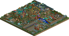
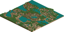
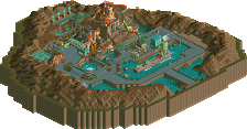
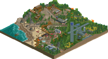
Rhynos Offline
It's just... oh my god. Looking through the park, I was very impressed (as always) by your extreme attention to detail and creative use of scenery, and greatly enjoying exploring the park.
Then, I got to the Laputa area. My brain exploded (made quite a mess, too, but a very beautiful kind of mess). I was able to recognise it as Laputa from just one glimpse - a check of the names just confirmed it. Genius, is all I can say. I'm lost for words. You are like the Miyazaki of RCT - just pure innovative, creative genius. This is my favourite RCT park ever.
More coherent comments when I've managed to scrape my brain of the walls and furniture...
Toon, I think a link to all his work is in his sig, trust me that you'll love it.
Loved this park, it is really such a good idea, adapting the Disney idea further into something, well... better than Disney! The park really had some cracking areas, some not so good. But overall, this is my favourite entry so far. The one area, just left me with my mouth wide open. The one with the indoor-LIM coaster, just, simply amazing. The hacks, the ideas, and most of all, the effort that must have gone into this park is staggering to say the least. 248 rides? Dude you nearly hit the limit for fucks sake!
Some bits were a little confusing, but looking at your concept art after help clear it all up. Your attention to detail was pretty amazing, and i loved the piston idea, i loved it so much i may have to steal it.
This park definitly deserves its spot, and if the top 2 are better than this, well, then bring them on. 'Cos this really was a fine piece of meat.
Must have been looking through it for about 45mins... Damn, its addictive!
-X-
Also interesting. with the lowest possible score for #2 being 72, there's obviously a quality jump in the last two entries. Its also crazy how the top 5 have only been separated by one point....yikes
Comments coming on this soon X. Really looking forward to this one.
also the drawings.
quite impressive, i have to say.
That said, i didn't enjoy this quite as much as some seem to have. Yes, there were some great ideas including the pistons, some lovely block work to make various flying machines and some pretty damn good hacks. However, i found it pretty hard to explore the park. There were loadsa huge buildings, an on the most part they were really good, but after a while got too much and needed to be broken up with smaller buildings I think. Some areas I had to switch the view a hell of a lot to make sure I saw all the details. I do understand that disney does buildings like this etc. but it was hard, especially in a small bench size.
That disney sign upon the entrance was really really good, and some of the trackitecture was awesome, especially some of the domes etc.
I liked the flyer quite a bit, especially the vertical part.
Overall, ths park was hard to look around an enjoy the details as much as I could have, but it did contains some cool ideas and overall, a fantastic concept.
Great work, and well done on the parkmaker spot as well as the bronze position.
Metro
I loved the idea for the park; very original and creative. That DisneyAir logo was awesome though, and "The Rocketeer" had an amazing layout. The only area I didn't like much was the "Laputa" area and some of the stuff around there. It was a bit of a mess and some things seemed a bit confusing as well. But it only brought it down slightly for me, because the architecture is so unique. Infact, the entire theming of the park is unique, and Discovery Mountain had a great layout. The Lunar Base was interesting as well, all of these wonderful ideas are executed so well.
Another thing I really enjoyed about it was that so much effort was put into it. I mean, it was completely stacked with ideas, rides, and theming everywhere; there was so much to enjoy and look at. Too bad that corner didn't get finished though... and a few parts were a bit blank and sloppy, but I can understand that under time constraints or whatever. The concept art was also beautiful too, which just proves my statement of all the planning and effort that went into this park.
Overall, definitely the best entry thus far IMO... Congrats on that parkmaker spot and the Top 3 placement too, and also proving everyone wrong in the predictions as well. You were even a bigger underdog then I was...
~Jazz~
Xcoaster Offline
First of all, I highly recommend running Rct2Reliable. You need to run it before you open "Condor Flats Racing Team," or they won't work, and a lot of the other rides have been trainered quite a bit, so they'll just break down a lot without it.
Also, you may want to close down the two Soarin' rides (which are made up of 10 Inverted Wild Mice tracks). I didn't really listen to my park until afterward, and plus I would've felt bad closing those after taking so long getting them to work right, but honestly, they don't add much besides slowing the park down a bit and adding some of Kumba's trademarked "Annoying Noise." You'll find the same problem with the pistons in Open Skies, but at least they look kind of cool, and it's not a constant noise. So if you do close those down, make sure you don't right click on them, cause you'll get an nasty error trapper.
My website (I'll add a section for this park later, I have studying to do at the moment): www.freewebs.com/xcoaster
I addressed that corner to no end in my long read-me, but basically, I had two more areas I wanted to do.
One, as was hinted at by the two fighter jets (which were only there because I was trying to figure out what to put on the mobile; I eventually went with the smaller Harrier), was a more modern "jets and helicopters" area, probably with a bit of "Air Force" type theme. As you brought up though, a war section in a Disney park would be really hard to pull off, though I do think it could be done, as it's not like Disney is completely against mentioning war or violence. I'd also originally considered instead making it more like Panic mentioned, with sort of an adventure feel. The original plan was to model it partially after the airfield in "Raiders of the Lost Ark" with the flying wing, and the Zeppelin from "The Last Crusade." I decided against such an Indiana Jones type emphasis, since it's been done a lot before, and decided to try a "Disney's America" style "Liberty Field" area, which is what I was going toward, but I ran out of time, and I just didn't have a lot of ideas that I felt were high enough quality.
The other area would've been a more Toon Town style airfield, probably called "Mickey's Flight School." That would've obviously had "Goofy's Barnstormer" and I probably would've also used "Tail Spin" and "The Rescuers" as sources. I don't think I could've fit both these areas in, and I'd hoped to at least get this one in, but I still didn't have enough time. Plus, along with "Liberty Field," it wasn't very well planned out.
Thanks. There were some areas, particularly "Magic Skies" that could've used much better landscaping, but overall I didn't place a huge emphasis on varied land shapes, since I figured the park would be fairly flat. More shrubbery would've been better. Also, if I hadn't compressed "Open Skies" so much, it would've had a much greater emphasis on landscaping, but it ended up as mostly being facades.
Hehe, thanks. BTW, aside from a few things, I feel that "Magic Skies" could've been improved the most. The airport area could've used some more stuff too, but I didn't feel as much of a complete overhaul was needed. Also, I'm surprised no one has mentioned how horribly cramped "Starry Skies" was. That was my least favorite area up until a day before I sent in the park, when I realized that "Magic Skies" was in much worse shape. At least I eventually remembered that that bird cage was supposed to go there. I had it marked off for something, but I couldn't remember what it was until the last day of building.
Phatage, JKay, Kumba- Thanks. Though, Kumba, maybe you shouldn't skip work over it.
You probably just need to download the bench. I don't think I pulled an Old Red, but I did use the landscaping editor a little at the beginning, so I suppose it's possible.
I think I may have originally gotten the piston idea from BOMB. Those pistons were, different, though.
I probably did put the most time into "Open Skies," even though it's relatively small compared to the other sections. I wouldn't be surprised if I spent a third of the time on this park just on that one section.
As for the ride limit... Well, I did mention that I used quite a bit of trackitecture.
posix - The entrance banner was actually the very first thing I did. It got a little messed up though, because at the very end I put a fence around that building and it glitched through the banner without me noticing. But I was really happy with it before that. Plus, wherever someone came into my room and asked what I was making, all I had to do was zoom out. Hehe.
Anyways, thanks to everyone else. The response is better than I expected. There were a few things I expected I'd have gotten nailed with by now (actually, it looks like Metropole and Jazz have hit on some of them, mainly the huge buildings and crowdedness, but I'll comment on that in my next message). Anyways, I'll comment more later.
Also, I still plan on commenting on the last few entries later. I've just been really busy with class lately, but after finals I can probably get around to it. Sorry. I want to take some time to look at the parks more before I comment on them in detail.
The ideas that the theming were top notch, the rides were solid but too numerous. The architecture seemed pretty poor in spots and brilliant in others.
I think you could've spread things out more and broken them up better but it's amazing none the less. I have no idea how to rank it because as a park it's perfect, as an entry I don't know. The style just sets it completely away from everything else.
Ride6
3. Xcoaster
4. Steve
5. cBass
6. JKay
7.DarkJanus
8.x250
9. ride6
10. Kumba
11. Jazz
12. Old Red
13. Six Frags
14. Magnus
Also, I hope my number 9 doesn't hurt anyone's chances of winning, but I have a nasty feeling it might. I stand by my judging though.
Corkscrewed Offline
Anyway, Ryan, I had a moment to look at the park while I was retrieving the names of the major rides for Iris, who was a jerk and didn't bring his RCT 2 disc home (
In regards to the lack of landscaping, I don't mind that. This park strikes me as a WDW Studios type of park (except like fifteen times better), so the flatness it fine.
What I love is the intense (and I mean intense) creativity with the hacking and trackitecture (I love that term; then again I claim credit for inventing it). The pistons, for example, were awesome. The "paint spray" of walls to get that mosaic texture (where you used different colored 1/8th blocks) was very cool. The Mission Space, though lacking compared to everything else, is probably the best you can get it given RCT's constraints, so even where you "disappointed," it wasn't your fault!
I loved all the signs and the words made from the blocks. Love the entrance sign, which I would never have the patience to do. Loved the energy and enthusiasm you put into this. Heck, loved pretty much everything.
Wow, that was more indepth than I anticipated. I'll get another review later. Fantastic job, though. This is my #3 as well.
Oh, and congrats on becoming the first placer to claim a perfect score!
But until then I would like to point out what contributed to the biggest flaw of this park as Toon pointed out, and that was that it did not fully achieve that atmosphere. Honestly, a big thing that affected that I think was your choice of music. Space style, for example, I think, should rarely be used in an amusement park, even less in any Disney. Its a very intense and mysterious track that really isn't family oriented; its uses are for things like the queue line to Space Mountain and things like that, and with rct you can't confine the music to a queue line. Instead I would have found something closer to the star trek or star wars themes, as I think you would have to import a custom track to get the atmosphere needed for a Disney space area. I feel the entrance was perfectly suited for modern-style, and maybe some summer style or toyland for the back of the park.
Another thing as rhynos pointed out is the landscaping. Those open fields on either side of the entrance could have been filled with beautiful flower arrangements that I'm sure the person who made a painted earth in space on the side of a building could do. The park, besides the centrepiece, was practically devoid of flowers, and I feel that they could have helped for the Disney feel.
I also would have wanted you to do something like a little museum-ish row of famous individual airplanes, things like flyer 1, hindenburg, Spirit of St. Louis, etc. I think this could've been done had you taken out one of the jumbo jets.