Park / Superior Amusement Park
-
 16-February 08
- Views 6,028
- Downloads 933
- Fans 0
- Comments 11
-

-
 55.00%(required: none)
 Silver

geewhzz 65% Liampie 60% Poke 60% Stoksy 60% Cocoa 55% Louis! 55% 5dave 50% inthemanual 50% MCI 50% FredD 40% 55.00% -
 No fans of this park
-
 Download Park
933
-
 Objects
360
-
 Tags
Tags
![park_4114 [H2H8 R3] Forum Caeleste](https://www.nedesigns.com/uploads/parks/4114/aerialt3853.png)
![park_2614 [NEDC2 #1] Winter is Coming](https://www.nedesigns.com/uploads/parks/2614/aerialt2316.png)
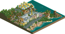
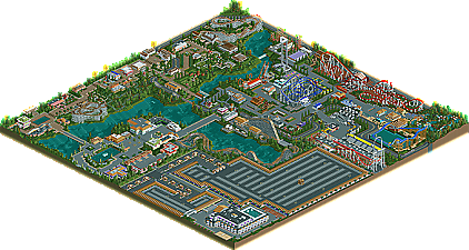
It’s nice to see an up and coming parkmaker not only get one runner-up with Korsareian Valley, but to back it up with a second full size park earning the same honor just eight months later. JDP backs his first runner-up with his latest creation, Superior Amusement Park & Resort. A quant park with the whole family in mind as it’s sure to meet the needs of everyone who visits.
Please post your comments below.
Congrats JDP!
First, the things I liked:
-The GG woody was layed out beatifully along that lake. It finsihed a bit slow but I still really enjoyed it.
-Pest Controll was a great little addition. I like the attempt at the larger style Mack wild mouse. It was nice to see something original.
-The old style out and back with a layout similar to Thunderhawk at Dorney (I forget its name) was probably, for me, the best thing in the park. Perfect layout, perfect pacing, perfect little realistic touches. Best ride in the park in my opinion.
-I loved Full Throttle, especially because of the little banners at the ride entrance. That really made the atmosphere.
-The way you did the track on the Mack supersplash was very ingenious.
-The landscaping seemed very clean and natural.
Things I didn't like:
-None of the staff had names. I don't know, just made the park feel incomplete.
-Your architecture got a little dull and monitonous in some areas. I think you had the right idea near the back of the park by the far train station, but near the front some things were just too simple and bland.
-The treeing was odd, and felt a little too planned out.
-Lastly, I think you need to work on your ride names. Some of the flats had absolutely ludicrous names. I can't remember any off the top of my head, but I know the Boomerang had a strange name, as did the Mack supersplash. Cain: The Return was a bit strange as well.
Overall, really nice job on this JDP. I think you have a really unique, pleasant style that could yield some great results for you in the future. Nice work.
The treeing was rather open and the architecture rather dull but the coasters held their own and the atmosphere reminded me of photo's SFDL (for example). I don't know if that's what you're going for, but it's what I got out of it. The coaster line up was something like what you get at most successful chain or non-chain parks: nothing completely mind blowing; no hyper, no 400-foot rocket, no coasters that would probably win the "OMG OMG OMG BEST EVER!" type awards, but a solid line up with lots of variety.
I really liked this. If you need help with a park in the future I'm sure I can spare a few hours to do a guest appearance (hotel, coaster, custom ride, etc).
Ride6
CP6- First off, thank you so much for all your help. I knew that you dislike my foliage but that's something that I am still improving on little by little. And as you seen aim, I do have something(s) coming along.
Ryan, thank you for downloading
Mr. Burns- Thanks buddy. I gave a large amount of time in to the park and thanks for thinking it should get some recognition. I am happy that you enjoyed the coaster line up. I remember a year ago back in February when I started the park off with the parking lot and hotel. I was shooting for a retro style hotel. I wanted to create a park that made it big through out the years. So after I did the hotel/entrance/parking lots I decided I will break the park in the three areas.
(everyone should read this)
Area one will be where the peeps enter the park and are able to park, buy tickets, get information, shop, eat, etc. Area two will consist of classic and old school rides that all would enjoy. This would be the area where most of the kiddie/family rides would take place. (This area of the park is where the first entrance was held and then it was moved to the other side of the lake.) Area three would hold the more thrilling and over zealous rides. So I really had to plan where I wanted each ride to go (whether it fits in area 1,2, or 3). That is why you see no newer rides in the "Superior Beginning" or "Elegant Gardens" areas.
So for the third area I just let all my ideas spill. I was going through all these designs in my head that you rarely see in the game (such as the GG, Intamin Rocket, etc). Don't get me wrong you do see these designs but they are usually off key (especially Intamins). Full Throttle took me about 3-4 hours of hacking before I was even able to put one little support on it. Next in mind was a Gravity Group coaster. They are quickly rising to the top of the wooden roller coaster world so why not have one in a realistic park. So I was really debating with myself on what to put near the lake; whether it a ride or coaster. Then the GG came in mind and I nailed the layout after a few hours.
So areas one and two were complete and I basically did all the roller coasters first in the third area and then based everything around them. So the coasters were my main focus and thats why the foliage and buildings just seemed eh.
Now to answer your main questions Mr. Burns. Yes shooting star was based off of the legendary Thunderhawk. Full Throttle was my main concern with the park. I put lots of thought and time into it so it means a lot to me. About the staff names, well I was going to do it but pretty much forgot, so sorry about that. As I said above, foliage will be worked on. And as the rides name I wanted to give every ride/ coaster it's own time to shine and have it fit with its elements, surrounds, and the area that it was in. Over thanks for the feedback.
Ride6- Yeah, I had a lot of motivation to do a park like this. I was reading a book about the history of Dorney Park (aka my home park) and it gave me the idea of me wanting to do an evolution park I guess you can say. As for the park that you mentioned, I never herd of it actually, lol. Thanks though because I am guessing that's a good thing. Yes, as for the coasters, I really didn't want anything obnoxiously big but I did want the park to have some tip top thrills and some name droppers. As for the guess spot, I will be more than happy to let you know when I have something else up my sleeve. Thanks for the comment ride6.
Special Thanks to:
Geewhzz for the tips he gave me.
hpg for the amazing logo.
Large thanks to these two guys:
Thank you Eman and CP6 for all of the help that you guys gave me on aim. You both helped me stay motivated and concentrated on this park. I give you two lots of props.
-JDP
Edited by JDP, 22 February 2008 - 07:10 PM.
Also, good choice on removing the Impulse for that there Mouse