Park / Tièrre Mòrtica
-
 12-March 06
- Views 13,680
- Downloads 1,063
- Fans 3
- Comments 71
-
-
 77.50%(required: 70%)
 Gold
Gold

Cocoa 85% G Force 80% Kumba 80% Liampie 80% Ling 80% RWE 80% Scoop 80% Xeccah 80% CoasterCreator9 75% bigshootergill 70% saxman1089 70% posix 60% 77.50% -
3 fans
 Fans of this park
-
 Download Park
1,063
-
 Tags
Tags
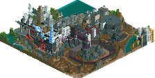
![park_3112 [MM2014 R1] The Haunted Estate of the Fantastical Lord Fredrick Kent](https://www.nedesigns.com/uploads/parks/3112/aerialt2743.png)
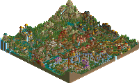
As for the park, I haven't really seen enough of the park yet, and I'm not really a fan of your style, but so far it seems like you're trying something new here, and that's good.
I love the way you create such great atmospheres with every park...and although I'm not a big 'dark park' fan, the little details certainly made this a nice park to explore. I have to admit the language thing was just too much for me...sorry...I work my brain too hard at work, that when I play RCT or look at parks, I don't want to have to 'work'...
Your parks are always full...full of rides, full of architecture, full of details. The only downside for me was in this park, it did seem a little more crowded than you usually let it get, but I imagine that was due to all the ideas you had for the park.
Loved the logo too!
Lets bring on Phatage
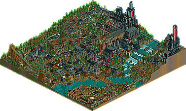
Anyway the park itself is very interesting and the history portion of the read me is very engaging and intense. I had to let the peeps out too, and in the process of laying down signs for them I expored the valley and the village a lot more that I had before. It's amazing how detailed that architecture really is and when looked at right it's absolutely perfect. The coaster still spend too much time underground except for the woodie which only has a couple spots that i would've changed. The Mine Train would be sweet if it spent more time in sight because I love how you used the intamin track for it with the side friction coaster adding support.
Great job using texture to create atmosphere too since I noticed rather comforting areas in the colors that one could rest one's eyes in but somehow those patches failed to affect the rest of the park.
I'm still really not sure of how to rank this, or any of the others now for that matter...
Now, bring on our victor!
Ride6
Corkscrewed Offline
I got a PM telling me a certain link didn't exist. Now, I might have blundered and written in the wrong link in the game (for those of you who did find the final banner). It should be an actual web page, not a d/l for a .doc file. However, if that's what I did, I've uploaded a .doc file that points you to the correct site, which should have a whole bunch of gibberish.
If none of this makes sense except to the person who PM'ed me... nvm.
Now I'm off to read this religious discussion my topic has seemed to evolved into.
EDIT: ROFLMAO... Iris hasn't posted the #1 park yet? I'll bet he lost the files or something and has been waiting for me to get back.
Corkscrewed Offline
http://www.corkscreweddesigns.com/tm
Corkscrewed Offline
Although I'm pretty sure any linguist could butcher me on mistakes I probably made. But it was all for fun anyway.
Seriously, this is a masterpiece. If you want an awful pun or some other literary term to describe it, it was one hell of a park. Thing was, it wasn't an amusement park, in that its "guest", whether it be the 666 or somebody who would walk into the park from the entrance and got to ride the rides in a strictly literal sense would not imo receive amusement solely because of the theming choice. Its obvious though that this was what you were going for when building it, and you did a great job at that as well.
Evaluating the physical aspects of the park, well, just about everything was a great improvement from your past works, qftb included. One thing that I especially liked was that you've learned how to make parts of a map that aren't dominated by architecture, something that I feel has also made people like fatha 10x better in my perspective. This way, I was better able to see what architecture was there for its full value. In a nut shell, your already spectular architecture, enhanced greatly from things in your past works with subtile and non-subtile details and variations, was further enhanced by the fact that there wasn't as much of it in quantity as before, and that's a giant hurtle to overcome.
Ride-wise, same thing. The mine train was brilliantly varied with underground and outside portions that it did not get boring and tedious. It also seemed to pick up speed out of nowhere, which is always a good sign of a good mine-train. The woodie was nice, but if anything its rather conservative layout seemed a little out-of-place with the rest of the park. I liked the dive machine, but I think it would have been a million times more genius had the large vertical drop been the end or close to the end of the ride, as that was the culminating point of the ritual. Maybe even have a station at the bottom of the drop (with some brakes of course) so riders exit the train having just descended 90 degrees into Oblivion, which is where that idea comes from as it basically is only a drop, turn, and brakes. I see the appeal in putting S&S towers on top of high elevation, but to tell you the truth they are scarier rides when placed in a valley. Explanation, When looking down from the top of one on top of a hill, you know in your mind that the drop is not as tall as the surroundings make it seem, and so you are less scared. But take the opposite, your mind knows that you drop even further than the surrounding area, something like Dominator at Dorney, and the opposite effect is achieved.
Your colour choices of the browns, black, and blood red were appropriate, and you did use them in a way that didn't get tiring. I still would like to see somebody use many different colours in a non-cartoonish way and create a flowing park, I've tried and tried but have failed in the eyes of others.
I also feel I should take some time to comment on the story. I think it was well constructed, but the language was a little over-the-top. I think you should have used secret banners (and the ones that can be deleted by the scenery mover so the hunt is harder
All in all, I think that the reason why you have improved so much is that you have taken the perspective of the peep, and the path and park layouts show it. The irony is that if this park were created in real life, I would not want to walk around it if I were seeking a theme park to go to. I still respect it for what it was meant to be and the excellent execution for what it turned out to be, but I think what I was looking for in this contest was somewhere I would wish to go on vacation to, and I built accordingly.
Again, may I slap your ass out of sportsmanship, and may we battle again someday.
Corkscrewed Offline
The language thing... I wish I could have spent more time on it. But alas, lack of time meant that was what had to 'suffer.'
Besides, I didn't want to make the banner thing TOO impossible.
Oh, and one thing about the dive machine. I think everyone gets that it's supposed to be the Ritual of Sacrifice. Basically, you are placed at the highest point in the park, and bent to face down, as though you're about to be executed. In my mind, I imagined a very graphic symbolic gesture with the hold and the drop. It's like getting beheaded. Your head (the train) falls off the cliff, and blood drains down into the holding pool below, which filters and drains the blood and preserves its purity. Whether or not this should go in the beginning or end I think can be debated. I built that thing pretty much in the beginning and didn't really think about changing it until it was too late, so oh well.
Ritul di Sacrifyss: It's like getting decapitated.