Park / Living at the End of Time
-
 26-July 10
- Views 21,656
- Downloads 587
- Fans 0
- Comments 19

-
 No fans of this park
-
 Download Park
587
-
 Tags
Tags
 26-July 10

 No fans of this park
 Download Park
587
 Tags
Tags
 Similar Parks
 Members Reading
Round 2 Voting:
Unfortunately I have cancelled the the 2nd voting stage. Due to 6 forfeits, thus leaving only 10 entrants, with a few of these highly unfinished, everyone who entered Round 2 will go through automatically to Round 3, the quarter-finals.
This is because there would only be 2 match-ups to vote on, one of which has 2 fully completed entries, where the effort put in is just too much to allow one person to go defeated, when others would go through with highly unfinished entries.
I apologise for the wait, this was due to making a decision on what to do, and then consulting those members it effects.
So all 10 entrants will go through to Round 3, resulting in two 3-way match-ups in the Southern Brackets. Below you will find a screen of each entry and at the bottom, the download.
Congratulations to all, thankyou for completing or attempting an entry, hopefully the next round will be more productive.
North West:
"Fairytale of New York":
STEVE vs IN:CITIES
BELGIANGUY vs FK+COASTERMIND
North East:
"Space Cowboy":
TURTLE vs CASIMIR
SSSAMMY vs NIN
South West:
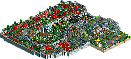
"Living at the End of Time":
RCTCA vs LOOPY
TOLSIMIR vs DR DIRT
South East:
"Lost Beneath the Ocean":
WANTED vs AIRTIME
COMET vs NOKIA
Round 3, the quarter finals, will be released on Friday.
Attached Files
downloads: 553
gotta look at all the entries, but FYI, the screen for my park said photobucket lost the pic....at least for me it does...
FK
There were three fantastic entries this round: FK's, Turtles and Tolsimirs. I think I liked Tolsimirs best. The hurricane with the spinning cars/trains is just ridiculously epic, and the other sections were great too. You're really, really good, and it was easily worth going out against you to see this entry. Turtle's were of the same fantastic Turtle quality one is used to, and I really liked the layout. Would have liked to see it 100% finished! FK's had a lot of things to explore, and some really nice scenery and touches here and there. Only the city was a bit lackluster in my eyes.
Congrats to all who got through! wait...
Attached Files
downloads: 488
downloads: 485
cheers, fixed it. i found it difficult to get a screen from your park
i didn't have any trouble, but split has posted them so cool
I wanna say thanks to Turtle, FK, Tolsimir, Loopy, RCTCA & Airtime. Your entries were brilliant. Hopefully with the next round we will have a proper competition, because we have got some interesting objectives and guidelines coming up in the remaining rounds.
Turtle - I just loved everything. If you can make this in a few weeks, I wonder what you can do in a few months. Please build us something big again!
Tolsimir - The Tsunami section was a 'meh', but the tornado was brilliant, the meteorites were an awesome suprise in an otherwise stupid section and the station area looked great. The ending was really great as well. Superb entry, well done.
FK - I always thought you were overrated, but I have to take that back. I'm glad to finally see something different from you, and I'm even more glad that it's this good. So many fun ideas everywhere! And I love how you did the dragon.
Tolsimir, that tornado was really clever, and the roar was ridiculous! Excellent job on the whole thing, even if I didn't understand it all.
Not many people looking at this any more it seems!
i was on vacation for that whole timeframe [ironically in new york], and when i came back, i had lots of band stuff to deal with in the studio.
so while i feel ashamed to have made it this far, i'll give me best for the next round.
thats the least i can do
I'm glad everyone liked my entry. Once i got the idea down, i had so much fun building all the details and little fantasy bits. Its been awhile sense ive done a mainly fantasy park so this was really alot of fun for me to just let go.
Split-the feeling fo the city was my main issue when i was looking over the final. The scale was what killed me. It would have looked awesome had i had more buildings to increase the 'big city' look, but i didnt have the time. originally i wanted the straight orderly look of the city above to balance the feel of the fairytales underneath.
as for the parks, Turtle's was fantastic and had all the atmosphere i would expect from him. I would love to see this idea expanded. Tolsimir, you were right, the tornado did look better ingame. i loved the idea of your park, which was a good interpretation of your theme. Nokia, i liked your idea given your limitations. however it really seemed to lack substance. what was their was greaat, but it just seemed empty.
lookin forward to next round
FK
I know there is no voting in this but I thought I would go ahead and score everything as if there was. This round the points were divided up differently than the last. Before the coaster was the main event. NOT THIS TIME! The ride(s) in the park only made up 25% of the total. 35% goes to scenery and theme. The last 40% went to atmosphere. You may be wondering why atmosphere was worth more than scenery and theme. Well... with such vague topics to build off of I felt it was more important to have whatever was built fit together as a whole rather than just hoe good objects looked. In other words once you picked our theme it wasn't necessarily how well you built it but how well everything worked with it. It was close for the two but in this case atmosphere won out.
25% - ride(s)
35% - scenery/theme
40% - atmosphere
North West:
"Fairytale of New York":
STEVE (0) vs IN:CITIES (3/10/7=20/100)
You had a nice start IN:CITIES the pond was great and I like how you were using a Suspended Monorail in your entry, an RCT ride that is usually forgotten about. Couldn't tell where you were going with your project but was there was very well done.
BELGIANGUY (0) vs FK+COASTERMIND (25/35/40=100/100)
Have to bow to you FK+COASTERMIND for coming up with such an amazing entry. This kind of detail I would expect in a accolade submission not in this contest. The way you tied this "Fairytale/New York" together with the cities skyscrapers, Grand Central Station and a malfunctioning elevator on top and below just about every kind of children's tale I could think of and some I couldn't. Rapunzel, 3 Little Pigs, Ugly Duckling, Hansel & Gretel and the 3 Bears just to name a few. Then there was the coaster! Using the "Bean Stalk" as the lift was just over the top. AMAZING!
North East:
"Space Cowboy":
TURTLE (25/35/40=100/100)vs CASIMIR (0)
The other huge hit in this competition was Turtles entry. Who would have though to bring TOY STORY into this? It worked so well. You pulled the the theme together with one movie! The Rocket Ship package, planets and Buzz himself combined with the great space scene and Rocket Coaster car. Woody's Saloon combined with Jessy's Round Up finished the needed combo. The 3D building and Sarge's Jeep Tours were great additions also. As for the the main ride in the park it was a perfectly executed B&M Flyer. The only part of this entry I didn't get was the Chinook. Isn't a Chinook a type of helicopter?, not an airplane. Once again this entry was on a level way above what I expected in this competition.
SSSAMMY (22/3/0=25/100) vs NIN (0)
After being my #1 pick last round you really dropped the ball with this. The coasters were great, really liked the Pony Ride. You had started some scenery but that was about it. Would have interesting how you were going to put everything together in the end.
South West:
"Living at the End of Time":
RCTCA (21/30/35=86/100) vs LOOPY (19/32/35=86/100)
These two LL entries were outstanding but I found myself bored with each. While RCTCA had a great time travel back to the last days of the dinosaurs theme to he also added humor to the place by naming things like "*asteroidagain" and "*yetanotherasteroid" the whole place just left me feeling like it was missing something. The entry held together very well and I did not let it boring me affect my score for it. LOOPY's entry held my attention a little better but generated the same final score as RCTCA's. Why? His theme was executed just as well as RCTCA's but was just executed in a totally different way. I liked the small details like the "Treasure of the After Life" and the Horsemen ride(s). I didn't understand the Old Oak Tree Control Room though. Both entries had good main rides but once again B&M's all around. B&M = BORRING&MUNDANE, there are other coaster types in LL right?
TOLSIMIR (25/35/37=97/100) vs DR DIRT (0)
Another great entry in the contest. Your take on 2012 in the world of RCT2 was just amazing. The twister full of cars, trains, and bikes was perfect. The land being ripped apart leaving water mains broken, building on islands of land cut off from the rest of the world, flooded areas and perfectly times explosions before the final end of the main ride itself. Replayed it several times. Loved it.
South East:
"Lost Beneath the Ocean":
WANTED (24/21/23=68/100) vs AIRTIME (15/23/27=65/100)
B&M's again.
COMET (0) vs NOKIA (23/28/35=86/100)
Of all the entries in this category NOKIA's was by far the best. It had a nice Sponge Bob fish tank feel to it from the "Fresh Catch" restaurant to COMET being out of the water in a space suit like the cartoon would do when they left the water. The little things in the tank were great also. Waste water pipe coming out of the bathrooms to the edge of the tank, Dacey Jones Locker. One of the better coasters in this group also. It fit the space (tank) very well.
Airtime Offline
Airtime Offline
Loopy's entry was excellent as always, better than I expected actually. I was pleasantly surprised by RCTCA's; although the asteroid stuff was too much the beginning of the ride was wonderul. Wanted's looks like it could've been really interesting. You should do more LL!