Park / Busch Gardens Sydney
-
 18-March 06
- Views 18,126
- Downloads 1,284
- Fans 5
- Comments 89
-

-
 76.25%(required: 70%)
 Gold
Gold

Kumba 90% CoasterCreator9 85% Sulakke 85% csw 75% Jaguar 75% Liampie 75% pierrot 75% alex 70% G Force 70% trav 70% 76.25% -
5 fans
 Fans of this park
-
 Full-Size Map
-
 Download Park
1,284
-
 Objects
459
-
 Tags
Tags
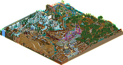
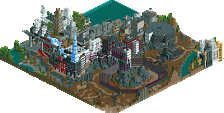
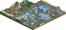
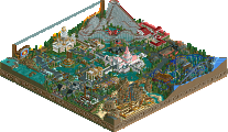
I love the overload of detail but as Toon said, it just didn't come off as pleasing to the eye. That and it seems to defeat the purpose (imo) to build details into places that can't be seen without removing other details... Well I mean seen in full. If part of it was already exposed and thus baiting me in I guess it's alright.
Great park anyway, and amazing attention to detail. If you can nail overall composition with that sense of greatness coming from little things then you could very well become known as the greatest parkmaker of all time... Er, that is if you build a full solo with it.
Very glad you entered and grateful for everyone else who competed (or judged). Without you people NE just wouldn't be the same.
Ride6
Shame on you
Here you have the lay-out of the invert. Haven't got time for the others though.
Fatha' Offline
Dayum...he called u fat....beat his ass.
I'm unfamiliar with Busch Gardens, so I can't say if it's realistically accurate...
Aside from that, it didn't feel realistic at all to me.. At least not like parks as RoB, any of Slob's parks or your previous SFWoE.. The main point of not being realistic imo is the clutterness.. Even if I compare the previous posted BG pictures, I can't really relate it to your park.. I should've done some wider pathing to spread it out more I think.. But I don't think that's what you were going for.. It reminded me of you RCT2.com Road Rally finals park you did a while ago.. Kinda the same style.
Aside of the realistic aspect, what was there was pretty nice.. Not mindblowing, but nice.
The rollersoaker was impressive, and motivated me to do some RCT3.. Kinda weird.. The other coasters didn't do too much for me.. The Intamin Rocket coaster on top of those buildings felt awkward.. I like to see the coasters apart from the pathing, but that could be personal preference I guess.. I didn't really like the supporting job on the invert.. Kinda too overwhelming imo.. Its lay-out and pacing were brilliant though (as was the woodie's and Intamin's) and proves to me you're one of the best coaster designers in the game..
The rapids (especially the part with the wooden coaster hack) was great.. A nice lay-out with a good guidance system... I also did like the foresty area, with the flume ride and those huge trees, that's really clever!
All in all a nice effort, but like XCoaster's park it was too much about the 'little things' for me, and I guess that's not really my cup of tea..
My judging:
1 | Sea World Brisbane- Steve
2 | Zodiac Thrills- cBass
3 | Tièrre Mòrtica- Corkscrewed
4 | En Midvinternattsdröm- DarkJanus
5 | Ecstasy Summit- JKay
6 | Busch Gardens Sydney- Phatage
7 | DisneyAir- XCoaster
8 | The Time Machine- X250
9 | Euphoria City- Ride6
10 | The Genesis- Magnus
11 | Memory Lane- Kumba
12 | Mossflower Wood- Jazz
13 | Rugged Range: The Last Ride- Old Red
Now I'm looking forward to this other park also in Australia iris hinted at..
I'm guessing it will be Titan's entry, and like last year's '0' park will be posted afterwards..
Oh, and thanks to iris and his gang for organising this whole contest.. It certainly proves NE's still in its own league!
SF
Corkscrewed Offline
This park... is by no means perfect. And I wouldn't even say it's a definite winner. It's not exactly pretty, and it definitely has issues of overall tightness and a lack of true synergy. In fact, with Natelox's whole recent spiel about the sum of a park's parts needing to add up to more than its whole, I'm surprise this one got the highest score, since it definitely wasn't a park meant to be viewed from afar.
And yet, none of these "flaws" are really faults, because I can confidently assume that Phatage meant to do all of this.
Fantastical Realism. That's what we christianed him when he built SF WoE and Epica. And what I see here is a very focused intensity towards realism in the details. A lot of these people have mentioned already, but when you have a park with:
- Water shots coming from the river below coming up towards a roller soaker
- A roller soaker with track hacked to look like roller soaker track
- A log flume with hacked in bobsled banked turns to simulate the extra protection a real log flume would have at the turns
- The creation of bigger, thicker trees from regular pines and a bunch of jungle shrubbery
- Park advertisements
- Alpine patterning on a roller coaster station themed to skiing
- An actual working rotating platform that turns for a rapids ride
- And much, much more...
You are definitely talking about a tremendously concerted effort to create a park that is as realistic as RCTly possible. And Phatage has done this better than anyone has ever done before. When I was talking about how an ingenious park could beat my very solid but not phenomenal Tierre Mortica, this was what I was envisioning.
The serious parkmakers of RCT have always been about Innovation. The whole Spotlight idea was brought up in the spirit of creating new things and expressing ideas in new and creative ways. So the fact that Phatage has come up with numerous little theme park details using subtle hacks is really a credit to his sheer ingenuity--something I can only hope to match one day.
Now, to me, the expense of all this is overall park concision. In part due to the map size, and in part due to the way Phatage organized it, Busch Gardens Sydney was indeed much to cramped to reflect an overall organizational realism. Having looked back at your post with those BGW pictures, I am even more affirmative in my point. It's not areas themselves that are cramped. Indeed, as you've pointed out, the path sizes are about the same thing. However, overall, the park is cramped. In the real parks, Busch Gardens has the benefit of being able to space their lands farther away from each other to create buffers and transition spaces. You did not do this here, and that's why many people are getting the "cramped" sense, even though your actual public spaces are not technically crowded.
Now, you've addressed this in part with your statement that within the confines of these lands, peeps would probably not experience the same tightness, and to a certain extent, I agree. However, because this is RCT 2, and the game is built upon an isometric engine, you have to make certain concessions to the idea of space. You cannot simply say that while an aerial view will reveal a park's overall crowdedness, because people inside the park wouldn't notice, you can still cram everything together. So in that respect, that's what "wrong" with the park.
At the same time, I realize very well that in order to exercise your ideas, you pretty much had to do what you did, so don't take the above as any sort of offense. I see it as a calculated risk. You figure out the best way to translate your ideas, and you take the flaws along with the benefits.
As I mentioned before, the park really isn't pretty, either. Steve definitely hit the Busch atmosphere in the head, but Phatage most definitely did not... at least in the traditional sense. Instead, he allows those precious details to do the talking for him, and they work for the most part. The jungle area could have LOOKED better, but I can't deny it was effective. My only moderate complaint was that the area around the Rocket Coaster was sort of messy looking, especially with that custom ferris wheel slipped into that tangled track, so that the overal distinction of spaces that Busch Gardens is masterful at is sort of lost.
But anyway, my point was that Phatage has never really been the expert themer; he lets the innovative ideas and creative details paint a different sense of beauty. What he did in Fright Nights he repeated here, and so while few people would say that BGS looks exquisite, most would still agree that it looks cool.
The coasters were pretty good overall. The woodies are the only ones I take exception to--mainly because they definitely end too quickly. And because they just don't seem realistic at all. It looked like you cramed them into as tight of a space as you could to get them to duel. Again, I'm guessing it was a space issue, but in a park where you have so many realistic details like custom supports and even a rocket coaster cable guide to the hydraulics room, to go and plop a coaster that doesn't even remotely have that realistic aesthetic seems to defeat your purpose. But that's just the way I look at it.
Denali is definitely the best RCT 2 invert I've ever seen, and one of the best inverts ever. This will definitely go on Iris' best rides ever list that will be revised for the 2948th time the next time Iris wants to revise it. The coaster had great speeds, pacing, and ratio. The biggest mistake I see people make in designing coasters is that they pack a ton of stuff in the first half, plop in a midcourse brake run, and then the second "half" is just two corkscrews and a couple of turns. That's pretty bad design. However, Denali was a wonderful deviation from this mediocre norm, because both halves are well structured to provide an equal amount of thrills, so that the midcourse brake run really IS a brief moment to catch one's breath before more thrills. This coaster felt full and seemed longer (in a good way) than its 2:10.
Rocket coaster was pretty neat, although as I mentioned before, the fact that it sort of twisted over and through everything seemed to detract from what I perceive as the traditional Busch Gardens atmosphere. This may be purely a matter of opinion though.
In short, I don't think we'll be able to establish a definite position about this park. Viewers more into aesthetics will enjoy this park less than, say, mine or Steve's. Those who love to explore and find little creative details will be absolutely enamored with this park. And so as the final scores reflected, Busch Gardens Sydney boils down to a matter of taste (in terms of deciding whether it IS the best of this batch or not). It depends on what you prefer.
However, in saying all of that, there is no denying the time, effort, skill, inventiveness, and enthusiasm placed into this park, and I congratulate Phatage on crafting a fine masterpiece in ingenuity.
EDIT: Whoa, that was pretty long.
Xcoaster Offline
Anyways... Back to studying...
What he said.
Corkscrewed Offline
Corkscrewed Offline
Will there be a PT3?....who knows, but as RCT2 flourishes I think these contests are getting far too difficult to judge objectively. I personally think head-to-head contests, such as QFTBX & H2H, are better nowadays because they only compare two parkmaking styles and not 14. Imo, there is too much diversity among RCT2 parkmakers today to really make the PT an accurately judged contest. However, I do congratulate everyone who participated, especially the judges, now that I know how difficult it was to judge this thing.
However, that is also what is so great about the PT. It isn't necesarily about who or what park wins, its about what people take from it. I love nothing more than a debate over something like which park should have won the PT, if a certain park is better than the other, if the judges did it right etc. It makes for a great competition with unexpected twists (ie. Jazz getting a 12 and 13 from RCT1 parkmaker judges) It's safe to say that almost everyone who has put down their list of how they would have judged it got different orders, but I think that's half the beauty of it.
I really do hope that there will be a PT3, but lets not look too far into the future now.
Metro
Metro
Corkscrewed Offline
Nope... no idea what you're talking about. Check my post even.
EDIT: Post #8000!!!