Park / Busch Gardens Sydney
-
 18-March 06
- Views 17,110
- Downloads 1,210
- Fans 5
- Comments 89
-
-
 76.25%(required: 70%)
 Gold
Gold

Kumba 90% CoasterCreator9 85% Sulakke 85% csw 75% Jaguar 75% Liampie 75% pierrot 75% alex 70% G Force 70% trav 70% 76.25% -
5 fans
 Fans of this park
-
 Full-Size Map
-
 Download Park
1,210
-
 Objects
459
-
 Tags
Tags
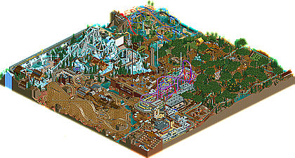
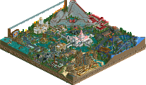
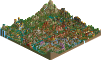
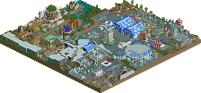
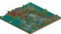
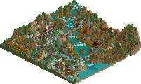
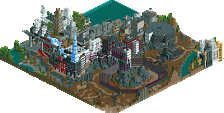
Even still... this park was awesome enough for me to do one of those
'little things' posts. Here's 13 things I thought were incredible:
If the hacked realistic Setpoint track wasn't enough, the spinning coaster car used as a water blast thing really sealed it for being the most realistic you can get.
That track used for the angled braking- something that's a staple on Intamin rockets, just impossible to do in RCT. Just looks so good here, though.
Subtle hacking even inside the buildings. 2 rail track on the brake run and transfer track- where the stresses are low.
Love the gears and stuff under the magic carpet ride. I also liked the window above that and the sign that can only be meant for riders to see that says "hang on tight"
Excellent supporting structure to that.
This whole whirpool thing is a great idea. Starting with the fencing up at the time to the spiral drop where the boats would be sucked around the whirlpool and sorta slinged (slung?) around to the next part of the course. I also love how the coaster frames this area with the diving helix thing.
The thickened spine on the lift and brake run were excellent. Allows for less supports. Also, I like the other supports to hold the lift stairs in between the major lift supports.
The hacked bushes on the ride give it that nice western feel. The little bit of trick track on the coaster is also a nice touch.
The metal crossmembers when the track crosses over places really adds to the realism. Just like any new wooden coaster.
I liked the doorframe for some reason.
Back to the invert and those really nice support pieces on all the inversions. Somebody outta make a custom piece to fit those so it looks better, but I'm just glad somebody decided to go as far as even adding supports like these.
For some reason, this just looks like a skilift station. I don't know why, but it has that feel- all the way down to the color. Maybe because it's on that bit of mountainous terrain. But I just think it looks cool.
Last one is the fake building facades. Wonderful for the western feel.
So that's all... wonderful realistic park.
And if you and Panic ever go at it in that realistic coaster competition, I'd be very inclined to try that out as well since I try to always build realistically.
I was slightly disappointed when I opened the park. It just felt extremely cramped and over done at first. I also noticed some really glitchy parts that immediately turned me off, especially some scenery peices that interfered with the flow of a coaster or ride. I also didn't like all the smoke puffs (what is it with those these days?) and didn't like the flow from one element to the next throughout the entire park. But it did get better from there.
I came across the snow themed area and immediately fell in love with just about everything here. Denali is easily my favorite coaster of the competition and absolutely loved it and its surroundings. The support work is just terrific, the layout brilliant and the whole area has loads of atmosphere. Although slighty cramped and glitchy, even the Colorado River Rapids was a nice addition. Definitely the highlight of the park for me.
The other areas were either just typical or below-average Phatage for me. Tons of hacks (some more obvious that others), tons of rides, sporadic foliage and some downright strange architecture. None of it really held my attention too long. The Hawaiian area would probably be my next favorite area, with the conservative shuttle invert, "Analanapakipakiashui" (name is a bit over the top imo). The forest area I wasn't really a fan of. I think I understand what you were going for with it, but it didn't work for me. While the custom trees were nice, I felt there were too many of them. I also found the foliage and landscaping very sporadic and un-harminous here. The Mardi Gras area was a great idea, but again, was way too cramped for me to really enjoy.
Overall, the park was tremendous but not really my cup of tea. In terms of realism displayed in this contest, this park owned, with Xcoaster & Steve's parks not too far behind. However, IMO, this just seemed like a glitchy and cramped version of SFWoE put into the Busch format. While I do admire your ballsy approach to parkmaking where you sacrifice so much beauty for realism, I do feel ,however, that approach was way overdone here IMO. I don't have much room to talk though considering you won the contest with this, but its not my favorite piece of Phatage work ever, except for Denali which I will hold in my book as one of the best, most realistic inverts ever. Its tough to place this one, but 4th place seemed appropriate for me. Big congrats on winning the contest Phatage.
If I were a judge:
Old Red [4.0]
Magnus [5.0]
Kumba [5.2]
Six Frags [6.0]
Jazz [6.5]
X250 [7.5]
darkjanus [7.9]
Steve[8.1]
Ride6[8.3]
Phatage[8.35]
Xcoaster[8.4]
cbass[8.5]
Corkscrewed[9.0]
I would also like to know why trav did not send in a entry, seeing as he took that extra spot which many others wanted.
I'm very, very glad you noticed that little feature, because that was what the park was intended to be. If you look at the scenario objective, I'm pretty sure I mentioned that the park was built entirely after the new millennium, 2003 for the most part (which explains why BSB has lap bars). Here's another interesting little fact, what I wanted to do with this coaster selection was take a big hit from BGW (Denali), one from BGT (Ghostown Showdown), and one that seemed logical for the times (BSB). I also wanted a family-coaster that the stereotypical, go-getting Australian would enjoy which is how the setpoint super-soaker came to be (the name is a little riduculous, I had thought of it coming back from Hawaii this summer though). In the end, I ended up with the main coaster selection of my favorite park in real life, by pure chance! Any guesses?
Corkscrewed Offline
And here you see a pair of the classic land whales... if those two much smaller prey don't get out fast, they might get eaten!
edit- I don't think they're at the park for the rides.
Edited by HandyAndyG, 19 March 2006 - 02:27 PM.
Phatage, is there a certain time frame you'd prefer or should it be more casual, like just when both are done.
Edited by Panic, 19 March 2006 - 04:13 PM.
While some of the stuff here is a bit... out there, (i.e. the entrance area) this was a great entry. Definately in my top three.
Coasters were brilliant. Delani is for inverts what Manta was for floorless coasters. Bourbon St. Blast is, IMO, the most realistic Intamin Accelerator built in the game so far.
I, too, had a problem with how cramped the park seemed. I understand why you had the narrow paths, but I really think this is one of those things that you just can't translate directly from real life to RCT.
Congrats on #1, Phatage.
-ACE
panic, check your pm
Although, cramped in areas, I thought it was neat to see a cramped park--a complete polarity to most of the parks I see today.
I did love every bit, every detail... down to the naming. The New Orleans area was pulled off especially well, and the invert in the snowy area was the best coaster of the entire competition. Definitely going to get my vote in the NE Awards.
Nice job Phatage, and congrats on the #1.
It was very cool and all. You had wacky ideas, and pulled them of perfectly. You have a touch for parkmaking I can't denie, you give eye to the tiniest details. I really loved the tree area, I'll give you full credit for the trunks only! They're so well found, usually people use stinking coaster pieces or wuarterblocks, but this actually looks like a tree! They bring some.. safety to that area imo. I loved that small eating place, very well hidden underground. One sad thing for the guests though, at one entrance for the Spiritsriver they only get a lifthill
The boston area looked very good, but the streety-ness, which was probably what you were aiming for, imo killed it, It didn't really give a clear view to the area, which looked amazing, and the coaster also covered the scenery. Very cool how you can use those colours and keeping it realistic.
The 'Soaked' area was again so wonderful, realistic, creative and original. I mean that rollersoaker, the water blast, the slides. (working and all). You even put stairs upto them undergound where you couldn't even see them!
Then there's the Western area, very nice again(getting bored of it ;P ), the coasters looked good, but they were so forced to fit in that tiny area, just like some of the other things. You have amzing ideas, and you can pull them off realistic with all so many details, but if it was just spread out on a bigger parkmap, with also peaceful places it would have stood out even more out of the others. I can go on talking about the park but that's just what it comes down to.
This park just stood way above the rest of the entries, but still there's soemthing keeping it behind. If it weren't for all the details and creativity, I probably would have hated it. Mixed feelings about it.
14| Kumba- Memory Lane
13| Old Red- Rugged Range
12| D4rkJ4nu5- En Midvinternattsdröm
11| Corkscrewed- Tierre Mortica
10| Jkay- Ecstasy Summit
9| Magnus- Genesis
8| ride6- Euphoria City
7| SixFrags- Cinemagix
6| cBass- Zodiac Thrills
5| Xcoaster - Disney Air
4| Steve - Sea World Bribane
3| Jazz- Mossflower wood
2| Phatage- Busch Gardens Sydney
1| X250- The Time Machine
Edited by Akasha, 20 March 2006 - 03:13 PM.
The invert, i must say, is one of the only coasters that made me think i'd be proud of it myself if i made it. The wooden duellers seemed to end a little bit too quickly, the intamin was nice but nothing too special there. Lots of nifty little details, way too cramped but i can tell that's been said before without reading the above posts. Anyways.. back to that invert. This, panic, is what i talk about when i say using straight track adds to coasters! Look at how beautiful it goes into those first few inversions. I really love how the entire layout feels themed, in place (though the corkscrew isn't my favorite part, but it passes, easily). i'm stunned, i went into the game expecting some ok invert that i wouldn't like.. how was is wrong! Now go learn how to make the game look smooth and pleasant to the eye, put some awesome coasters and work your ideas in without them stealing the show everywhere so that your eyes don't know where to look at (though i'm sure, this can be looked at as a good thing.)
Anyways, my list.
Phatage's Busch Gardens Sydney
Cbass's Zodiac Thrills
Xcoaster's Disney Air
Corkscrewed's Tierre Mortica
Steve's Sea World Brisbane
Dark Janus' En Midvinternattsdröm
Ride6's Euphoria City
Jkay's Ecstasy Summit
X250's Time Machine
Magnus' Genesis
Six Frag's Cinemagic
Jazz' Mossflower Wood
Kumba's Memory Lane
Old Red's Rugged Range
I think this year has still been pretty nice. The quality wasn't great, amazing, or anything near that in my opinion, but given the parkmakers such as mala, posix, rrp, kiri, toon, turtle, slob, xsector, etc not entering.. i say i could have expected worse ;P.
Congrats Phatage on winning.
Corkscrewed Offline
... okay... considering I'm basically average sized, I'm not sure what you're trying to get at.
Edited by HandyAndyG, 20 March 2006 - 05:02 PM.