Park / Busch Gardens Sydney
-
 18-March 06
- Views 18,132
- Downloads 1,284
- Fans 5
- Comments 89
-
-
 76.25%(required: 70%)
 Gold
Gold

Kumba 90% CoasterCreator9 85% Sulakke 85% csw 75% Jaguar 75% Liampie 75% pierrot 75% alex 70% G Force 70% trav 70% 76.25% -
5 fans
 Fans of this park
-
 Full-Size Map
-
 Download Park
1,284
-
 Objects
459
-
 Tags
Tags
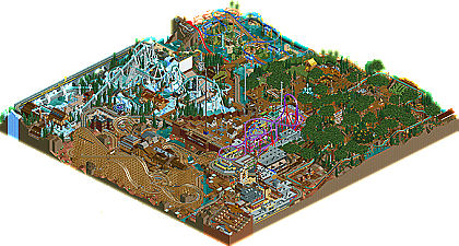
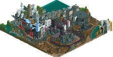
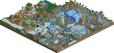
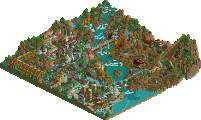
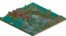
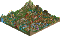
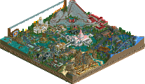
And now for the gold. One of the quickest superstars we've ever had here at New Element, it only took one year from Phatage to go from under-appreciated parkmaker dropping subliminal gems such as "Epica" to him now getting the shine he deserves winning the second annual Pro Tour. He joints the elite company of Natelox, X-Sector, Toon, Mala, and cBass as the only parkmakers in NE history to ever win one of our prestigous contests. And what an interesting park he made to pull it off. Ironically, with all of the extremely complex works of fantasy Phatage has become known for around the community, one of his most experimental projects of all time may also be one of his most realistic. Not many parkmakers can excel at both fantasy and realism, yet Phatage proved he can do just that at this year's NE Awards when he swept awards for both categories. Those looking for a park in the same vein as "Epica" or "Fright Nights" might not understand why this park placed first. Those who really appreciated "Six Flags Worlds of Excitement", or any other of Phatage's recent realistic work will be in absolute awe. Busch Gardens Sydney is loveable in many of the same ways our #3 park, "DisneyAir" is. It may not look beautiful from far away, but once you truly explore everything the peeps were meant to, you'll learn to appreciate it a lot more. The park packs a punch when it comes to coasters, headlined by the icy Inverted Coaster "Denali", my favorite ride in the park. There's also a set of dueling wooden coasters, entitled "The Sheriff" and "The Wanted", which are incredible as well, minus a small decrease in quality towards the middle-end, probably due to space constraints. Then there's the very ballsy forest area of the park, overgrown with gigantic trees and sprawling plants, where almost nothing except leaves is visible from the overview, yet has so many incredible details packed within that it still keeps that Phatage charm. Congratulations Phatage on joining some elite company...earning possibly the highest honor this site has to award. Oh...and by the way, now that Busch Gardens has placed a park in Sydney...it appears it's about time for some nearby competition....To be continued.
edit:
____
Edited by chapelz, 18 March 2006 - 02:11 AM.
Edit- HOLY CRAP
Edited by OLE, 18 March 2006 - 02:31 AM.
Rhynos Offline
i edit the post when i've checked the park
very well hacked=)
Now if you could do this again but on a bigger scale...........
Great use of those landblocks to make earthy umbrellas. Also love the dining shelter thing. Not to mention the realistic touch on the log flume after the drop to slow the log down a bit (or stop it from going slightly sideways or whatever it is for in real life). Oh an the obvious large trees which are a stroke of genius, albeit slightly overpowering.
Gotta love those escalators in a nice shelter with plants overgrowing onto them. Another example of a realistic touch on the log flume with a ladder leading up to the top in case the boats were to get stuck. I also liked the discrete hack of the bobled track underneath the flume to give it a more realistic, tubular look.
A (in RCT3) rollersoaker (not sure what they are called in real life) Awesome use of hacking here to create a realistic and new kind of track. Love the waterfall that it goes through. There's also an awesomely excecuted Lazy River. I though the whole waterpark in general was pulled of fantastically considering the limits or RCT2 in that department.
My favourite ride in the park, and quite possibly my favourite Invert ever. The support work on this is the best I've ever seen, and some that I am sure I will be taking influences from in the future. Love that red and white thing...I think it's a lightning rod, but please correct me if I'm mistaken. The position of the Batwing in comparison to the rapids is just perfect.
Those lights are awesome, I love them. And there's that custom ferris wheel style ride which is another example of great hacking.
Using the glass walls to create a layered land texture is a fantastic idea and pulled off really well too. It's used a lot over the western area and I'm sure it took a lot of zero clearancing and patience to do. Nice one.
An awesome rocket coaster. I loved the realistic touch of the hydraulics buildings with a piece of "chain" connecting to the end of the launch. Just shows that Phatage knows his stuff concerning coasters and puts in every realistic detail. I also like how the rocket coaster seemed to be on top of everything rather than intergrated into it, showing how it was probably built more recently than the rest of the area.
This was one of my favourite details and it's used throughout the whole park. I love the way you hacked some stairs onto a sloped path. Makes it realistic as there's steps for peeps, and slopes for disabled access. Something that would be found in real parks, and something that I would never have thought of doing before. Another example of the layered land texture too.
Was cool how there were some block pieces zero clearanced onto the western buildings to make it look more like a roof. Generally good intergration of the multitile buildings.
Advertisements. All parks have them, but you rarely see them in rct parks. Phatage has used them all over his park to give it a more realistic and believable feel.
Had to cut away a bit of tree to get a decent view of this. Goes to show that there's probably a whole lot of details I haven't noticed hidden under the large trees. Anway, this is a cool rainbow for the entrance of the valley rainbow chairlift ride. Just looked cool imo.
A cool donkey ride with hacked grand national horses. Generally a cool idea, and the open space gives a bit of a rest from the compact and somewhat chaotic rest of the park.
The sign there says "A Kodak Moment" or something along those lines. Another cool touch that shows how Phatage sees the park through the eyes of a guest. There are quite a few of these throughout the park where guests would get a good view of a ride or whatever.
More great use of those lights to help pull off what is a hard theme. Lovely buildings here and many of them house that awesome ghost train (apologies, can't remember the name)
A nice little campfire with a smoke signalling Elephant. I reckon there are tons more details like this that I have missed so far, which is another reason that I will look at the park again and again. I'll probably do some more "little things" for this park in the near future.
Anyway Phatage, thank you for creating quite possibly the most realistic park ever made in RCT2. Congradulations on desevedly winning the contest and I can't wait to see more work from you in the future.
Metro
best invert i've ever seen in all my rct years, i guess.
also the duellers were very lovely.
intamin too of course.
quite a massive and impressive park.
how can you go on building it when the game is already slowed down like that from all the stuff?
for me things were way too dense and compressed to really enjoy anything but the coasters.
still a worthwhile #1, i think.
what future projects do you have in mind?
Kevin Offline
I did notice that there were tons of little details that added to the realism of the park, but it was overall way too cluttered and chaotic for me, so I didn't really like it that much.
But, I do think this park was better than all the other parks in the competition, so It deserves #1. Congrats!
I'll be getting a lot out of this in the coming weeks hopefully, and thanks for putting all the time you had into it.
about the clutterness, I think it resulted mostly in the fact that I used smaller width paths. It was a logical decision, though. For a park this small, it obviously doesn't receive as many guest a day as say something like bgw or bgt, so the paths were made smaller, the entrance was made smaller, etc. I've had the opportunity to visit parks that follow this trend and I've found that it doesn't feel cramped because the paths aren't filled to the max with guest. If the park was the size of a certain peninsula sticking out into lake Eerie, maybe the widest single midway I've ever been to, of course I would've used wider paths. Something like fatha's DMM I would have liked a lot better had either the paths been larger or the map been smaller, its all proportion.
At first sight it is amazing. So many little details that I'll never be able to fully go through. Your work continues to amaze me.
I will say though, that I'm a little dissapointed. The areas transitioned into each other nicely, but the park overall didn't feel like a real park. I mean in SFWOE, it felt like a real park. This felt like RCT parkmaking "realism". I don't know how to describe it any better than that. And thus, I'm a little dissapointed.
Well done and congratulations on the winning park. The coasters are excellent. I can't wait for what you have in store for us in the future. (hopefully you'll stay around after you begin college)
But still, what I saw was nothing short of brilliance. It wasn't pretty or anything but it all comes down to the substance of the park to make it what it was. The coasters? Perfect; I think Denali and Bourbon Street Blast are my two favorite coasters of the contest. I also didn't mind the small paths in the Orleans area since they're basically narrow alleys in reality, right? Anyway, I ramble on.
It's very worthy of the gold, I think, although it might not be my favorite. It was just very hard to enjoy due to the lag on my end, but all the details made up for it significantly. I'm on Toon's boat, basically.
I could make about a 4 page post of little things alone for this. lol
Also to comment, I feel very strongly that the smoke puffs add very little in terms of atmosphere to a park and actually very little in terms of realism. All they really do is slow a park down and I plead with parkmakers to stop overusing them. As a restauranteur, a rooftop ventilation system does very little other than remove hot air, most of the smoke and grease is captured by filters in the hood above the cooking appliances. It's only in the event of a serious smoke issue that you would ever see real smoke coming out of the stacks (actually our ventilation system uses fans, not stacks, so the stacks you see on a lot of buildings are probably for the plumbing in which case you'd be in real trouble if there were smoke coming out of them
Congrats on the win, enjoy spending the money too... If you are feeling generous maybe you could spare me a few $'s?
-X-
Agreed. But then again I'd actually wouldn't know which park had the #1 look. It's very cool with the the details and all, but something about it bothers me, can't really put it in words. Thanks Metro for doing a 'little things' !
1.5.Xcoaster, Phatage
3. Corkscrewed
4. Steve
5. cBass
6. JKay
7.DarkJanus
8.x250
9. ride6
10. Kumba
11. Jazz
12. Old Red
13. Six Frags
14. Magnus
I think that this park and disneyair were just as good, but in different ways.
The details were awsome, the best part imo was the banking on the flume, also the water drips and blasts on the watercoaster, your Elephant smoke signaling a P into the air, the glass to form the colored land, the party lights, shit I could go on all day.
However the crampedness hurts it imo, even in the area with normal sized paths you cover more then half the area with huge custom trees? 1 or 2 would have been enoght imo.
Btw, what you gona do with the $100?
Great park, gona start another topic and talk about it more later too.
Thx Phatage
where was it?