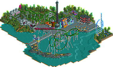
Park / Dimi's Superhero Island
-
 26-August 10
- Views 4,631
- Downloads 991
- Fans 1
- Comments 20
-
 64.23%(required: 65%)
 Design Submission

Liampie 90% turbin3 80% Evil WME 75% SSSammy 75% CedarPoint6 70% chapelz 65% John 65% K0NG 65% Roomie 65% ][ntamin22 65% nin 60% posix 55% RCTNW 55% 5dave 40% geewhzz 40% 64.23% -
1 fan
 Fans of this park
-
 Download Park
991
-
 Objects
274
-
 Tags
Tags
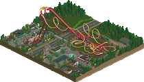
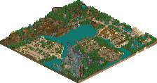
And I can't really understand, why this didn't win.
The foliage was amazing, the landscaping was great, layout + theming was good.
Good job Dimi, definately design-worthy
1. The pacing is nice, but it goes through that cobra roll at 42 miles.
2. the launch was just, ehh.
3. The coaster doesn't do well with guest; in the sense that the coaster should be the main focus, but the postion of the coaster being off to the side just shows of the architecure as the main eye appeal to the viewer of the park.
I liked it however,so sorry for not getting design on it, Dimi.
tdub96 Offline
Couldn't you have dimported a multi tile black tile piece to get rid of the rest of the grass? That did kind of take a shine off it...
Well, regardless, I really appreciate this and though it does have some spots that could be improved upon as mentioned in above posts, I think you achieved something quite nice. Great job!
I feel like you answered your own question. Oddly enough, those were the exact issues I had that precluded me from giving it a higher score.
Well I can understand a score of 60% but not 40%... 60% is good but with faults, 40% is just plain bad. It means the judge didn't really like it which I don't get. Sure it has flaws...
@ jaguarkid140: that's exactly the part I didn't like very much either, but I thought it suited the surroundings.
@ djbrcace1234: personally I don't care much about the coaster speed, but I understand most of you do. I didn't think it was worth redoing the whole coaster. Why is the launch just ehh? It's pretty basic but not ugly, is it? About the coaster position: I just suck at park layouts.
@ tdub96: I won't turn it into a park, or not in the near future. Mr. Freeze was just ment to be decoration to add some realism.
@ deanosrs: me too. Again, what's wrong with the launch? To be honest I don't like Titan's launch. It was never my intention to recreate The Incredible Hulk perfectly, it's just an interpretation. How should I've changed the cobra roll?
@deanosrs: I agree. Should a full park of this quality 'win' Honorary Mention in the eyes of the lower judges here?
Disagree. The 'main' part of the coaster is very viewable from the paths, and I if I walked there my attention would definately go to the lake side and not the architecture side of the path. The second half of the coaster is, just like the real Hulk coaster, more 'hidden'. It's very well visible from the station area and the queue though, I think it works really well as a 'teaser' for the queueing guests. I see no problem here!
I think launches are better from the perspective of guests when you go slowly up the lift hill most of the way then get launched at the top. This launch was at the bottom then the ride slowed towards the top, whereas I think once a launch lift hill starts it shouldn't stop until the first drop. I just think otherwise all the launch is is a short cut to the top of the lift hill; it should be more than that - it should take the guests by surprise. They thought they still had another 40 ft of lift hill to go, then all of a sudden before they know what's happened they're halfway down the first drop!
With Titan I was referring to the tunnel he built which looks better and actually quite a lot like the Incredible Hulk. You can see what I mean on the incredible hulk on this photo:
http://rcdb.com/557.htm?p=604
It's a tunnel in the air; whereas yours looked like a cage over the track. I know you may have felt that just looked better given you weren't trying to directly recreate. It's cool you can still see the trains; but on the flipside it doesn't look quite as good.
With the cobra roll, I think they look best if both large half loops go to the outside, and if the two tracks aren't directly next to each other on entry exit. I always do my RCT cobra rolls like; large half loop left, corkscrew, straight, (optional further straight), corkscrew, large half loop left. One of those things that the community seems to have built up a "rule" as to how to do it. Rules are made to be broken and the best RCT parks break these rules and not only get away with it but make it better than it could otherwise have been. In this case I don't think it looked quite right though.
Anyway bad luck. I can see your frustration regarding recent designs. Looking at them, this is as good. For me, especially with people going smaller and smaller on maps these days it seems, the quality required for a design should be 75% not 65%. This getting 65-70% and just missing a design would have been fair enough, ignoring recent designs. You can see the problem judges have though - they're not just thinking, "what mark should I give this out of 100", they also think, "is this worthy of a design? If not I can't give it 65% or higher!" And then what a "design" should be I'm sure is slightly different from judge to judge etc.
Not having a go at the system or anything it's so much better than when it was just down to whether Iris liked something or not! But every system has unavoidable flaws and there's usually someone who loses out.
But at the end of the day, you enjoyed building it, many others including me and I'm sure most if not all the judges enjoyed viewing it, so it really doesn't matter.
wow.... I downloaded it and looked through it and realized Dimi's point, it was an Interpretaion!!!!
anyways, great foliage and architecture... Great job, but too bad.
Most certainly not. But the thing is, you can't judge something by what isn't there. Undoubtedly this would have scored much higher had it been a part of a map, as opposed to a standalone design where weaknesses tend to be magnified tremendously.
For me the two--what raw number out of 100 and the accolade thresholds--go hand in hand. If I liked the submission enough then it will garner a score worthy of an accolade. If I don't, then it won't. At any rate, yes, it does suck to come so close but not quite reach the threshold. And at the same time, it's impossible to fault people for having their own personal preferences--preferences that can easily be tracked through a panelist's voting record. Sometimes falling just short of the threshold happens, but that's just the way the cookie can crumble when you take 15 very different people and ask what they think of something.
@ deanosrs: thank you for the detailled feedback. You're absolutely right about the launch speed, but I still think the 'tunnel' looks better when you can see trains going through. I think when I built the layout one and a half year ago I made the cobra roll this way because it was more easy to support, but I'm not sure. You're probably right that it would have looked better if I had built it the way you described, but that's in my opinion a tiny detail. I understand other members find it more important.
@ Austin55: thank you, I like your work too! There's definitely new stuff coming along, but it's going slowly. Furthermore Värmland Park is at 85% or so, but I'm not rushing anything. I've recently uploaded Pacific Pier, an old RCT-Guide Summercontest entry, but other than that I don't have finished unreleased stuff...
I'd still like to know why Nin, RCTNW, posix, geewhzz and 5dave voted that low though. If I'd understand your reasons I can keep them in mind when I want to release future work.
A few reasons I voted that low:
First off - it's a rip-off of the Superhero island of IOA, and therefore not your own idea. I expect rip-offs to be either extended with own ideas or improved. And IMO it was a lot weaker than the original. What I'm trying to say is that you used an idea what was already there and didn't use it to its full potential. I wasn't a fan of the archy that much. It was nice, but looked too sterile. I know it's a cartoon area, but still you could have included many more details. The transfer track, the station didn't convince me either. I didn't understand why you put Mr. Freeze on the map. Seemed out of place imo. Pacing and the tunnel didn't really feel right either.
But there were many positive aspects in this design too. IMO it was one of the best interpretions of the theme. I haven't seen many Hulk-attempts yet. So kudos for that! The hacks, the supports and the layouts were all very nice. The tunnels were also nicely executed. Foliage was nice and the broken down top spin was a great idea.
Maybe I was a bit too strict but still these are my thoughts.
Looking forward to see what you come up with next!
"MFG"
Don't do that! Unless you agree with them... just build stuff you enjoy watching. But always go with what you prefer rather than what the judges do. It's a subjective thing, please yourself and the game is so enjoyable. Try to please others and it becomes work.
@ deanosrs: of course I only build for my own pleasure, and I only build the way I want to. I'd never change work because someone else would like it better, but that doesn't mean I can't improve my work by listening to the comments of others.