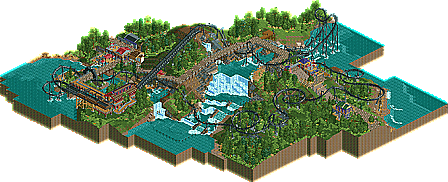
Park / Bird of Prey
-
 22-August 10
- Views 1,745
- Downloads 632
- Fans 0
- Comments 7
-
 56.54%(required: 65%)
 Design Submission

RCTNW 80% Kumba 70% CedarPoint6 65% turbin3 65% chapelz 60% John 60% K0NG 60% posix 60% 5dave 55% Liampie 55% Evil WME 50% Roomie 50% SSSammy 50% nin 35% geewhzz 30% 56.54% -
 No fans of this park
-
 Download Park
632
-
 Objects
251
-
 Tags
Tags
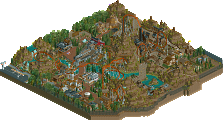
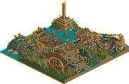
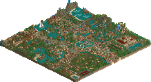
The layout is a little tedious, it goes on for too long and for me resembles just a large circle much. When guests look at a coaster from the ground they shouldn't be able to easily work out where it's going imo - it makes riding it so much more exciting. I say that as a theme park visitor myself rather than putting myself in the shoes of a little rct guest!
Try some crazy stuff and see what happens - might be more exciting to build and for people to view!
the moment the train accelerated to go into the cobra roll was fantastic. as others have said though the layout became a little insecure after that.
what i would advise you is to adjust your focus towards park design. right now you concentrate almost entirely on layouts, custom supports and landscaping. you take an extreme amount of care especially with the latter two and you do it well. but without a park focus, as in shops that have a bit more meaning than "pizza stall 1", other more gentle rides that know why they exist instead of being added randomly, or simply just recreational areas for guests to relax, what you create has so little to do with a park that as the viewer you can't identify your creation well. try to see yourself more as the ceo of the park instead of a coaster designer.
I enjoyed this but as others have said the layout sort of lost cohesion towards the end. The landscaping was excellent and the corscrewed hill over the path after the barrel roll would look awesome
Hey posix how come this got no points in the DB but his previous two design submissions did?