Park / Cowboy Bebop
-
 26-August 10
- Views 2,111
- Downloads 688
- Fans 0
- Comments 5
-
 57.31%(required: 65%)
 Design Submission

Evil WME 85% Kumba 80% turbin3 70% CedarPoint6 65% chapelz 65% BelgianGuy 60% Liampie 60% RCTNW 60% SSSammy 60% ][ntamin22 55% K0NG 50% nin 45% 5dave 40% John 35% geewhzz 30% 57.31% -
 No fans of this park
-
 Download Park
688
-
 Objects
237
-
 Tags
Tags
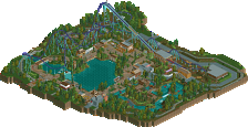

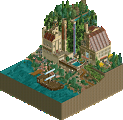
I thought it lacked charm. I think a lot of RCT parks get this by using stuff like the RCT windows and doors over the glass which I always thinks removes charm (actually, this park reminds me a little of a coaster I built in a pro tour once - the GTA one, think it's on my profile). It just all seems a little... dead... but then is that the theme?!
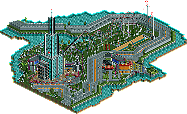
Architecturally, I'd just add to the above that I think you overdid it on diagonals a bit. For me, RCT is primarily stuff at right angles. This is when we can be the most creative because objects line up most effectively. Personally, diagonals blocks and the curves of rides when used as building "blocks" should be used only to allay the blockiness of RCT or if you have a good creative idea for them. It seems on one set of buildings they were diagonal buildings almost which doesn't work as well because you can only see one side of the building at any time.
As others have said the coaster wasn't great. Too short and too slow I think. I wasn't a fan of how it went underground.
The above probably sounds terribly negative and I don't mean it to! I think parks deserve more comments than they get on NE generally and there were certainly many things here that I saw and smiled at. The wind turbines were fantastic, as were many other little hacks you had hidden around like the security camera or the power generator.
Your latest screens look pretty cool and certainly an improvement or stylistically more appealing to me anyway, and it's great that from the start of your readme you appeared to enjoy building it.
Congrats on finishing, though!