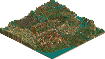
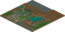
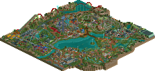
Park / Kumba

56 Comments

  • Levis%s's Photo
    okay you have shown you can do realism also darren. now please come back to the fantasy side.
  • turbin3%s's Photo
    No! :p
  • BelgianGuy%s's Photo
    I agree, you've done fantasy and your realism is really great and very atmospheric and aesthetic, something thats really hard to do with a certain realism style so really congrats for that. I'd like to see a full scale solo in this style of realism by you if you aren't already working on it^^
  • Bolliger & Mabillard%s's Photo
    :eek:
  • J K%s's Photo
    You've done yourself proud. I love it all. I love it that much that your objects have really inspired me when I saw this design a few weeks back that I'm nearly halfway through a design trying all the stuff out.

    Congrats, I think this is your best work to date but please never let go of fantasy either.
  • Chillsons%s's Photo
    Amazing! I've not been on it but im pretty sure that looks alike! :mantis::D
  • dmaxsba%s's Photo
    Been watching you build this in the forums for many months and enjoyed it every step of the way. Congratulations on the big win.
  • Phatage%s's Photo
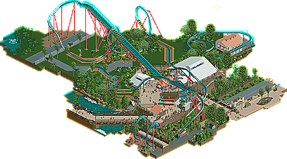
    Great attention to detail obviously. Pacing was pretty accurate too, as were supports and about all of the necessary supplemental coaster structures. In terms of non-coaster details, I thought the area could have felt more overgrown; this more reminds me when I rode the coaster a long time ago but from what I understand from pics and whatnot, it feels more like the jungle it was supposed to be these days. Maybe some larger shrubs lining the paths would have done the trick, stacking them too.

    It really pains me though about that layout; obviously one of the harder ones to translate into rct, but the diagonal station idea I showed in your thread doesn't concede nearly as much design flow just to match things up spatially. I would have preferred more space between the loop and the interlocking flatspins to all the turns in the track you had to implement in the first half of the ride. Of course, making those buildings and other scenery on diagonal axes would have been a lot more difficult, but I was hoping that you would venture just a tad farther outside the box than you already have (to be literal, outside the grid).

    Something a bit more feasible that would have helped would be to extend the map in order to make the area where the bridges connect, but I think you would have run into a space problem there with your current spacial arrangement and so not including it was probably my second favorite option you could have taken.

    It was great to see such a large scale effort pay off for you though, with all the documentation and consulting with the community. One of the great things about recreations is that they can hit close to home in a good way (which I also think is one the reasons why this site has shifted to a more realistic style over the past couple of years, maybe even culminating with you doing a minimal-compromise recreation). Anyway, please don't be all cliche on us and make this your last piece of work, you've always been an inspiration and I know of more than one parkmaker whose rct inspiration has been given a boost thanks to this.
  • J K%s's Photo
    Great words. I actually love how technical it gets when it comes to recreations and how much fine tuning you have to do to make sure everything looks right. Coming from a guy who just loves the scenery side more I thought all the structures were incredibly well done and the catwalks really did enhance the design. I loved the masks you made yet I think they could have been slightly more clearer. Great attention to detail and this is why your one of my favourite parkmakers. Seriously though, new objects are the future of RCT2.
  • That Guy%s's Photo
    While I can't appreciate it to the fullest since I haven't ridden Kumba in real life I can see how much effort you put into this, especially object-wise. I loved following this in the topic and even though I've already seen most of this, it's just as stunning as when I first saw it.

    Gratz on what I believe is the new highest ranking design.
  • RRP%s's Photo
    Great work kumba,easily your best work to date and so much better than your other recent work. To be honest i had my doubts to whether you were going to murder this with the dreaded brown wooden fences,and the usual terrible jungle bush selection but you pulled it off great. This wasn't perfect but i'd say the 90-95% is about accurate. Good work on the objects aswell, most will make great additions and im sure they will get reused constantly.
  • olddtfan51%s's Photo
    This is a great recreation the detail is fantastic the best I have ever seen.
  • tdub96%s's Photo
    20/20...absolutely muy perfecto, stunning, jaw-dropping...DUUUDE! Haha, sorry, but this thing is insane. You should definetly go for a full scale realistic park next, I'm sure that it would find itself in the same category as this, WWAP, and ZWWW. So congrats man! And please start that realistic solo (if it hasnt started already).
  • posix%s's Photo
    Okay, I hadn't seen this up until now as I didn't get to vote on it back then, and I deliberately didn't download it until today so I would really feel like posting my thoughts, and uhm... wow, I just want to say I loved it whole-heartedly. When people take inspiration from real life and go through with it to the end great things happen with the game. There were a lot of very good moments in this that really put me in a kind of awe. Just a pity you decided to cut out the area so much. Showing some more of the surroundings, like for instance allowing to see how people can get to the path under the cobra roll, would have been nice.

    A full scale solo in this style, even with a little less details, would clearly be one of the most epic spotlights this site has ever seen. Kumba, I am honestly telling you, I think your "fantasy" stuff is utterly worthless compared to this creation where you showed what you can do with realistic style parkmaking, which is not far from completely redefining it in RCT2. Please do not leave the realms of realism. Don't you want to be on the stronger team, anyway? :p
  • SSSammy%s's Photo
    i completely agree with posix. i couldn't give it full marks because the area felt crampt, and i wuld have much prefered to see more work on the map. excellent stuff, though. pleae show us more realism in the future!
  • GigaG%s's Photo
    Holy Shit - take Mushrooms! This design is really detailed. Although, is there really that little tress around Kumba? Besides that, this design deserves to be a Spotlight!
  • tdub96%s's Photo
    Um...catwalks... :drool:

    So realistic, everything is so :eek: its incredible
  • rK_%s's Photo
    i just looked at Kumba for like a half hour on the bing satellite...

    holy fucking shit Darren. this thing is epic bro. this should have been a spotlight to me more then a design because i honestly have never seen anything like this since rct has been out.

    wow...
  • Insanity%s's Photo
    :eek:
    92.68%....wow, what a score,
    This is definetely my favorite design of all time.
    Once again, Kumba's done it again.
    GREAT-NO-AMAZING JOB
  • Jaguar%s's Photo
    How did you make the different colored staff, that is one hack I cannot do.