Park / Meadowbrooke Falls Thrill Park
-
 09-January 03
- Views 6,627
- Downloads 2,721
- Fans 0
- Comments 43
-

-
 75.00%(required: none)
 Spotlight

csw 85% 5dave 80% saxman1089 80% G Force 75% posix 75% RWE 75% Scoop 75% Cocoa 70% Liampie 70% ][ntamin22 65% 75.00% -
 No fans of this park
-
 Download Park
2,721
-
 Tags
Tags
Corkscrewed Offline
*Waits patiently for the inevitable flaming from Chauncey, an event that has become a sort of "Corkscrewed's Review ver 2.0" for the NE Spotlights... except without the whole walking through the park and praising it part. Still, Chauncey's flaming has become a fixture here, and I'd feel empty w/o a good flame. I'm sure Chauncey's thinking up new and exciting ways to criticize the park right now, but that he'll probably end up with the time-tested "It looks like shit."
Oh yeah... and the second custom title, plz.
To the below response... it was... polite. LOL
Very Corkscrewed!
None the less, I really like the park, and it is probably my favorite park of yours so far (however, from the looks WDE will win that small worthless title when it is finished..... it is looking simply amazing from what I can see)
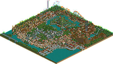
Enterance: A little too much water in the harbor near the enterance, but I'm going to guess that was made to fit in with another map. Overall I don't really care for the enterance, the architecture is nothing special and it doesnt really flow well. The raised area with the Catalina Grille was a highpoint and does add a little charachter to the area. The faded red ruins the ticket area, a darker red or another darker color would have suited it a little better. The little plaza after the tickets looked a little nicer than the rest, but just didn't stack up to the rest of the park. The following plaza is significantly better, and the merry-go-round makes a great centerpiece for the spot.
Lake Como: This is a very interesting little Italian section with some great rides and decent architecture. Cruisin' Naples fits in very nicely and the docks are a nice touch to the atmosphere. Again the architecture up front didnt do much for me but moving into the back of the area it improves. I really like Alpine Plumit, it has great interaction with the path and a good layout, theming could have been a little stronger though seeing as it was mainly just trees.
Gibraltar: Probably my favorite area in the park. Significantly better architecture throughout and it creates a nice marketplace atmosphere. Conquistador is a very different inverted, making it all the better. Interesting choice on repeatign the swinging ship flat ride as it was also found in Lake Como. I wasn't too keen on the little drop off water area behind Gibraltar, the building flows fine into it but all the land sort of drops off and the transition doesn't really come off as smooth.
Concord Hill: While the buildings are nice, this area didnt really offer a whole lot. I think the use of the scenery buildings really distracts from the look of the area and the space could have been better used. The Concord Chaple was very well done, and is the highlight of the area. Revere's Ride is one of thoes coasters that would be fun to ride, but looks rather bland just based on sights, the color scheme didn't help much either (I'm not big on alternating colors). Again another repeated ride in the form of a Merry-Go-Round.
Swashbuckler's Cove: This area came off very well. Nice atmosphere that is heightened by the little lake in which Paradise Isle lies. Buccaneer is a very interesting ride with a great layout. The buildings look nice, but dont quite match up to thoes of simillar areas.
Oregon Country: Would have to be a close second for best. Alot to look at with some nice buildings lineing the sides. Devil's Peak and Columbia River falls dont have much going in the way of uniqueness but doi fit in nicely to the area. Wild Wrangler has a great layout, but I think the custom supports it is drowning in take away from the attractivness of the coaster.
Emerald Glen: A nice quaint little area with alot in the way of atmosphere, but it comes up lacking in attractions. The Rye Dragon is fairly boring, with nothing special in theming or layout. Search for the Pot O' Gold's only interesting moment is the bend outside of it's building. The walkthrough Glen however is a nice addition that is really the backbone of it.
Paradise Island really came off lacking, Cascade Peak is equal in the randomness of it's theming and layout. The sudden transitions from track to water and back again without cover or reason ruins the look of the ride for me. The volcano top does add a little flavor too it, but the area still comes off as rather bland.
In the end, it may not be the most glamorous cutting edge park, but a collection of nice coasters and a very different look really make it an enjoyable pak to view. Great job corkscrewed, and congrats on spotlight.
anyways.. i really liked this park.. i like most of ur parks.. but it does miss that certain something. Personally.. i think the atmosphere is missing a bit.. and the "specialness" factor.. ok i cant explain it but i really did like some of the theming but think it would be better with a bit less coasters
"Best Park. Ever."
Where have you been? I rarely comment on parks these days, and I haven't downloaded any of the recent spotlights.
Nothing past DDI, which I only downloaded out of intrest, due to the "arguement" which erupted around it.
But if it will please you...
"It looks like shit"
...not that I've actually downloaded it, or plan to download it anytime soon, or ever.
Theres just something that makes me like it so much. my fav area had to be the pirates area, then lake como, Alpine plumit just fitted so nicely in to the space.
Great coasters, nice theming (plus I like how you got 7 themed area in to that map without it looking crowded)
Well done corky on spotlight
The thing I really didn't like was the theming, I can't quite tell what it is exactly that I dont like about it, it's just not really my style and what I like.
I did, how ever, really like 3 of the coasters. The vertical snow themed coaster had a nice layout and was different from what we are used to seeing in parks, so I liked that. I also like Buccaner, the stand up B&M, the supports were great as was the colour scheme and layout. My favourite coaster, though, was the inverted. The supports were amazing and I felt it had the best atmosphere of any area in the park.
Overall great job on a fantastic park and congratulations on recieveing the spotlight, but at this point in time I dont think it deserved it.
Corkscrewed Offline
Another clarification... some people seem to be confusing the shopping center area w/the entrance, or not understanding the boundaries of each, and that is perfectly understandable.
At one corner, where there is a lot of water, there are a row of shops and restaurants that line the waterfront. This was part of the Lake Terrace Shopping area. Had you seen the other six maps, you'd understand. From one part of this, the entrance to the park stands. The actual park features a very small entrance plaza area. It's only that little part that goes in a bit, then turns to the left in an L shape, and then leads guests toward the "hub" where they can choose to turn left, which will lead them to Lake Como and Emerald Glen, or turn right, which will take them to Oregon Country.
That's why the "entrance area" as a lot of you seem to be calling it (which is really part of a separate entity... it's a shopping area outside of the park) seems so off. The actual park takes up only about 80% of the map.
Thanks for the comments, and I had a feeling people would have conflicting feelings about the park, which is okay. I was going for something different, and I think I definitely achieved that. As for the other competing parks, I would say that they might have been "better," but I think this park was chosen cuz (according to Iris), it was so refreshingly different. I guess "controversial parks" is what I do best *cough* RUPE *cough*. Personally, I did not think that this park by itself was good enough to merit the Spotlight. Had I actually finished the entire resort, however, I guaranteed that would have blown everyone away.
And yes, I did see SWA before... but his Pirates area is much better than mine, which is only a modified version.
Anyway - Corkscrewed, yes it is 'different', but I believe one of the other parks in this round is more innovative and...well...better, but that's just me. I can understand Iris's choice, but i'm obviously going to have to be more forceful with my opinions next time