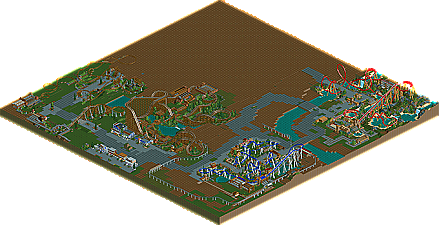
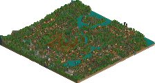
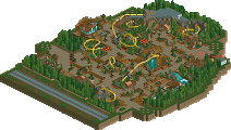
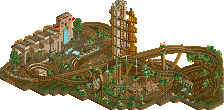
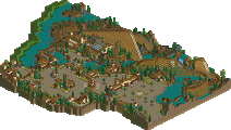
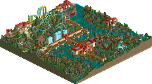
Its.....average. Thats really all I can say. It seems like a large step down from CP6's new spotlight Watkins Woods. I thought about giving it a break because of its age, but then i thought to myself "Jesus, RoB is like 4+ years old and its still probably the best RCT2 park." So yes, its average. The coasters are average (Except for the woodie) for the most part, the Blue SLC is actually decent but it rides more like a B&M...it seems like slob decided that he wanted a B&M coaster, but for the sake of being unique he built an SLC. The Mine train is actually very nice, but its horribly unfinished.
So I will say this....to say this would have been the best RCT2 park ever now is absurd. To say it 2 years ago? Still absurd. Its an average to slightly above average park.
I actually thought the SLC looked perfect the way it was. Didn't look like it should have been a B&M layout at all. However the woodie, I think it was called "Thunderstruck", it looked very Big Bear-inspired. VERY. The rest of it was nice, and is just as good as what goes on today IMO, just less all the art deco and little nitpicked "details".
Fatha, i'm sorry but I don't agree. This park has class, something which 80% of people just can't grasp, and never will. It's a maturity shown by the willingness to stop just at the right point in terms of detail and content.
Now, it's hard to say that about a park as unfinished as this, and maybe i'm biased in hoping that it turned out perfectly. But I think it would have been an amazing park had it been finished.
Its average in the sense it doesnt have any magic. Does it have class? sure of course it does. Sea World Brisbane has class, and I didnt deduct points from it because it lacked class...its was very pretty. And this also is just as pretty. But it just doesn't have any magic....and perhaps it cant truly because of its unfinishedness. Had it been finished would it have been a great park? Perhaps, its hard to say. Would it have been a legendary park? No, it would not have in my book. And I think more than Art Deco and "details" as you would say separate this from work like today imo. Watkins Woods, for example, doesn't have a great atmosphere because of art decos and little "random" details, it has a great atmosphere because of the use of colors, spatial qualities, etc etc. Building vs Building yes I will concede that thrillmatics buildings and WW's buildings are close, but I feel WW's are just a tad bit more developed, but NOT because of the reasons you say they are imo.
As far as the SLC goes, I say it rides more like a B&M because, well, it rides nothing like an SLC. Most SLC's in real life (And I will critique his park on terms of realism since that is what he is making it for, just like I critiqued WW for its realism) are compact, have doubled elements (sidewinders, Cobra Rolls, Double corks, double inlines, etc). This coaster started off right, but then immediately after that immelman it rode like a Beemer in my mind. The amount of helixes helped its cause as a Vekoma, but to me it just felt like a B&M. Never the less it is a good coaster.
Everything isn't about class, and whether its classy or not really is irrelevant in my mind. Does it have an atmosphere? For it to be truly amazing, it needs to be more than a park. It needs to be an experience, something that when you look at it and reflect back on it two years from now, youll remember moments in it. Few park really have that for me, and even fewer RCT2 parks have that. It has to be truly inspiring to be considered amazing by me, and perhaps thats just me being very hard to please. Ill give you examples of RCT2 areas that have these qualities:
-Turtle's Asian Area in IC
-Tibet in RoB
-Entrance of RoB
-Atlantis Section of RoB
-XCoaster's DisneyAir
-Denali Area of BGS
Those areas have magic, they have soul. Do they look classy? No, they really aren't pretty in the way that this is being called "pretty" or "classy." They have atmosphere, they have ingenuity, and the passion and drive is VERY evident in the respective areas. Whats built in this park can't even touch any of of those areas in terms of atmosphere, but then again like I said perhaps its hard to judge this park because of its incompleteness....but even some portions of this park are somewhat done (like the Beemer Area and its entrance)...and those areas really aren't on that level. One part of the park that does approach this is the Woodie's area around the Loop....the Loop is PERFECTLY placed and would be dazzling to look at in real life. Other than that, i say its average because well, nothing is there to suggest its extraordinary (like people are claiming it is). its very good. Not great in my mind.
it took me a long time to see the brilliance in this park. parkmakers i used to love i now see as flawed, but now i see why metalface became one of the few to master the game. turtle put it so truthfully...it really is about knowing "when to stop." there are many talented people on this site, don't get me wrong. they know how to make kickass buildings, coasters, details, or any combination of those. but very, very few people know when enough is enough. metalface/slob is one of them.
this park is insepration. i lovged it.... that woodie and sl. tgreatnes/ a;tj0pi tje suupports weren sp perfecdtly alligmed on the slc. but sill. AWESOME/
>Steve LOL Hey i actually will apologize, I might have been too harsh on the park, i prolly should have placed it a few spots higher in retrospect....if you want you can "Steve" my park like I "Fatha'd" yours if you judge this PT
When i critique parks I don't look at the "oh is this my style" and then decide whether or not I like it. For that reason I believe that portions of BGS are amazing (a totally realistic park) and also believe that portions of Mala's work are amazing (totally unrealistic work). Holding parks to the "is it my style" standard really take out the fun in viewing parks. When I view parks nowadays I will never chastise you because a coaster is unrealistic, I will only chastise you because a coaster is unrealistic when YOU attemped to make the coaster unrealistic. I don't feel there is a wrong or right way to do certain themes. I particularly don't believe that Turtle's asian area is the best representation of an asian area (as you can see by my Japanese Gardens screens, they are totally different and show how are approaches are different)....and I don't necesarilly find Turtle's area very pretty for my tastes....that being siad, I respect the atmosphere created and the time and effort that was EVIDENT in the buildings, rides, and others aspects of the area. For that reason, I remember it and hold it in high regard. Same goes with the entrance of RoB...I really don't think the buildings themselves are well done, and some look very bland and lifeless....but why do I love it? Its majestic, its spatial qualities represent those of Babylon perfectly, and the setup of the area is brilliant. It's atmosphere and aura is created by its organization, and not by its architecture necesarilly...and for that reason I hold it in high regard.
Why does this wow me? Majestic entrance, very very Disney esque much along the lines of DCA's entry. Totally achieves everything intended, and while i necesarilly might not like the sign and how it looks, it works, and i can't help but like it because its perfect for this park. I dont like the idea of not having more foilage around an entrance, but i can appreciate why he did not use any more foilage around the entrance. It better represents the intended atmosphere, that of an airfield, and makes the entry appear more as if its a terminal. I may not like how it looks without more foilage, but I moved past that and liked it.
Shows Denali. I find parts of this screen rather messy and unlikeable. I would have made the buildings perhaps more in the style of a "log cabin" and used darker tones, and yes everything does seem a little cramped from my point of view looking at this. But spatially its brilliant. Denali moves perfectly through and around its setting and gives guests incredible, incredible interaction (the helix soaring above the pathway, the immelman diving under the bridge, the coaster soaring right past the large movie screen area). Moments like these make parks magical, and Slob did this with the placement of the loop. I really don't like the style of the buildings in this area (minus Denali's station, which is spot on imo), but I can't help but LOVE the area as a whole because of the magical moments created. I can cleary see Phatage's vision here and its executed perfectly.
Why on earth is this so freaking ridiculous? Because SAC made it? Because it oozes out atmosphere through its colors? No. I actually find the colors a bit drab and don't really like the blue entrance that much, but i do understand that it was put their for a reason. This screen is majestic. This entrance is majestic. It IS Babylon, and it embodies that area in every aspect imaginable. The setup with the wall surrounded by the moat river, it just gives it that magical feel. Its not the building that do this, its the spatial aspect of the area itself. The building are rather ordinary, but the environment and space created is totally extraordinary, and represents Babylon well.
This is the best entry sequence I have ever seen in rollercoaster tycoon for an attraction. First the setup, guests see the train roar through the Cobra Roll...then they see BIG letters "EVERSIO LEMURIA," and are totally drawn towards this majestic and imposing entrance built across a towering gateway. They enter into the coaster's "area," to see it roaring through a private space over a waterway. Totally unreal parkmaking here, and the type that really makes you WISH you were experiencing this. Notice a trend with this park? The buildings don't really do much for the atmosphere and only serve as backdrops for the spatial qualites of the park. Oh, and it helps to have great coasters as well, but thats another argument.
Things like these make parks like this special. And you want to know whats even more amazing about these works? They are THEME PARKS. They have rides, they have shops, they have stalls, and they are laid out and act just like a theme park should. They feel alive, and they dont just consists of buildings plopped down on the sides of pathways and rides plopped down without thought (not saying that thrillmatic does this). There is evident thought behind everything that is done, and that is why I appreciate these works. Perhaps know you guys understand why I really just can't call thrillmatic amazing and a crowning achievement of RCT2....it just does not have the magic that works like these do....and it has nothing to do with class, style, or prettiness.
I'm very glad you did that, you should start a topic in the discussions forum so we can all contribute. Still, I was waiting for the critique of my asian area...
Of course thrillmatic isn't a crowning achievement in RCT or whatever, it isn't even 30% finished. Still, when I look at it I think it's magical in the way you've described. Particularly the corner with the red B&M. That setting is beautiful, for me.
so i realised today that for some reason my saved games folder disappointed me when i looked for thrillmatic. whoever has this, can he pm me the latest version of the park? i'd like to add it to the site.
83 Comments
RCTCA Offline
Carl Offline
Download
deanosrs Offline
middlesheps[replacethiswiththeatsign]googlemail.com
Carl Offline
deanosrs Offline
Fatha' Offline
So I will say this....to say this would have been the best RCT2 park ever now is absurd. To say it 2 years ago? Still absurd. Its an average to slightly above average park.
7/10
Ling Offline
Turtle Offline
Now, it's hard to say that about a park as unfinished as this, and maybe i'm biased in hoping that it turned out perfectly. But I think it would have been an amazing park had it been finished.
Fatha' Offline
As far as the SLC goes, I say it rides more like a B&M because, well, it rides nothing like an SLC. Most SLC's in real life (And I will critique his park on terms of realism since that is what he is making it for, just like I critiqued WW for its realism) are compact, have doubled elements (sidewinders, Cobra Rolls, Double corks, double inlines, etc). This coaster started off right, but then immediately after that immelman it rode like a Beemer in my mind. The amount of helixes helped its cause as a Vekoma, but to me it just felt like a B&M. Never the less it is a good coaster.
Everything isn't about class, and whether its classy or not really is irrelevant in my mind. Does it have an atmosphere? For it to be truly amazing, it needs to be more than a park. It needs to be an experience, something that when you look at it and reflect back on it two years from now, youll remember moments in it. Few park really have that for me, and even fewer RCT2 parks have that. It has to be truly inspiring to be considered amazing by me, and perhaps thats just me being very hard to please. Ill give you examples of RCT2 areas that have these qualities:
-Turtle's Asian Area in IC
-Tibet in RoB
-Entrance of RoB
-Atlantis Section of RoB
-XCoaster's DisneyAir
-Denali Area of BGS
Those areas have magic, they have soul. Do they look classy? No, they really aren't pretty in the way that this is being called "pretty" or "classy." They have atmosphere, they have ingenuity, and the passion and drive is VERY evident in the respective areas. Whats built in this park can't even touch any of of those areas in terms of atmosphere, but then again like I said perhaps its hard to judge this park because of its incompleteness....but even some portions of this park are somewhat done (like the Beemer Area and its entrance)...and those areas really aren't on that level. One part of the park that does approach this is the Woodie's area around the Loop....the Loop is PERFECTLY placed and would be dazzling to look at in real life. Other than that, i say its average because well, nothing is there to suggest its extraordinary (like people are claiming it is). its very good. Not great in my mind.
Steve Offline
Just kidding. I'm bitter.
Ling Offline
However now I do see a little bit where Fatha's coming from. Will never dampen the fun I get from the park though.
ACEfanatic02 Offline
Ling, make sure you understand how old this park is.
Thunderstruck is what inspired Big Bear, not the other way around.
-ACE
Ling Offline
My bad.
CoasterForce Offline
Milo Offline
still say RoB will never be passed up though...
Brent Offline
a;tj0pi tje suupports weren sp perfecdtly alligmed on the slc. but sill. AWESOME/
ACEfanatic02 Offline
-ACE
Fatha' Offline
LOL
Hey i actually will apologize, I might have been too harsh on the park, i prolly should have placed it a few spots higher in retrospect....if you want you can "Steve" my park like I "Fatha'd" yours if you judge this PT
When i critique parks I don't look at the "oh is this my style" and then decide whether or not I like it. For that reason I believe that portions of BGS are amazing (a totally realistic park) and also believe that portions of Mala's work are amazing (totally unrealistic work). Holding parks to the "is it my style" standard really take out the fun in viewing parks. When I view parks nowadays I will never chastise you because a coaster is unrealistic, I will only chastise you because a coaster is unrealistic when YOU attemped to make the coaster unrealistic. I don't feel there is a wrong or right way to do certain themes. I particularly don't believe that Turtle's asian area is the best representation of an asian area (as you can see by my Japanese Gardens screens, they are totally different and show how are approaches are different)....and I don't necesarilly find Turtle's area very pretty for my tastes....that being siad, I respect the atmosphere created and the time and effort that was EVIDENT in the buildings, rides, and others aspects of the area. For that reason, I remember it and hold it in high regard. Same goes with the entrance of RoB...I really don't think the buildings themselves are well done, and some look very bland and lifeless....but why do I love it? Its majestic, its spatial qualities represent those of Babylon perfectly, and the setup of the area is brilliant. It's atmosphere and aura is created by its organization, and not by its architecture necesarilly...and for that reason I hold it in high regard.
Why does this wow me? Majestic entrance, very very Disney esque much along the lines of DCA's entry. Totally achieves everything intended, and while i necesarilly might not like the sign and how it looks, it works, and i can't help but like it because its perfect for this park. I dont like the idea of not having more foilage around an entrance, but i can appreciate why he did not use any more foilage around the entrance. It better represents the intended atmosphere, that of an airfield, and makes the entry appear more as if its a terminal. I may not like how it looks without more foilage, but I moved past that and liked it.
Shows Denali. I find parts of this screen rather messy and unlikeable. I would have made the buildings perhaps more in the style of a "log cabin" and used darker tones, and yes everything does seem a little cramped from my point of view looking at this. But spatially its brilliant. Denali moves perfectly through and around its setting and gives guests incredible, incredible interaction (the helix soaring above the pathway, the immelman diving under the bridge, the coaster soaring right past the large movie screen area). Moments like these make parks magical, and Slob did this with the placement of the loop. I really don't like the style of the buildings in this area (minus Denali's station, which is spot on imo), but I can't help but LOVE the area as a whole because of the magical moments created. I can cleary see Phatage's vision here and its executed perfectly.
Why on earth is this so freaking ridiculous? Because SAC made it? Because it oozes out atmosphere through its colors? No. I actually find the colors a bit drab and don't really like the blue entrance that much, but i do understand that it was put their for a reason. This screen is majestic. This entrance is majestic. It IS Babylon, and it embodies that area in every aspect imaginable. The setup with the wall surrounded by the moat river, it just gives it that magical feel. Its not the building that do this, its the spatial aspect of the area itself. The building are rather ordinary, but the environment and space created is totally extraordinary, and represents Babylon well.
This is the best entry sequence I have ever seen in rollercoaster tycoon for an attraction. First the setup, guests see the train roar through the Cobra Roll...then they see BIG letters "EVERSIO LEMURIA," and are totally drawn towards this majestic and imposing entrance built across a towering gateway. They enter into the coaster's "area," to see it roaring through a private space over a waterway. Totally unreal parkmaking here, and the type that really makes you WISH you were experiencing this. Notice a trend with this park? The buildings don't really do much for the atmosphere and only serve as backdrops for the spatial qualites of the park. Oh, and it helps to have great coasters as well, but thats another argument.
Things like these make parks like this special. And you want to know whats even more amazing about these works? They are THEME PARKS. They have rides, they have shops, they have stalls, and they are laid out and act just like a theme park should. They feel alive, and they dont just consists of buildings plopped down on the sides of pathways and rides plopped down without thought (not saying that thrillmatic does this). There is evident thought behind everything that is done, and that is why I appreciate these works. Perhaps know you guys understand why I really just can't call thrillmatic amazing and a crowning achievement of RCT2....it just does not have the magic that works like these do....and it has nothing to do with class, style, or prettiness.
Turtle Offline
Of course thrillmatic isn't a crowning achievement in RCT or whatever, it isn't even 30% finished. Still, when I look at it I think it's magical in the way you've described. Particularly the corner with the red B&M. That setting is beautiful, for me.
posix Offline
(thanks wicksteed)