Park / Lost Era Resort
-
 08-March 03
- Views 6,628
- Downloads 2,805
- Fans 0
- Comments 40
-

-
 73.75%(required: none)
 Spotlight

5dave 75% csw 75% G Force 75% Jaguar 75% RWE 75% saxman1089 75% Scoop 75% Cocoa 70% posix 70% Liampie 65% 73.75% -
 No fans of this park
-
 Download Park
2,805
-
 Tags
Tags
Corkscrewed Offline
i hope everyone enjoys my resort =D
didn't i see this at one point? i can't remember...
anyway, congrats ^_~
Corkscrewed Offline
WOW
I love it. I absolutely love it. It's a very interesting blend of styles that doesn't completely succeed yet does not hurt the park at all. There was not one coaster that I didn't really like, and the Mines was probably the best wooden wild mouse I've ever seen.
Cyber was a cool coaster, partly because I've rarely seen the lift hill up the half loop hack (how do you do that again?), and basically all of the rides were superb.
The theming really caught my eye, especially where the atmosphere was vibrant and/or tropical. WME used to be Mr. Darko, but this has sure proven me wrong.
Those who are looking for something refreshing from a four year old game will find it here. WME incorporates a barrage of hacks, but he solidly integrates them so that they are not screaming for attention. Rather than stand out from the park, they blend in and ENHANCE it.
This is definitely a top 5 park in my CHART right now. Congratulations on an absolutely magnificent job!
Quick Ratings:
Theming (35%) - 9.3
Coasters (28%)- 9.1
Architecture (17%) - 9.0
Naming (10%) - 8.8
Environment (10%) - 9.5
OVERALL - 9.2
The themes fit perfectly EVERYWHERE, and the coasters are incredible, and the resorts are just wow.
This is totally increidible. I can't speak.
Great job WME.
Except the woodie was very, very, very quickly tree'd.
Themeing (25%)
Coasters (25%)
Buildings/Architecture (20%)
Landscaping (10%)
Atmosphere/Overall Look/Naming (15%)
Other Rides (5%)
*Bonus- Creativity (10%)
*20-5 Points added or subtracted for park size (so the rating cant be directly compared to smaller/larger parks)
Themeing- 17/25--- The themeing found in this park is different. I personally didnt find it incredibly creative, yet it had its worthwhile moments.
Coasters- 19/25--- I really dont think you can say the coasters were really THAT innotave. Most of the ideas had been done before, and were just used in a different in this park. I like the way there arnt any really huge coasters that dont stand out or steal the show. Pretty nice for the most part, but like the themeing, the coasters had their downsides.
Buildings- 11/20--- I can tell these buildings were made a relativly long time ago, because personally I dont think they are at all what WME can do now. There was a lack of detail and quanity in places, and they didnt particularly stick out well.
Landscaping- 6/10--- Not to much to say here. This is one of those parks that doesent really need the use of landscaping to be incredible, but still does a decent job of it. The tree selection was a bit iffy in some places, but other than that, not much to say.
Atmosphere- 8/15--- Its so-so. Like landscaping, nothing really much to say. Although, I can tell you that most of the names (ESPECIALLY the park name) were quite weak. Work on your naming some, its always been rather your weak point.
Other Rides- 3/5--- They were okay, and nothing special. Thats sort of my attitude towards this park in general, but if I am guessing correctly, most of this park wasnt made very recently anyways. I guess maybe I was expecting something more along the lines of Gliphindel Oasis.
*Creativity Bonus- 3 points for creativity. There wasnt that much really, but it was there all the same.
*Size Bonus- 5 points for the resort may, which was by the way, very nice indeed.
Overall Rating: 72/100--- For a Spotlight, this was rather weak IMO, but for any park in general, it was wonderful. What is distracting me is the scary fact that this ISNT Gliphindel Oasis, so you will most likely be getting ANOTHER spotlight soon
Very scary indeed.
Congrats WME.
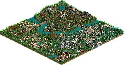
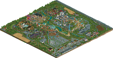
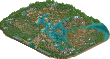
-== Map 1 – The Lost Era==-
Entrance – Slight overuse of trees, flower coloring a little strange. The double Carousel rocked, send me Winhack NOW. Overall - 6.5/10
Futura – The coaster was nothing special, and I didn’t overly care for the support job. But the alien statue was cool. The rest of the section had a nice alien atmosphere to it. Overall - 7/10
The Troposphere – A better coaster here and some very nice themeing throughout the section. The colors on Dr. Octopus were vivid, I would have never thought of using purple but it came out very nice. This is my personal favorite section in this map. Overall - 9/10
Horror Domain – nothing too special here although I enjoyed the haunted church ride. I don’t normally care for horror sections too much, but with the horror themeing options I think you did a good job. Overall – 7/10
France – It had some good themeing although it honestly didn’t strike me as French. But then again, I’ve never been to France. The woody had a nice layout, however; I believe there were too many trees throughout the ride. The water ride was ok; I liked the queuing line. Overall – 6.5/10
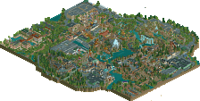
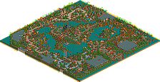
-== Map 2 – Water Park ==-
Entrance – Wow, this park is much better than the first map, IMO. Your themeing has seemed to take a step up. Cyber was cool, when the heck did you start this project? The Dreamcast is flippin’ old! Overall 8/10
Amazonia – This is the best themed section in this map. The colors go great together. I feel sorry for Groltas; he has to rescue a girl that looks like a panda, poor guy, but a nice looking stadium.
Over all 9.5/10
Hidden Depths – Looks good, the water slides are very impressive; although it would scare the crap out of me to ride some of them. Parallel hotel: If I had to stay the night here, I would kill over I think. I would probably just climb to the top and jump off. Hoping I could fly over to PyroPenguin’s hotel. The hotel looks just freaky, so good job. 9/10
He spanked mine anyways.
Loved the park WME, one of favorites, the resort was simply brilliant, perfect. Some of those slides...a little 'intense'..yes.
BF
Not my favorite park from you, but it's up there. Nice to see you win Spotlight. Now all we need to do is wait for Prince Ashitaka to win it, and then the universe will be back into balance.
*Kirii sees a pig fly across the sky outside of window*
This time it's quite the same, but this time I do like the park. It has a few extra things that made me like it, except for a some of the themed area's. I probably wouldn't have picked this park for the spot, but I think you deserved it. Good job!
1st of all the wave pool has been done many times before, and then, u posted screens and i didn´t but i still made it almost 6 months before you did.. oh well.
the park has been on my list of things to do forever, and i asked around to see who could kind of give me a date, and xsector still had a finished theme park last modified on November 2002. That should kind of answer the question why some things are different, like the architecture butterfinger pointed out, and the trees spiderman pointed out. I´m really surprised it was THAT obvious
and plz keep the wonderful comments coming
My major problems with the park? Over tree-ing, boring names and it has a suspended in it. Apart from that the hacks are really awesome (butterfinger - WME is the hack-king, and I doubt anyone else could do the things he does).
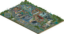
The resort map is fantastic, but I don't think it surpasses Sunken Retreat (that park is pretty unbeatable in the resort department). I just thought that once you'd seen one lot of slides there wasn't much different in the rest. The detail all over the map was good, but I didn't think there was enough variation to make it 'really' good. Good job on the Invert - bit of a preview for...um...'something else' there, eh?
Well Done on the spotlight - and I can't wait for Glyphendel to get you your second! If only you weren't so damn productive...
What we really need is for:
Womb
Glyphendel
Happy Place
Outrage
and
Any other crazy park in the making
to be in the same spotlight round - then people would see the true meaning of the words 'rct is great'. But X has gone and finished Outrage, so that kind of sucks.
Anyway, congratulations again!