Park / Pixie
-
 17-August 10
- Views 5,782
- Downloads 1,248
- Fans 4
- Comments 10
-

-
 77.31%(required: 65%)
 Design

chapelz 90% Evil WME 85% inVersed 85% nin 85% Roomie 85% RCTNW 80% SSSammy 80% turbin3 80% Casimir 75% Liampie 75% 5dave 70% geewhzz 70% Kumba 70% posix 65% K0NG 50% 77.31% -
4 fans
 Fans of this park
-
 Full-Size Map
-
 Download Park
1,248
-
 Objects
295
-
 Tags
Tags
![park_2434 [H2H6] R5 - The Replacements - New Fantasyland](https://www.nedesigns.com/uploads/parks/2434/aerialt2181.png)

![park_4161 [H2H8 Semifinals] Disney's Fairytale Kingdom](https://www.nedesigns.com/uploads/parks/4161/aerialt3928.png)

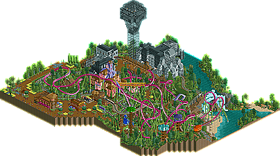
Loved the atmosphere in this one, and even though I found the layout to be awkward at first.. I started to really like it after a while. It just works. The elements interact with each other and are spaced out just enough. The buildings weren't too great, but they worked well with the theme. The foliage was really impressive, too.
My favorite thing I've seen in quite some time!
Congratulations on your design and your now official comeback (award plz), and good luck on finishing Peony Gardens. If it's as good as this, I can imagine myself voting spotlight for it.
Minimalism once again prevails!
Also thanks for all of the positive feedback, guys. Pixie was tons of fun to build, and I think that shows through. In retrospect, I should have included a readme to explain the theme a bit. It's kind of a play off of the whole Area 51 myth here in the US with the government using desert in the Nevada as a compound to produce advanced technologies and to test UFOs/extraterrestrials/etc. In the case of Area 92, it's a population of jungle pixies they are targeting and researching.
Again, thanks a lot, guys! It's great to be back and hopefully I'll have more soon.
Still the best Intamin Blitz layout in RCT or in real life. Interesting to look back at the (surprising lack of) comments and not see anyone really recognize it as a B&M take on an Intamin Blitz considering it was 3 years after Cedar Point opened Maverick. Layout has incredible flow as well. Also appreciate John leaving out the signature horseshoe roll that most people who do Intamin Blitz layouts in RCT tend to include, those look terrible in RCT with the default sized corkscrews, maybe the larger ones by X7 would be better, who knows. Another point of appreciation from me is not launching the train right into trim brakes like on the real Maverick, god that irritates me to no end lol. Launching up into a dive roll, with no trim brakes, is a much better solution. I think that's what I like about this design so much: it's a very successful implementation of looking at something in real life but adjusting it to work within RCT's boundaries to it's best look and function.