Park / Der Koloss
-
 10-May 07
- Views 3,863
- Downloads 647
- Fans 1
- Comments 28

-
1 fan
 Fans of this park
-
 Download Park
647
-
 Objects
163
-
 Tags
Tags
![park_4121 [H2H8 R4] North Fork Mountain Park](https://www.nedesigns.com/uploads/parks/4121/aerialt3862.png)


![park_2847 [PT4 R5] I Am the Elephant Seal](https://www.nedesigns.com/uploads/parks/2847/aerialt2500.png)

![park_3325 [H2H7 R1] Tenochtitlan](https://www.nedesigns.com/uploads/parks/3325/aerialt2925.png)
Wicksteed Offline
Make another design this good and It'll make NE design.
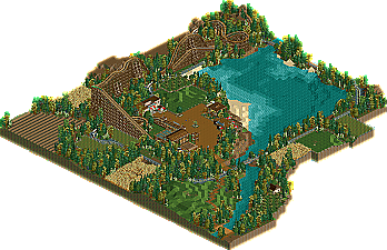
Wicksteed is one of the most talented guys germany has to offer, and we have many. This woody was great and the surroundings one of the best and most creative i have seen in a long time. The acre was brilliant, the Hau den Lukas (sorry dunno the english word) was genius. Schießbude and Scheißbude - killing pun. Shame this didn't make it. Great work Wick - now finish your solo and show Kumba that the german Invasion continues!
I'm sensing some favoritism here.
Downloading now. Will edit this post later.
What the hell does that mean?
Explain yourself.
If you only take the experienced players, no one will get anywhere.
How can a language barrier effect your viewing and enjoying a good design?
In my opinion, it wasn't quite worthy of a design though. Some things were really well done - the fields surrounding the ride for example, were spot on. The whole atmosphere was perfect. I thought it was realistic... but I agree with Kumba on the ride being too short. It was nice to look at for 2 minutes or so, but it didn't hold my attention that long, purely because the coaster layout and length weren't quite good enough. Good, but not good enough... keep it up though, this bodes really well.
DL removed so it still has a shot at NE design.
RMM Offline
that's bullshit.
that was one of the stupidest things you could have said.
and you said it. even worse than your spelling.
http://www.rct-world...rct2/latest.php
Better that he said it and admitted it, then that every one is thinking it. This probably happened before even before Kumba came in charge. Cannonball comes to mind if you ask me. I don't think it's that unusual that the 'proven' builders get a VIP treatment.
Designs should be judged by quality and not the names behind them.
Wicksteed, congrats to this Coaster. Though the track before the first drop was quite strange I liked it to a certain degree. I don't think it should be design, but it is a nice little thing you have been building there, with some great ideas, like the "Hau den Lukas".
Looking forward to see some future projects from you.
Magnus
oh dear lord, i hope we'll see a time when once this site will not be doomed with stupid admins ...
arguing about design yes or no, after Kumba's post, was completely redundant and useless.
disneylhand Offline
Again, would you mind explaining this please? I would like to hear more before posting my thoughts and end up sounding like an idiot by jumping to conclusions.
-disneylhand
it's as bad as it looks.