Park / Universal's Outrage
-
 11-April 03
- Views 7,825
- Downloads 4,029
- Fans 2
- Comments 41
-

-
 83.13%(required: none)
 Spotlight

Kumba 95% no G Force 90% no 5dave 85% no csw 85% no Ling 85% no alex 80% no Cocoa 80% no Liampie 80% no Poke 80% no chorkiel 70% no 83.13% 0.00% -
2 fans
 Fans of this park
-
 Download Park
4,029
-
 Tags
Tags
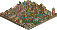
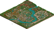
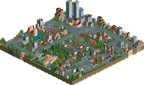
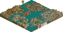
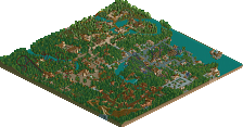
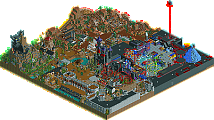
The entrance area is amazing; the architecture is so intricate and beautiful and uses the wild mouse coaster for theming in the best way I have seen in a long time. The river ride in the area is very nice and has a lovely station. The volcano with the steam is great as well! My only complaint with this area is that it lacks the use of fencing. In some parts it looks nicer with out a fence, such as next to plants but along the side of the river and especially on the exit path to ‘Paradise Falls’ I think it would benefit from them.
Now onto Temptation Island. The first thing that strikes me about this area is the bright blue colours of Rip Curl clashing with the red path. I personally don’t feel that they mix together very well, but never mind. The path does go extremely well with the architecture though, which is amazing as it is through out the rest of the park. Rip Curl it’s self is a great woodie. It has a relatively small station but the lift hill makes up for the lack there. I am not a fan of the supports and the treed theming gets a little boring but the three way half pipe is a nice idea and makes Rip Curl very different from the average wooden looper and I like it a lot. My favourite part of the area thought has to be Subtropic Bounce, the palm trees just looks so great, I love them!
Port of Discovery has got to be the strangest area of the park and I still haven’t had time to take in everything that is going on in this area. There is just too much to look at! The Experience is in my top 10 favourite coasters ever, quite easily. The temple it navigates through it’s journey is amazing enough by it’s self but the rest of the layout and theming it well above average as well, the whirl pool, yet relatively simple, is an example of the beautiful theming here. My only problem is with the foliage around the ride I think it is a little bare and a few shrubs and bushes around the area were the ride first leaves the station wouldn’t go a miss. Other then that though it is great. I’m not even going to try and work out how you built the Outer Space building, I’ll just say it is the best motion simulator ever and leave it at that. The rest of the area is just as amazing, there are so many great rides and restaurants I really can’t find anything much to criticise here, it is one of the best areas ever created in RCT in my opinion. The detail is stunning and the flat ride Flymo is just, well, I have run out of descriptive words!
I’m going to have to leave this area now or I wont ever get this done, so onto the next area with the black paths. I don’t know its name because you left the two signs at its two entrances as ‘Happyland’. I find this area to be the poorest in the park. Being a fan of dark parks and a big dark park maker my self you would have thought I would like it but it makes me more critical and the duelling inverts don’t help either. If they aren’t made by Mala then you have done an amazing job at repeating his style but it is a style I despise. I prefer these duellers to the ones in Mount Sinister because you are a better themer but I think their station looks extremely rushed and pretty shit really compared to what you have done with the rest of the architecture in the park and the mountain they are resting upon looks extremely boring and ugly just brown for the most part. I don’t find the steps really improve it for me either. I don’t like the blackness of them; I think you would be better off giving them silver sides. The mine train isn’t bad but again I don’t feel it is up to the standard of the rest of the park. The area is nice but doesn’t blow me away like the rest of the park does.
Now lastly onto the Atlantis: Sea Base area. I didn’t think much of the Great White, just an average luge but I love the architecture in this area and the inventiveness. The dolphins in the water are a great touch. The explorer is another cool simulator and the ship is very nice but I think it is maybe a little too white. Sea Odyssey is a great ride to, I love the station and the music in the area adds heavily to the atmosphere. It reminds me a lot of something you might find in a Disney park such as Epcot rather then Universal.
Overall I think you have an amazingly detailed and creative park on your hands here X-sector. This is by far your best to date and will almost certainly clinch you another spotlight. I don’t think the park is really very Universal like at all and doesn’t use the film licensing that comes with the Universal name to it’s advantage but I don’t really care because the park is good enough with out it. I prefer everything on the left of the entrance to the two areas on the right of it but nothing is below average and as I said this is an amazing park.
Your use of theming was insane(in the best way possible), and the wooden coaster....well, that was insane too
I've been looking at the park and the more I look the better it gets. This is in my top 5 favorite parks. Maybe even number one. Yeah you heard me right. The thing is, I can't find any faults. None at all. The whole thing is flawlessly executed. Great looking terrain, great looking trees and plantlife, great looking buildings, and fun well designed rides. CDS is a distant memory now. DEO had moments of brilliance but was obviously rushed. Valley of the Kings with its excellent duelers was a mere taste of things to come and this here is the real deal. Could it be the most innovative park release since UIX?
My favorite section is P.O.D., one of the best sections I've ever seen. The coaster building reminds of something out of No Limits cause people always use custom supports to make huge structures like that. When theming is so detailed that it looks like another game you know you're onto something good. Great colors and lots of fun details throughout that I haven't fully explored yet. I want to take another look at Tyline CA now because I wasn't as appreciative of innovation when I first looked at it as I am now. Great architectural detail.
The entrance area is one of if not the best executed entrance area I've ever seen. Of course Nevis did this theme first in iris' Troy Resort park but seeing it fleshed out here to a full section really makes me appreciate how good it looks. Great colorful flowers and bushes and praise you for not cluttering it with useless fences. I love how the waterride tucks into the mountainside and how the plantlife grows right up to the paths. Great use of minicoaster track for the roofs too (again Nevis did it first but you've expanded upon it and made it better).
The blue wooden coaster is probably my favorite coaster in the park. It reminds me of an RRP wooden coaster but with a cool Pawn/mantis type half-pipe thingy. Excellent colors, superb custom supports (and I mean that -- some of the best custom support use ever right here) and it blends in well with the rest of the section. Oh and those palm tree launch towers made me smile. A great idea executed that well always brings a smile to my face. Simple but effective.
I for one loved the dark section just as much of the rest of the park. At first I thought the steel texture, halloween fences, maze roofs, and waterslide tunnels were overused but the more I look at it the more I like it. The mine train coaster looks wonderful as do the dueling inverters. Much more so than Mala's duelers (though obviously he must be credited for inspiration). The combination of black textures with red flowers, green plants, and purple/fuscia accents is one of the best color schemes in the park I think. Oh and I also love all of those crazy steps going all over the place up the side of the mountain. Great landscaping throughout as well.
The Atlantis Sea Base was the lesser section I thought but not because it was low quality, just because there wasn't enough of it. Or too much of it was water more precisely. The buildings in the section used coaster peices well (pipes etc.) and I liked the colors but there weren't very many buildings. Great looking ship. Would you mind if I borrowed some of these ideas for a park I'm working on? Oh and I wish you had themed the sub ride like vTd did in Florida Disney Sea. It would have added a lot to the section. Oh yeah and great supports as always on the Great White -- which is a fishhook coaster (Nevis) not a luge coaster (adix). Not surprising since your tower supports are always the best (evolution and DEO).
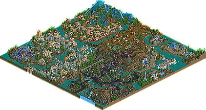
I won't waste your time with meaningless ratings. All in all this was one of the most stunning parks I've seen in ages. The way you situated the whole thing around a mountain was brilliant because each section makes good use of it (well maybe not the sea base but the others do). I'm sure I'll find more reasons to like the park as I look at it some more. Wonderful job X-Sector, you've just catapulted into the very few super-elite parkmakers in my mind and I shutter to think what your projects may be looking like now if this looks old and uninteresting to you. I don't know the extent to which other parks inspired you but anyone else who's ideas somehow made it into this park, you're brilliant too!
I haven't posted something this long in awhile. Thanks again X-Sector for such an inspiring park.
second of all, i ought to post my review..
Outrage by Xsector
Test Review Thing Walkthrough
Theming plus some other things.. by area
Entrance area- lovely, very tropical, i wouldn't change a thing. luv the interesting archy. The water ride has a bit of
an awkward layout but then again that's kind of nice.
Sea Base- Luvly boat and some really nice buildings. However, the area is a bit too spaced out imo. lotta water and landscaping
still very nice tho.
Black Moon Quary- another really nice area. some really nice theming in here. and some pretty nifty ideas, and i luv the purple
associated with evil.
Port of Discovery- probly my personal fav area. luv the entrance part. awesome unique buildings and impeccable theming
Temptation Island- well.. red paths just DONT work. but people use them for that reason which is fine i guess. You did use them
the bestiest i have seen yet, and the palm trees are really awesome.
Gripes- Layout.. long walk back to the exit/entrance from Sea Base =/
Some REALLY bare spots that just need finishing. the mountain.. yeah.. still too bare, lot better tho.
Coasters-
RipCurl- sweet coaster, awesome colors.. tho im not too fond of the "hacked" part, with a beginning like that it's all good =)
The Experience- awesome building, lift similar to ripcurl's.. absolutely awesome tho.. the coaster might not look great without the
building, but who's gonna delete that building? and hey, it looks PERFECT WITH the building.
Symbiotes- should each be A SYMBIOTE, to make two SYMBIOTES ;-).. i really don't like these coasters layout.. but you know that..
i didn't like mala's much either so that might be the problem =)
Purple Haze- needs a mechanic!.. a really nice ride, too bad for the ratings.
REALLY REALLY BIG GRIPE-
how there u made the ferocious tiger into a security guard ;-)
Spotlight chances- definitely a winner in my book, lots better than GOD actually.
My list- probly does make it, tho it might be last. i believe only 7 are on that list tho so u should still make that an
accomplishment. i'd have to look into that again ;-)..
i know it´s not very "official" in the writing and whatever, but it´s the way you test parks you´ve seen throughout the construction (in a way) (i guess)
so there... congrats x and thx iris coz x can no finally stop whining how universal´s outrage isn´t gonna be spot. =)
Entrance-- It was f'cking fabolous. The train was a good touch, more than most parks. The only real problem I had was with the lack of trees.. Too much bush. Just like Ty's mom.
Temptation Isle-- I hated those colors on the coaster. Those palm tree things were superb. Lastly, it had a lot of the aspects I saw in the entrance. Namely architecture.
POD- The Temple. Maybe it's the color, maybe it's the ecclectic style of it, I haven't a clue, but I hated that shit. The "HAPPYLAND" Cafe was cute.
Black Moon Quarry-- I like what you where thinking here, man. But it was poorly-excecuted in my eyes. The idea really appeals to me (so much so that I'll steal it) but the coasters were alright, but didn't really 'duel' well enough. I hate that symmetry shit.
Atlantis Sea Base-- Might I say that you're my hero? Those fishtanks make me want to become a homosexual and fuck you. But what the hell were you thinking putting cacti in there?! I hate that shit.
All in all, I enjoyed the park. But the architecture was very much the same in a few sections. I also had a problem with the hack-age of coasters, but I won't bitch about that, as I don't like hearing that myself. I did however like the detail that was put in to the park, things that you didn't really need to do, but did them anyway, just to make me (and Mantis) pleased. Good job, and I can't wait to see the Posix collaboration. Well actually, I can.
*Stargazer*
why dont you post a sticky topic in the advertising district that has a link to the current spotlight discussion whenever the spotlight is fresh? (like, a week)
hmm?
I have come to the conclusion that x-sector is God! Yes...anuways, I loved POD, my favourite section of the park. The entrance had an amazing atmosphere. The Atlantis: Sea Base was meh. Seemed like a Terras Labs wannabe. The dark section was pulled off well, I don't know why people don't like it. Better than half the "dark" stuff out there.
yay.
At first i wasnt overly keen on the big mountain but everything around it was amazing.
But now the mountain just seems to fit in.
If you keep this work up project shine or spiffy will also get spotlight....
-Orcs
I'm not sure what you mean by that.
You are aware that the download link for the park is on the page as well, meaning that its finished?
Not trying to sound sarcastic, you're just rather new here and might not know how it all works, which is cool.
yea , Im new..lol
-Orcs
Might I take this chance to announce a new collaboration park with Coaster ED and I? It's called the Enochian Desert, and features coasters by irsi(what were we thinking letting him do that). That's all for now. We'll post screens, just for Dragon Master over here.
How many projects is that now?
6 or 7?
You all thought I've been doing nothing for 6 months. Ha! We'll see who's laughing when I unleash my 16 map wonder on you all. Bwah hah hah.