Park / Universal's Outrage
-
 11-April 03
- Views 7,825
- Downloads 4,027
- Fans 2
- Comments 41
-

-
 83.13%(required: none)
 Spotlight

Kumba 95% no G Force 90% no 5dave 85% no csw 85% no Ling 85% no alex 80% no Cocoa 80% no Liampie 80% no Poke 80% no chorkiel 70% no 83.13% 0.00% -
2 fans
 Fans of this park
-
 Download Park
4,027
-
 Tags
Tags
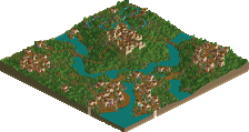
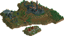
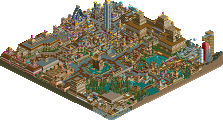
~Prince Ashitaka~
Themeing (25%)
Coasters (25%)
Buildings/Architecture (20%)
Landscaping (10%)
Atmosphere/Overall Look/Naming (15%)
Other Rides (5%)
*Bonus- Creativity (10%)
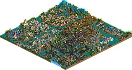
Themeing- 15/25- I am sorry to say that this rating was greatly reduced due to only 1/4 of the map--- yes, the dark section. This section contrasted horribly next to the other bright and "Universal-ish" sections in this park. It just totally didnt fit in. Not only that, but this area also reminded my of a Mala park WAY too much (By many peoples standards this would be a compliament, but most certainly not by mine). It just lacked the quality and innotaveness that was featured in the other sections..... of course, this little opinion of mine might just be due to my strong dislike of dark, un-realistic atmospheres. Either way, this hurt my judgement on the park. A lot. In addition to this, many spots lacked the necissary attention to detail that I like to see in a park.
Coasters- 12/25- I wasnt totally impressed by the coasters here. Yes, just like you would expect me to say, I thought they were way too unrealistic, blah blah, the whole nine yards. But really, the designs in many of the rides lacked a lot, and just wernt very appealing at all. I think these could have been improved by a few themeing touch ups, but again, I probably only feel this way becasue of my dislike of unrealism.
Buldings/Architecture- 15/20- This is one of your stronger categories for this park. It is rare that you see someone get so creative with such a repetitive thing as architecture. The buildings in the space age section (sorry for not using the proper names of sections, but I am too lazy to go back and see what they are) were quite inspiring, as well as many of your other large buildings/cienama's.
Landscaping- 6/10- Good elevation, treeing, and working with the land were your strong points here, but the score was brought down a bit by the look of laziness in areas. Some of the landscaping could have been greatly improved with a little more work.
Atmosphere- 8/15- This is a very mixed section indeed. Some of the atmosphere was wonderful, yet some was very off in proportion to the rest of the park. The feeling inside the park was fairly nice for the most part, yet naming was a bit of an issue. Most people will have trouble ajusting to a park named Universals "Outrage". The overall look was a bit below average, mostly due to the contrasting of the darker section, but fine and bearable all the same.
Other Rides- 5/5- The other rides in this park were actually quite wonderful, and even inspiring in some cases. A great deal of creativity was used in their making, and there was a nice variety as well.
*BONUS- 5 extra points added to the overall score for creativity*
Overall rating- 66/100-(Yes, I do try to be a tough rater, so keep that in mind).
I really would like to see some more realistic work from you in the future. CDS is amoung my most charished parks of all time for its wonderful realism and atmosphere, yet none of your other parks meet that. However, definetly dont let my personal preferences bring you down. Congrats on the latest spotlight, and good luck in the future.
I loved the entrance section. GREAT stuff there. However, you make a right and are blinded by that horrible red path. It hurt really bad. The coaster colors somewhat clashed too, making my road to blindness that much shorter, lol.
The "Mala Tribute" kinda ride thing was neat, especially the custom building.
Posix's area was ok, but nothing really stood out for me as spectacular.
Overall, 7/10 from me. Great park, but there were somethings that shouldn't have been done in order to diversify yourself from the normal trend of parkmaking. But, keep it up X!
Corkscrewed Offline
However, I definitely think it was deserving of Spotlight.
Well done, X! Now, get some RCT 2 work done.
I almost forgot it was supposed to be a tribute, and nearly flipped my lid o.O;
I need to calm down...
no, i need pills, sweet pills... and... ah, lithium, you are my only fwend... *dopes up*
oh yeah, cool park, some sloppy hacks, but brilliant theming.
X-Sector broke out from his old "sunnydale falls to vermonty" skin with DEO and Evolution, but this park is his crowning achievement.
I can't believe the things in this park - things that haven't been seen before mixed with nostalgic things that everyone recognises.
And I came up with 'Symbiotes' as a name
X, i'm expecting more of the same, and more madness in the future! But I still can't believe you finished it before womb, you bastard
Well Done!
In fact, Extremely Well Done!
Top 5 material.
Overall, I'd maybe give it a 7.5/10.
Aérôglòbe
Everything bright was awesome.
Everything bright is awesome.
Let me clear a few things up as well.
Yes I knew the duellers would cause this problem of everyone saying something. I had a decsion with Mantis about it aswell. I e-mailed Mala to ask if I can keep them or if he could do some for me but he never replied so I was going to delete them but people kept telling me to keep them as they fitted so well.
The Dark section well yes I agree with you all it was the weakest section but I don't do dark.
I agree with people saying some of the areas could be better but towards the end I was getting a bit bored with the park and also I started new projects so I just wanted to get it out of my way.
Thanks everyone for the comments so far
People are so hard to please these days
Aérôglòbe
good job.
EDIT:micool ive started a topic for exactly the things like that in beast area,go now.
*X-sector - how did you hack those dolphins into the water? Winhack? My beast won't do it! I tried for hours like a month ago, but I basically gave up on the idea.*
Now i have seen it all....The dark area wasn't my favourite but the mine train was very good.
I fucking loved ports of discovery and atlantis sea base...Very creative.
Ripcurl was bloody creative and one of the best buildings i have ever seen in rct was The Experiences wooden temple...WOW...
Overall this park is defintely in my top 5 or even 3 parks..
excellent work X
Anyways, looks like a very creative and innovative park, and I hope to see it soon. I'll edit this post with my official response.
Where is everyone? Comments on spotlights have gone down so much. It's a shame.
The dark section I have mixed views on it kind of seemed out of place to the rest of the park but still it was well made and I like both coaster in this area.
Overall probably one of the most creative parks ever and I would rank this park now in my top 5 even higher. Also some of the hack are great it really makes me which I spent the time to learn how to use winhack. Great park X Sector and fully deserved the spotlight.