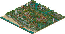
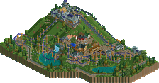
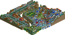
Park / Mysterium Adventures

19 Comments

  • Comment System%s's Photo
  • Goliath123%s's Photo
    I loved it, good job bro

    16/20
  • disneylhand%s's Photo
    I thought this park was VERY good. I'm somewhat surprised by the panelists' scores. I mean, this barely even made gold.

    -disneylhand
  • BelgianGuy%s's Photo
    I only had the impression there where to many coasters... one or two less would've been better I think cuz they sometimes looked forced in their locations, but yeah otherwise this park was really great.
  • Casimir%s's Photo
    Why it was only was a 70 for me:

    - Some bare spots filled up with trees (sure, even spotlights have that, but I just don't really like it
    - Foliage in general. Seemed too random.
    - The asian-style area. Sorry, I thought it wasn't up to par.
    - Some sloppy finishing / bare textures (Western area / the brick tower near the entrance)

    I REALLY liked your layouts and hacking ideas, though. The coaster stations are convincing, too.
  • SSSammy%s's Photo
    yeah i had some big issues with this. the foliage throughout the park was essentially filler. it's not a massive secret that i hate filler. to add to this, the overall colour use in the park left some of it feeling dead and textureless. aside from that, i think that this park had so many great ideas that i would be hard-pressed to find them all in one sweep of the park. i think the battlestar ride would have been better off as vekoma, as we see them less often and i love obscure rides. all the rest of the rides were fantastic. you're just full of creativity, but i don't think this release has really shown your full potential because overall, it felt dull somehow. i'm sure the ability to liven it up will come in time, i just thought that it wasn't apparant in this park.
  • Xophe%s's Photo
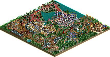
    I've just had a quick look at the overview and I can't wait to download this and see it properly - it is really my kind of park - so vibrant and full of life. The style reminds me a bit of Magic Realms, which is a very good thing! Anyway I'll let you know my thoughts once I've had the chance to download it.
  • Liampie%s's Photo
    I had high expectations of this, and the park lived up to them. Everything in the park was good; rides, ideas, park layout, atmosphere, a fun factor like only few parks have (Zippo's and to a lesser extent Magic Realms). The architecture and foliage were pretty good too, although not everywhere.

    I'm surprised by the 'low' score this park got. I really loved this park and it's one of my favourite releases from 2010 so far... SRF, where were you in H2H5? :???:

    Congratulations and thanks. And please don't stop. :)


    Pretty logo, verti!
  • Austin55%s's Photo
    Wow, this was good. I love the coaster lineup. A GCI wood (ha, get it? wood=Would? lol) have been perfect haha. I think I understood alot of what you were going for, I actually liked some of the filler foliage, the place where it hurt the worst was around the Dive machine splash down.
    Either way I loved this, might just be my favorite release of the summer.
  • Jaguar%s's Photo
    This park really reminds me of magic realms, and I must say that the fun factor in this is excellent. I think Invasion is inspired off of the coaster "Battlestar Galactica." at Universal Studios Singapore.
  • X_Fusion%s's Photo
    Congrats StormRunnerFan !!!!!!!!!!! :nod:
  • rK_%s's Photo
    wow, this is what RCT is all about, what a great line up and every coaster is paced so well an the ride layouts are just as good, if the areas where bigger you could have had a shot at spotlight but i agree with the scores that were given, great work SRF!
  • tdub96%s's Photo
    This park was awesome. What a great atmosphere created by a perfect combination of realism and fantasy. Great work, 17.5/20
  • postit%s's Photo
    I really liked the queue cover by the volcano coaster and those elevator lifts are fucking great. I've got to learn that hack. Some really cool ideas and strong execution all around. I think that in terms of quantity, there was not that much there other than the coasters, which were all over the place. In a way it was a little overwhelming. I think the best parks are those that have a great mix of all kinds of thrill rides, gentle rides, and pretty scenery. In many ways, this was a coaster enthusiast park, and there's absolutely nothing wrong with that. It is just a) a little bit unrealistic (considering your style is moderate realism) b)aesthetically not as appealing. I understand the comments about the foliage and everything, but it didn't really take away from my experience. I guess my request would be to let everything breathe a little more next time, fewer coasters (that vary more in size), and maybe more of a cohesive unifying theme. Congrats. :)
  • Roomie%s's Photo
    Hey guys
    I guess my vote here was a little low on another look through but not by much. Its a well executed park with some nice coasters. Invasion is a good representation of the recent BG coasters in Singapore (Although this one works :) ) and Curse of Port Royal is superbly done. The entrance section is a little cramped but would look awesome in real life.

    Overall i found the park lacking a bit when you looked away from the coasters and a few things like Cavern Calamity seemed a bit shoehorned in.

    However it did get a Gold so whoever said they expected a higher score... Spotlight is the only higher accolade :p
    So congrats SRF good work on the Gold and keep it up :)
  • Splitvision%s's Photo
    I've always been a fan of your style SRF, and as it is abundantly represented in this park, I'm a huge fan of it too. Most things about the park were original, like ride selection, park layout and the overall feel of it all. When I say that the park layout was original, that's not all positive though. It felt a tad confusing, perhaps it could also be called a bit sloppy. It didn't have that natural flow that the very best parks (i.e. spotlights) usually sport. Another thing that was a minus for me was that I didn't particularily love any of the areas. They were all nicely done, but none of them really stood out. But I think Twisted Canyons and T.N.T Valley were my favourite areas, with Dark Sands coming closely behind, much due to the B&M coaster, which I thought was the best layout in the whole park. Lost asia were my least favourite area, even though it was a kinda fresh and original attempt at the Asia theme. Overall a really nice park, it just lacked that something extra which stands out and catches your attention, something that keeps you looking at the park a little while extra. Be sure to include that in your next big solo and I think the spotlight is within reach. Can't wait to see more!
  • CedarPoint6%s's Photo
    I'm very impressed with this one. It's the first thing I've gotten to look at since I've come back from the summer, and it was a good first pick, I think. I'd have gone for a 16 or 17 on it, I think. Relatively realistic all the way through and I really like the attention to detail in terms of the block sectioning hacks. You had a really interesting selection of coasters, which I really liked-- a lot of the modern types we're seeing built now and some interesting other additions. I'll have to look at this again soon and maybe right some more once my life settles down, but I know its a park I'll be looking back on a lot more in the future. I like it a lot.
  • J K%s's Photo
    Yeah I really liked this as well and I'm impressed about the size of the map and your ability to build quite fast (or what seems quite fast). Tips for the future is to go for the themes that separate your work from an asian theme or a western theme, by this I mean give your themes a twist. If your going to build an asian theme I want to see a story behind the theme rather than just a representation of what we all perceive to be that culture. This will lead to more creative ride designs and theming possibilities and the theme will be unique to you.

    A bit more detail and identity on your buildings would be nice as well as more dominance in your coaster layouts (all appear like supporting coasters). This all will come with time however but I love what you do, now just get even better please.
  • RamSam12%s's Photo
    Sorry for the late reply. Finally got some time to catch up on the latest releases. I enjoyed the great selection of unique coasters and rides that set this park apart from most others. Everything was so well done, especially the Intamin TNT coaster. That really stood out the most to me. Landscaping was nice too. Great work man!
  • Xophe%s's Photo
    I thought I'd finally give some comments on this - sorry for the delay. The park in general has such a fun quality about it that really appeals to me. Everything is bright and busy, if a little chaotic in places. I thought the entrance area was great; it has a nice enclosed feeling without being too crowded - I particularly liked the little seating area by the main path and the glimpses you get of the ride popping in and out of the castle-like building. The monorail going off the edge of the map is a nice touch too.

    Some other highlights for me included the custom signs for each themed area - especially the curvy futuristic ones for the military base area. I also liked the trackitecture queue cover for the volcano coaster. The TNT launched coaster was my favourite ride; you packed an impressive amount of layout into a very small space and importantly it looked good too, especially the part where it blasts out of the tunnel with the crates of dynamite.

    As other people have mentioned, the park does seem a bit squashed into the map, and the crowded feeling isn't helped by the densely-packed trees between the areas. These barriers are effective at dividing the themes but the areas could have used some breathing space. The same goes for the various enclosed rides - again great use of space but they seem a bit claustrophobic. At the end of the day, though, it's a very enjoyable park and I look forward to seeing what you come up with next!!