Park / Legacies Themepark - Europe
-
 19-August 10
-
 Legacies Themepark
- Views 21,473
- Downloads 3,435
- Fans 11
- Comments 50
-

-
 83.46%(required: 80%)
 Spotlight

Six Frags 95% yes turbin3 95% yes K0NG 90% yes Kumba 90% yes posix 90% yes 5dave 85% yes Casimir 85% yes inVersed 85% yes RCTNW 85% yes Roomie 85% yes geewhzz 80% yes nin 75% no chapelz 70% no SSSammy 70% no Evil WME 50% no 83.46% 73.33% -
11 fans
 Fans of this park
-
 Full-Size Map
-
 Download Park
3,435
-
 Objects
504
-
 Tags
Tags
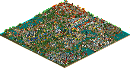
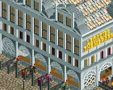
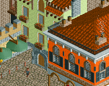
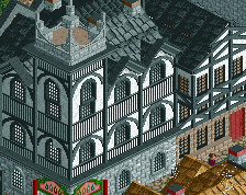
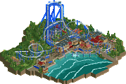
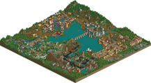
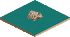
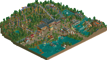
My only real issue with the park is the lack of a spotlight, flagship coaster. The two B&Ms were hurt either by an awkward layout or pacing or both. The rest of the coasters were just too small to be considered the park's crown jewel, either. I go back and forth about whether or not I love the park without a solid coaster lineup to backup the park's incredible atmosphere. Right now, though, I love it.
Congrats again!
I had some mixed feelings on your rides. Basically I liked the small ones better then the big ones. Yeah the coasters did not do much for me in this park. All of them seemed to have no new twists or originality. The layouts were all good, just I never got a "wow" feeling off any of them and I should in a spotlight park. Rutschebanen might be an exception tho, that was pretty good even if it was like 1/3 the size of most featured wooden coasters.
Now the small rides I really liked. That mermaid splash thing was extremely cool and fully original, loved it. The De Kaaien remote boats with the mini cranes purely awesome. The Masarati streetrace = brilliant. Not sure if it's small rides, but the playgrounds you did all over the park were all top notch.
Another reason I might not have liked the coasters was the landscaping. It was okay, but seemed a little messy to me and it brought down Ikaros and Silvius Brabo imo. Also on a hardly related note, I wish you did some longer custom windows. Those stacking hacks looked awful in otherwise totally amazing areas.
The Knossos area was something I have been waiting to see since taking Greek history this Summer and you did a pretty good job on it. Loved that you had the labyrinth with a Minotaur, great touch. Also you incorporated the trademark red pillars very well, only they should be more narrow at the base, so id have liked to seen a custom object for that. Overall a really good area which I can approve for being fairly accurate to history
I was unsure if I would vote yes or no for spotlight, only lucky for you if I need to think about it I will almost always vote yes, especially in a large project like this where you clearly put in a lot of time and work.
Congrats on joining the spotlight club! We'll start the hazing soon
Overall for me an 18.4 and a nice NE Spotlight park
Im, mentally exhausted from going through this. The architecture was amazing throughout, I loved the way you did everything and the writeup itself was absoulutly awesome. Ride wise the park is pretty crappy I thought, an odd lineup of rides and the layouts were pretty poor IMO, except Ducati Dash wich was awesome haha.
Still though, the archie and the way you did it (as in the writeup) was awesome and well supported by other little things and misc. details that added alot of Charm (the Jousting, for instance). The Statues, foliage, and the small structures such as tents and Kiosks were all very well done.
Maybe Ill do something more in depth later. I really love this.
I second that, they did send the mermaid to the Expo in Shanghai
@postit. Thanks. I agree that the coasters shouldn't make the spotlight/gold difference here. The 'coasters' in DisneySea were pretty shitty as well, and that one won spotlight too. Indeed, this is a themepark and not a coasterpark. I'm glad the accolade panel agreed!
@Fizzix: Haha, I'm glad there's someone who actually does enjoy the Floorless.
@Kumba: Thanks, awesome post. warning: chaotic text ahead! Being compared to IC:
@Xophe: I'm looking forward it!
@Sey: She's in Shanghai? I hope she stays there. What a disgrace.
Thanks for the replies so far, keep 'em coming!
FK
and again, if everyones kinda not feeling the flyer, i enjoyed it, i think it looked pretty fun an it was well paced throughout, congrats again liam!
The funny thing is that now that I open it up again and look at it with the knowledge that everyone adores it, I'm finding more things to like.
I just noticed that Nyhavn looks quite like it, for instance. Anyways, Copenhagen was by far the best section. Rutschebanen is a lovely coaster to portray in RCT.
I noticed a lot of small details, but I still can't help but wonder whether this is a city or amusement park. The architecture does look nice a lot of the time, but I found there to be way too much of it. I couldn't find much else in the park, honestly. The water ride in the back was nicely set up, but it's not the hardest thing to accomplish. Apart from Rutschebanen, I found all coaster layouts to be far below par. I'm really not a fan of all the orange roofs, either.
When I first opened up the park I was impressed with things, then I started to dislike it. Funny thing is that now I'm liking it a bit more than my vote. Kudos on a spotlight, I might not agree with it but it looks like the majority does! That's what counts
And two Dutch spotlights in a row.. there's a trend starting..
In short - it's brilliant!
@rk_: I will definately do cities without themparks in the future, but not on a 70² map. More like 150² probably.
@Evil WME: If Roomie quickly finishes TTA, that could be three in a row.
and with permission, may I use it on one of my parks??
Kevin Offline
I finally managed to get a new copy of rct2 for a little fun, and this was the first park that I downloaded and looked through since I last played, which was a few years ago. What a perfect park to reignite my interest in the game. I'll definitely be looking over this many more times...