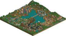
Park / Legacies Themepark - Europe

50 Comments

  • Comment System%s's Photo
  • MF72 %s's Photo
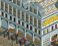
    I can't wait to open this up in game. As soon as I saw the entryway I knew this was going to be a great park. Needless to say, I'm not very fond of the flyer layout, but I don't think layouts were Liampie's top priority.
  • In:Cities%s's Photo
    from the half hour i just spent going over the overview, i'd say that this park is well worth the spotlight accolade given.

    amazing work liam.
    good job!
  • deanosrs%s's Photo
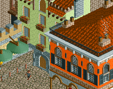
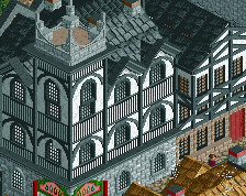
    Liam, this is architecturally fantastic.

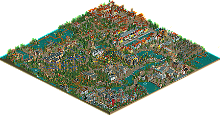
    I wanted to post more detail but wondered if you could tell me which area is for what city? I couldn't find any signs in the park or the readme and haven't followed any topics you've had in the ad district.

    Think there may be a Siena area in there?
  • Louis!%s's Photo
    ^You can. If you read the read-me and look at the pictures of inspiration you can match the cities to the areas because of how well built the park is.

    This is fantastic Liam, you kind of know my thoughts all ready, but I'll post a more detailed response here soon.
  • Roomie%s's Photo
    Congrats Liam. My favorite release of the year so far.
    The strange thing is. when i first opened the park i wasn't that impressed, but as i spent more time roaming and looking at the details i became more and more amazed. The custom cable cars over the woodie were amazing and the little water jump ride was a lovely touch.

    Coasterwise the ending to the flier was nice and the butterfly loop on the B&M is nicely placed and an underused element however i found the invert lacking in layout towards the end.

    Atmosphere wise I can't fault the park. Each city is captured wonderfully.

    A truely excellent release and a well deserved spotlight :)
  • verti%s's Photo
    Liampie, I spent about an hour looking at the overview - and then I'll still have to download it and give it a better look. It's amazing to see all the tiny little details you have here, I think it's honestly beautiful. Every bit of this park shows you had a purpose for it, and made it work, and there's so many little hacks and tricks that are pulled off so well. A very well-deserved spotlight.
  • posix%s's Photo
    liam, my sincere congrats. the architecture in this park is just so ridiculously good. like i told you, i never thought someone would actually be able to finish a full scale park with this high-detail architecture style in rct2. it always seemed to me people could only post screenshots of it in dump-place, yet you break with this. the ideas you have implemented in this park are so complex and yet comprehensible, even if sometimes they require a certain amount of background knowledge. having gone through the history of the hansa in one of my courses earlier this year, i appreciated lübeck quite a bit as you can imagine. i am astonished how you went so deep with the conceptual fundament of the park.

    what we see today are the fruits of not having too many contests. some of you might remember the old days of ne where spotlights weren't that rare as they are today. however, with europa park and legacies, and with other contenders that i'm sure many of you know of, i hope the spotlight is something we'll be able to enjoy more frequently again in the future. i really think it's the one feature that drives this community. that isn't to say we'll never have a contest again, but you just want them to be not too exhaustive and time taking or else they dominate and consume away the community.
  • J K%s's Photo
    Here here I'd take a spotlight anyday! Congrats Liam, it is truly deserved and I'm glad you were the first to that title. I will add more detailed comments at a later date but this is truly deserved my friend.
  • SSSammy%s's Photo
    i thought i would take some time to explain my vote. the architecture was fucking outstanding in places, and in others it was weak and blended in a little with the rest of the park in my opinion. the sheer quantity of "stuff" in this park was great, and it showed what you were capable of. another thing i look for in a park is balance. in mysterium adventures we saw that there were too many rides, outstanding as they were. in your park we find there are too few rides, and 90% of them were painfully bad :p sorry :D as i said to you on MSN, how could you let yourself leave that fucking flyer in the park? haha. the park layout, however, was outstanding for what it was, although i would have had a bigger plaza area. it would have made the whole thing feel more understandable. i feel that the park would have benifited greatly from better balance with the architecture/rides/open space ratio. i found very little space to breath within the park. sometimes the mown grass beneath a megacoaster is all you need, but the park felt completely saturated overall.

    to conclude:
    - i look for sweet ass rides in parks. even if it is just one amazing arrow looper. i think this is crutial to understand. one good ride in my opinion could have carried this better.
    - better balance. keeping the place full of fun and information while maintainign the "room to breathe" for want of a better term.

    the more i look through the park, the more i enjoy it. i do stand by my score, however. i just couldn't justify scoring it any higher without loving any of the rides. massive congratulations, buddy. i respect the panels decision, as always. the majority of these people are greater builders than i.
  • posix%s's Photo
    sss, i think those are some valid points of criticism. i personally was just blinded by the quality of the architecture that these other things didn't matter to me too much.
  • Liampie%s's Photo
    This is my favourite birthday present so far. I'm so happy that the park is finally done!

    Thanks for the replies so far, it's great to read! I'll reply more in-depth later. I'd like to thank posix/geewhzz/release people as well for their patience :p Thanks a lot, and sorry for being so picky. :p

    edit: Speaking of words that end with -icky, can this topic please be sticky? 8)
  • tdub96%s's Photo
    Wow, awesome park. I spent a good half hour on the overview and still havent d-loaded it yet, which means its probly damn well worth the spotlight. Congrats dude on one helluva park. The archy was unbelievable, the details were sweet, foliage was great, ride layouts were alright, but enough to keep it at a spotlight. Amazing park.

    Oh, and great work by the release prep. I saw that the topic in the AD was finished, and it only took 6 days for you guys to get this on the front page.
  • X_Fusion%s's Photo
    Amazing Liampie !!!!

    Congrats !!!!

    :nod:
  • rK_%s's Photo
    even how out of the norm it was i thought the flyer looked pretty fun, congrant Liam!
  • djbrcace1234%s's Photo
    After complete review of this park, I have to say you have outdone yourself Liampie. There is so much to look at, and the details are just splendid. Some of the hacks seen in the park I adored as well, one of them being the pulling boat and the Shoot the chute type rides.

    SSSammy had a point about the flyer as that did seem out of place. As much as it was nice, it was one of those head scartches for me.

    Agian, this park was well done, and agian, congratulations!
  • Liampie%s's Photo
    @deanosrs: Each area has one or two big signs with background information about the city, a parkmap and the name of the area. Just look closer. :p (The first galleryscreen shows one!)


    @Louis!: As I said before on msn, I'm glad I 'convinced' you. :p Means a lot.


    @Roomie: Favourite release of the year? With parks like EPWS, Virginia Key and Sonoma Falls that's quite a compliment. Thanks! :D


    @posix: I don't think the spotlight frequency has got much to do with contests... In the old days there were contests too, perhaps even more contests. I think it has got everything to do with details instead! Parks are getting so detailed, most parks/parkmakers are doomed from the start; finishing something just takes more time and dedication than it used do. I don't think it's a coincidence that the past few spotlights and golds are often relatively clean, compared to the recent work by for example nin and robbie92. I can't wait for the next contest btw. :p

    Thanks again, your words are most meaningful to me. :)


    @SSSammy: I don't think the Flyer is that bad :p I really understand where you're coming from though. I knew beforehand that the coasters could kill some votes. :p What other rides do you cinsider painfully bad? :)

    About the space issue: I agree! I wanted to keep green buffers between each ara, and although it worked in some places especially around Knossos, Antwerpen and Lübeck were just too compact... Besides coasters, planning is something I'll definately work on for my next park. Actually I have already tried drawing some park layouts for Legacies Themepark 2! This time I'll take a bigger map so space won't be really an issue though.


    @tdub96: Haha, actually I submitted it two weeks ago. I just waited with the final update too fool some of you. For the full effect I should've waited until yesterday though. And the teletubbies distracted. :p


    @All: Thanks!
  • Wicksteed%s's Photo
    http://www.nedesigns...ndpost&p=513005

    and congratulations!
  • postit%s's Photo
    Really Liampie. Extremely impressive. As it's been mentioned by posix, it is remarkable that you were able to complete this - it's in a new wave of hyper-detailed parks. Like Wicksteed has pointed out, there are just so many little ideas that are pulled off well. I really love it. The coasters were not exactly typical "spotlight coasters" but that didn't bother me. This was not a coaster park, this was a theme park and I think I like immersion more than intense rides anyway. I didn't get into RCT parkmaking because I like roller coasters, I got into it because I love theme parks and the way they make me feel when I visit them. In a way, you nailed this to a degree that I have seen few times before. I loved looking around. Inspiring.
  • Insanity%s's Photo
    Great Job, Liampie I always knew you were more than capable of making a spotlight!! :party:

Similar Parks

Members Reading