Park / Aero's Wormwood
-
 10-May 03
- Views 12,772
- Downloads 4,568
- Fans 4
- Comments 72
-
-
 70.63%(required: none)
 Spotlight

alex 75% Cocoa 75% 5dave 70% Austin55 70% G Force 70% Liampie 70% MCI 70% Poke 70% Sulakke 70% trav 65% 70.63% -
4 fans
 Fans of this park
-
 Full-Size Map
-
 Download Park
4,568
-
 Objects
431
-
 Tags
Tags
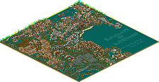
![park_2614 [NEDC2 #1] Winter is Coming](https://www.nedesigns.com/uploads/parks/2614/aerialt2316.png)
Excellent park, and some great ideas - the enclosed flat rides, the water channels....great
Well Done!
RMM Offline
I feel like you could do much better really. It just wasn't what I expected from you. You can do better, especially you. The park was okay.
Mike
Well, I used to do these stupid reviews, but my RCT died, and I couldnt anymore. But now seeing that RCT2 has FINALLY won a spotlight, I can once again spread my genius to my fellow forumists!
well... maybe not genius. Oh yeah, I have to write a review.
At first, I didnt like it. Im not sure why, but after looking at it for a few minutes, I realized that I actually liked it.
There was a lot of detail in the park, which is good. I also liked "Prozac Pretzels" and "Sho-ping Dynasty" which I think was supposed to be a play on words... If not, i'll look like an idiot.
Rides were ok, nothing really that awesome, nice custom supports though.
I would write more, but my fresh chicken strips from Publix are getting cold.
Rides: 4/10 Scenery 6/10
Final Rating seeing as I have less than 2 weeks left of escuela, I will be lazy and add intead of finding the average, I'll just add them together, so the park gets a perfect 10/10!!!
Choking on chicken tenders, need beverage, stay tuned for more of my brilliant writing... or something.
RMM Offline
10 / 2 = 5
= 5/10
Though I did like some sections. The dutch section had great archy, as did the aztec section. Altus Maximus was my fave coaster, but it didn't have much competition...
It's definately not the best RCT2 park I've seen, but I cant say this didn't deserve spotlight becuase I haven't seen the competition...
Coasters - 5/10 (Altus Maximus =
Theming - 6/10 (West Section = 9)
Archy - 7/10 (West and Aztec = 10)
Layout - 7/10
Overall, 6/10, sorry, its just not near the best in my oppinion.
Now it is time for my thoughts on the park I suppose.
At first glance, I could tell this park would have a lot of detail. I was right. Aero's style isn't my favorite, but in rct2 I really like what he has going. The fans made from the spining mechanicle peices was brilliance. Complete brilliance. The chinese section blew the others away in my mind, very nice colors there. All in all, the park was very nice. Deserving of the first ever rct2 spotlight here.
Congrats Aero.
you're it!
*runs away*
you're it!
*runs to corner and giggles*
Come on people, you could all be commenting instead of letting us play tig!
Aero I loved the park.
The entrance was great and So different and nice (at the same time) and has that nice RCT2 look. I loved the mixture of colours that went on in this area.
China - Holy Shit this area was done perfectly I loved the colours of the area green and red work so well together.
Fort Thunder - another great area and captured the atmosphere of a old western town perfectly. The racers who cool and I loved that water ride it was themed so well.
Venice was my least fav area but it still looked good.
Azteca- was a bit small looking to me but I still liked it for the fact it was different to most aztec areas this had more of a jungle look to it and thats what makes me like it even more.
Ireland - Me likes alot banshee is a nice stand-up and Four loop clover (I'm with iris this is an awesome name) was wicked
Double dutch has to be my fav area its was incredible and had a lovely atmosphere.
awesome rct2 work aero21 I have loved all your parks southern Gardens being my fav
At first i didn't know if i should respond to this. But i had a good laugh, and feel obligated to share my thoughts. What a moronic statement!! I suppose you didn't notice what area the ride was in? I am fully aware of Vekoma's piece of crap that they left on PGA's doorstep, and assure you that in no way is my ride meant to be associated with it.
As for all of you that have downloaded Wormwood, thank you and i hope you visit it often.
I'd actually prefer it if you didn't take our graphics.
There's no mention (that I saw) that gives credit to New Element for any of the graphics, including the logo and the three screens on the 'spotlighter' page. That's not cool
You can't just take content like that, its illegal.
Look in the fucking readme dumbass.
Things arnt looking too hot for you around here.
What a fool.
Iris. You know what to do.