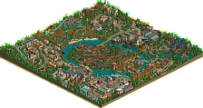
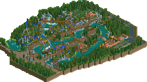
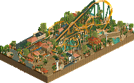
Park / Aero's Wormwood

72 Comments

  • iris%s's Photo
    Congratulations aero21 for becoming the first parkmaker to break through the barrier and win the spotlight using an RCT2 park! Aero now joins the elite group of multi-spotlight winners including x-sector, Fatha', Natelox, PyroPenguin, and NeViS. Maybe now aero will finally get the credit he deserves as one of the best parkmakers here at New Element, instead of being as criminally underrated as he is today. Great way to kick off the "rct2 revolution" here at New Element, and you can be ready for one of the best rounds of Runner-Ups coming up this round. (Hint: we may even bring back Hidden Parks!)
  • Physco%s's Photo
    This park was okay. I was just expecting something a little bit more from what everybody had said about it. Some areas were nice, but nothing special. But that's just my opinion. :bandit:
  • RRP%s's Photo
    holy crap, this is better than I thought it would be, its all so realistic and flowing.I just love it, its your best park to date aero, good job.
  • sircursealot%s's Photo
    Oh. My. God.
  • rctfreak2000%s's Photo
    I love the logo for the park. Just felt like I should say that.

    The park? Hmmmm...

    Howabout, awesome?

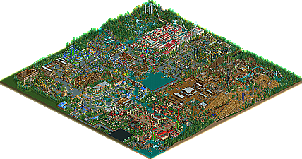
    Brilliant colors, tree selection, rides, supports and most importantly, theming.

    Great job Aero, bout time you get a new park as spotlight :lol:

    -Freak

    P.S. I swear to Buddah, if I can't find some of the runner-ups, I will hunt you down iris :D
  • Brent%s's Photo
    No. I did not like this park at all. And to tell the truth, I'd choose Elsinore Falls over this park any day (EF is my least favorite SL, well... was). From the screens the park was looking pretty darn good, but up close it's a totally different story. Kinda like that one Seinfeld episode, where his date was hot out of the shade, but in the shade (in game in this case), she (the park now) looked horrid. I can't believe there was so much dead space at the bottom left corner. The coaster designs were sub-par, and the whole park looked rushed, when in reality it wasn't (I think). From the time the park opened to the time I quit to load the wb for a new park I'm helping out on my thought on the park was the same... how, how could this be so boring? Oh well, I guess with me it's hit or miss, and this park was just one of those miss ones. Better luck next time.

    -Brent :|

    EDIT: Freak, c'mon, you don't really mean that about the logo, do you? That was like a foreshadow of how bad the park was.
  • Turtleman%s's Photo
    Wormwood is my fav rct2 park so far.
  • HeArTlInEtWiStEr%s's Photo
    Does this mean that Fantastic Wonders is a runner up?

    HT
  • Scarface%s's Photo
    A............................................................................................MAZING

    Defintely underrated and the people who said you are bad and overrated should hurt themselves...

    Loved it..
    Dutch area was brilliant and seemed so crisp and clean..well done on that.

    But China Town was absoltely stunning. I must admit from the screens china town looked awful but when looking closely it was amazing. The reds and greens captured the atmosphere perfectly
    well done...

    The entrance was also clean and crisp and had a hint of alton towers in their with the colours and the buildings... very nice

    Four leaf clover was a good ride and very compact but that lifthill and first drop was strange..
    All the other rides were good but the supports on Altimus maximus were also strange. But i know that you were trying something different and trying to get them to look like real life ride supports (cant remember the ride you said).

    I was a little disappointed that there was some spare land with no trees etc... That could have been filled to give the park a more complete look but still it is overall a great park..

    Congrats
  • Scarface%s's Photo

    P.S. I swear to Buddah, if I can't find some of the runner-ups, I will hunt you down iris :D

    I have never found a hidden park as ive never looked...lol
    I know the links r hidden in the site somewere and you have to find them...
    but
    Wereabouts do u look ? im new to looking for hidden parks..I used to just get people to send me them lol :lol:
  • Timothy Cross%s's Photo
    This is a great park areo. I can see why my park,"Fantastic Wonders" lost to yours as I honestly feel it's the better park. Great work.
  • Toon%s's Photo
    Having had a chance to see this park a couple of times as it progressed, I was 99% sure it would be a spotlight winner. What I liked most about it is that it in no way looked like an RCT1 park. The architecture took full advantage of what RCT2 has to offer. The park had a great flow and layout.

    My favourite area was the oriental area (one of the first done in the park). The colours and mood of that area are wonderful. Also, you are the king of custom supports in RCT2. You just make them look great imo. Great job and I really look forward to seeing how that next project of yours turns out!

    Iris, I hope you're right about Aero rising out of the shadows with this park. It is a well deserved spotlight.
  • Aeroglobe%s's Photo
    Wormwood is amazing. I didn't get a chance to look at it too much, but from what I looked at closely (The 4 Clover thingy, and the entrance), it was all great. The entrance was so detailed, and my first impressions of the Chinatown area thingy and the Western-ish looking area was amazing.

    Great park.

    Aérôglòbe Posted Image
  • Dirk Pitt%s's Photo
    :0 WOW!! This is better than I expected! The theming is so good!
  • Hevydevy%s's Photo
    Wow. The theming was amazing. The China Town section was my favorite though. Great colors and a great coaster. The Banshee was nice, and the Four Loop Clover looked great. Fort Thunder was nice, it's definately the best western section i've seen. Great mix of wood, and metal/mechanical themeing. The area with Jaguar I have mixed feelings about. The area kinda reflects a Mayan or Aztec theming yet it looks totally unique. One thing i didn't like about the area though was that the rides weren't named or colored according to the theme. The Italian section was nice. The kiddy section was not what I was expect, but was pulled off nicely. Ireland was good, and the Dutch area was priceless. It's good to see you've been able to keep your style in RCT2, and that you stuck to it and finished the first real milestone park in RCT2.

    Can't wait to see what you do next,
    Hevydevy B)
  • aero21%s's Photo
    Thanks for the comments, everyone. I must say that this park was a risk, i have had ideas in my head ever since the first game that i had never been able to pull off in rct1. With this park i was finally able to get those ideas out. 1. The china area was something i had planned for Cinescape East, a kind of "sequal" to the John Woo area of Cine1. But i was never able to get the colors to go with what i wanted, you will notice the fences i used near Kung Pow and the three layers used. It mimics an Asian style of fence I saw at Magic Mountain once. The store that Pow flys through on it's way to the Mid-course break was something i have always wanted to do. If you notice thier are windows from the store to the ride wich would be behind the checkout counter, can you imagine the surprise when the trains come flying through? :lol: . last, the supports on Fire Dragon are about as close as you can get to traditional Impulse supports and you can see how i developed the idea from one of my old parks "Marriots Grand Adventure", there is an Impuse near the boardwalk that has a hacked version, but now i have the look I want. AThe Azteca area was originally going to have an Amazon look with a more Jungle look. I chose to lighten it up because who the hell would want to go there? So now it is more of a "gateway" to the jungle. Infact "Mindbender was originally titled "Myan Mindbender" but that name is too comon. Altus Maximus is a Giovanola coaster and it's supports were patterned off of Goliath at MM, except for the drop, which i had to come up with something different because its curved. Anyways, there were a lot of things that went into the park, some will love it, some will hate it that's the way the world is. Enjoy the park, and feel free to explore it's many details. You know, I really envy those Peeps in there ;) .


    Thanks!


    PS- Damn you Iris for putting that blurb about the Kings on the Spotlight page! :lol: J/K
  • Blitz%s's Photo
    rippin park man. I never really like, LOVED your style or anything, but this is pretty good...
    The building for the steel wild mouse kind of bored me though =\
    ...and some of the areas seemed unattended to...
    but overall, killer park, and very deserving ^_^
  • Nitrous Oxide%s's Photo
    This is my favorite Spotlight yet. Actually the only one I like. I love the little waterfall by the Rainbow ride. Awesome coasters too!
  • Raven-SDI%s's Photo
    Hello.


    Other then the excess of B&M coasters, the park is very good.


    Raven-SDI
    §
  • Corkscrewed%s's Photo
    It's funny... from the candidates, I actually thought another certain park should have won.

    This is solid Aero for you. The coasters are great, and the theming is very unique... with a sort of pleasant feel to them. In all honesty, I don't find this park amazing/overwhelming, but that's just my view of Aero's style. It's very good and solid and strong, but it doesn't usually have a :OMG: sense to it that much. I'd compare this park to the Utah Jazz during their prime or maybe to this year's Spurs. Efficient, effective, but not really "wowing." It's fully deserving of a Spotlight, though, it's just that this time, another park should have won. ;) Or actually, if I had it my way, both this park and "that" park (boy, I'm pretty subtle, ain't I?) would have won on consecutive chances or something, hehe.

    Congrats, Aero! Now go look after your daughter! :p