Park / Calypso Theme Park London
-
 21-August 05
- Views 5,437
- Downloads 785
- Fans 0
- Comments 22
-
-
 No fans of this park
-
 Download Park
785
-
 Objects
350
-
 Tags
Tags
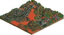
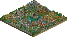
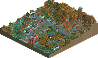
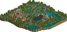
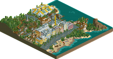
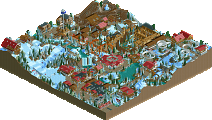
I'm new on this Board, and I wanted to show you guys some screens from my theme park.
By the way, I think I'm the first Austrian guy here,hmm?
It's actually finished and I just wanted to know what you think about it!
Here are the Pics:
Mainstreet
The Entry to the Park
There you enter the Park. You can see the Info Booth, the Ticket counter and the Entry Gate to the Park.
Mainstreet
The Mainstreet is very Arabian-like. There are 2 Rides, 1 Show and many Restaurants and Shops in this Area...
Greece
The Splash "Odyssea"
This is the Intamin Spillwater "Odyssea". There is also a platform where you can get wet
The Greece Area
This is an Overview over the Greece Area. You can see the Custom Arrow Looper "Pegasus".
Spain
El Diabló - B&M Multilooper
The B&M Multilooper El Diabló with 5 Inversions and a 90° Degree Drop!
El Torre - Intamin Gyro Drop
El Torre - The Intamin Gyro Drop located in the Spain Area of the park. You slowly go up the Tower, where you fall into the darkness of the tower! Inside the tower is a stairway and a viewing platform!
Rio Rapido Falls - Mack River Boats
Rio Rapido Falls with the "Splash-Bridge". You can get wet from both sides on the bridge.
Spain Area
A little Overview over the spain main area. You can see the village mainplace and the many buildings there.
China
Shogun - Intamin Mega Coaster
This is Shogun with it's 360° Degree Twisted Drop.
Shogun Twists and Turns
Here you can see the many twists and turns Shogun has got to offer!
Geisha - Zierer Kiddie Coaster
This is Geisha - a simple Kiddie coaster. Nothing spectacular!
Mexico
Mexico - Overview
This is the mexican area. You can see the River Rafting and a few buildings in the back.
Mina Grande - Vekoma Mine Coaster
This is the Vekoma Mine Train in the park. Before it gets back to the station it dives a bit into water, where the waiting people get wet
Wrath of Tuankanum Darkride
This is the last picture from mexico. It shows the Darkride of the Park. It's an Sally Interactive
Hotel Herkules
Hotel Herkules - Pools and Restaurant
This Hotel offers 2 Pools, 1 Slide and 1 Restaurant on the Rooftop. You can perfectly see the Park and it's Coasters from the rooms. A Enthusiasts dream!
Backside&Logo
In the foreground you see the Herkules Stunt show.
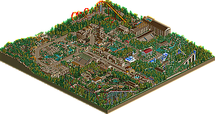
DOWNLOAD PARKMAP
(1600*1200, ~800kb)
Hope you enjoy!
Greets!
let's see...
you posted in a polite way, you advertised the park late and elaborated the screens, it shows a lot of promise and you speak my language. or do you?
maybe you've shown a bit too much though.
anyway, i get the impression that you approach parkmaking in a healthy way. i like that. although you are a beginner the park is above average beginner level, in my opinion.
keep up what you're doing.
Thanks for the Reviews!
Yes I just fell in Love with brown
next time I try to use more colors!
Im just too scared to get too colourful
Greets!
troopa
Where's the download?
Actually, there is no download!
I just wait untill I get some Tips to improve the park, then you'll get the park!
Greets!
very great idea...
as for the park itself....it looks really nice....tho it is very brown.
brown is a great base color, but it doesnt look that good if the whole park is that color.
just experiment with more color schemes, and you will get a whole lot better...
it looks nice...keep it up.
Welcome, your park looks very good overall with a lot of nice details!. And very well thought out. I also would like to download it.
I agree with what's said before on the too much brown. May be you can elaborate a bit on the white and blue in the Greece area, add some yellow or yellowish-brown in the Spanish, etc. and see if you can live with that. Would certainly make the park even more promising.
But overall: very nice and promising work, looking forward to the download
inVersed Offline
My only concerns are the colors (way too much brown) and a few of the buildings lack detail and are a bit blocky
Thanks for the Replies!
I'll change a few colors and add some details at the buildings!
greets!
I agree a lot with posix here too, you're approching this the best way possible and for that alone I respect you greatly and look forward to releases and other future parks from you.
ride6
Other than that, keep going, and listen to what others are telling you.
To be honest this isn't top quality, but that doesn't matter since that's just practice and experience so that will come eventually. However I see several things that show great potential. What is most important is to develop your own building style and to deviate from other builders (that's what Posix is trying to say I think)
Here is the Download!
I hope you'll enjoy
I'm a perfectionist, so I'm not that contently with it
DOWNLOAD (size ~8MB)
Greetings from rainy austria