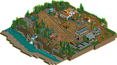
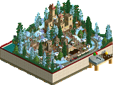
Park / Bandito

25 Comments

  • Comment System%s's Photo
  • SSSammy%s's Photo
    <3 <3 <3
    everything in this was well formed and "perfect". well not perfect but you know what i mean. everything felt like it should have been there and i was loving the whole feel of the submission.
  • posix%s's Photo
    i still don't see what was so good about this. it was solid. nothing more. i couldn't find anything special?
  • rK_%s's Photo
    this site is confusing sometimes... I'm with posix on this one, its looks rushed and all around incomplete.

    the logos sick though.
  • Lowenaldo%s's Photo
    Im going to have to agree with both posix and rk, and the layout, in my view, wasnt very strong either.
  • geewhzz%s's Photo
    what is so confusing about looking at a distribution of scores and realizing your opinion isn't the only one that matters?
  • Cena%s's Photo
    I thought the lowest and highest score where not counted in the average number? How the hell can Posix his vote then be counted? Is there somebody who voted lower then him?
  • SSSammy%s's Photo

    I thought the lowest and highest score where not counted in the average number?

    well done, good grammar. were*

    How the hell can Posix his vote then be counted?

    ?
    how the hell can posix's vote then be counted?

    Is there somebody who voted lower then him?

    than* otherwise good. 1 merit.

    his vote wasn't counted.
  • Brent%s's Photo
    Is that Raiden in the logo?
  • Jaguar%s's Photo

    i still don't see what was so good about this. it was solid. nothing more. i couldn't find anything special?


    Not everything is or has to be special or unique, though I agree with you
  • Stoksy%s's Photo
    Is it just me or are logos becoming the most important part of a release...I mean, look at 5Dave's Six Shooter logo (OMG!), and now an incredible logo from Louis! it seems that logos are taking that "next" step. Especially since Fenrir and Mirage...

    Will download later, the train track looks hell cool but I've got a feeling that there wasn't enough on the map. (Then again I am yet to see the park in-game) Anyways, gratz on the design!
  • Jaguar%s's Photo

    Is it just me or are logos becoming the most important part of a release...I mean, look at 5Dave's Six Shooter logo


    I think 5Dave used this in his Logo for six-shooter. I typed in S&W 357, and this was one of the first resultshere. I guess most logos made by image cropping, They do a really good job at it though.
  • posix%s's Photo
    i just wanted to post my opinion because i was the low vote. i do think that if something is to win an accolade, it has to have a minimum of "special".
  • SSSammy%s's Photo
    what did robbie do? just out of curiosity.
  • Liampie%s's Photo
    The layout flowed really well, but it was too compact to follow the train properly. The surroundings were nice and fun, but not memorable for me. This design is good, just not good enough IMO... I understand why it won though, Congratulations!

    @SSSammy: Perhaps the layout?
  • Insanity%s's Photo
    Wow, just barely made it in but i don't see how, it should of gotten higher than a 67 but I somehow see posix's point...
    Anyways, thats a sick logo :X
  • Insanity%s's Photo
    ^oh i forgot to ask;
    what DID robbie do???
  • Steve%s's Photo
    Something about a beige wooden coaster and red sand mountains just always seems to hit home with me. Maybe Mala has something to do with it? Regardless, well done on this one, jusmith! Like others have said, it was nothing out of the ordinary, but it was still a joy to look through. I too am curious as to what Rob built.
  • nin%s's Photo
    Whenever I see your rct2 work never get the impression that you really pushed yourself to be better. There's never a great deal of improvement that can bee seen, I always think that you just never strive to 'beat' whatever your previous work was. This may not be the case, but when comparing your work in LL to rct2, the thought always comes back. Now, this is only somewhat of the case in this park being that you wanted to complete something in 24 hours and so there wasn't a huge desire to push yourself,but hopefully you'll see what I mean whenever you work on your next rt2 park/design.
  • robbie92%s's Photo
    For all those curious, I built most of the layout. It was originally a guest spot for Jusmith's Lakeland AP. However, when he reworked the landscape, he needed to get rid of the ride, but didn't want to waste it, so he made a design around it, slightly modifying the layout. If I understand correctly, it was an under-24-hours design as well. To be quite honest, I still have not seen this one in-game, except for my layout in its original setting.