Park / Sea World Atlanta
-
 17-July 03
- Views 17,691
- Downloads 7,362
- Fans 6
- Comments 72
-
-
 86.25%(required: none)
 Spotlight

Cocoa 95% no G Force 95% no Louis! 90% no nin 90% no 5dave 85% no Liampie 85% no Xeccah 85% no chorkiel 80% no csw 80% no Poke 80% no 86.25% 0.00% -
6 fans
 Fans of this park
-
 Full-Size Map
-
 Download Park
7,362
-
 Tags
Tags
Twisted Offline
It's just plain brilliant!
Creature is an awesome coaster.
Valhalla was pulled of excellently.
It's all just amazing!
Well done, for what i think may be the best spotlight yet.
j/k
I wonder how much work people think I did on SWA. I should release the map RRP sent me first before I worked on it to show you how much I did (like I care anyway that was just a random thought that came into my head).
if x hadn't finished it off then it would never have got done
the middle isle, u liked it before, wtf it was so crap (the landscaping was really bad and suffered the same problem that people like butta (no offense) do) and there was no bushes and one crappy building
end
Anyway.
Pirates of the Caribbean
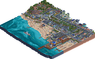
Damn. This is a theme that I can't see being beaten. It was amazing in BGL, even better in CLAP and this is just exemplary. It's leafy but bare....all at the same time! How is that possible?! The 3D Cinema is a great addition, with great colour choice, the station for the Kangata Volcanic Tour is annoyingly brilliant and the docks are just....GAH! This is possibly the most annoyingly perfect areas in existance, even more so than the whole of Moonlight Magic. The textures...mmmmmmmmm.
Orkney Island
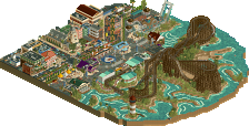
OK. I'm sorry. I really am. But who the hell told RRP he could be as good as vTd at volcanoes?? No matter how hard I may try, i'll never be able to landscape like that. What is the key? How? Bah. In any case, the Mysterious Island in FDS now has some younger brothers to keep it company. The pillar-supported path rooves are just a bonus on top of the inexplicably fitting but vaguely random architecture and the treeing is also annoying exact. The stadium rocks, and The Secret of Valhalla is too natural to be natural. Already I get the impression that when I see this park i'm thinking "duh, that's how to play rct", even though I know that this quality is beyond any skill I possess. And this isn't even my favourite area...
Geyser Rock
This is. Those path tunnels are just preparation for what's to come. Tell me, RRP, how the FUCK do you come up with something as brilliant as those fish tanks?? Maybe they've been done before, but I certainly haven't seen them anywhere. If I went to this park i'd spend half the day here. I mean...dammit! There's even crabs! The Animal Show is also irritatingly good. Flowing water spring+speaker+tunnels+balcony=good show. And now my first...*shock*...complaint! You can see the tops of the entrances to the boats! Argh! You should have built the WHOLE park at level 13 or something! Muahaha. But then I see the fucking Roarin' Rapids and go back to being mesmerised. River ride turns! Fucking river ride turns! Underwater fountains! Realistic loading platform! Fuck! The waterfall looks shite (complaint #2) but the way this much space can be devoted to a rapids ride with it being WORTH it is impressive enough. Oh, and then there's The Voyager, but that's venturing into the realms of the FUCKING UNFAIR. Land height hack, crazy lift, multi-windowed, glass-enclosed vertical drop, steel coaster track-enhancement, compactness...and one of those stupid queue lines that aren't made of queue line and hence look awesome. Shit. I'm beginning to hate this park more than I like it simply because I don't hate anything and like too much.
Blue Dolphin Coast
Now for the completely-fucking-flabberghasted section of this walkthrough.
1. Martian coiled thingies never looked so fitting
2. Custom supports never looked so intimidating
3. Floorless coasters never flowed so well while looking so damned awkward
4. Beaches never looked so effortless
5. Vents never even EXISTED before this
Now wait a fucking minute. He's had one unique texture combination in the entrance, and another one here? Is that possible? He's made an enclosed 3D cinema look unobtrusive! The beaches don't even stand out! The coaster is even scarier than Soul Harvester! I'm on the verge of just giving up on this park. Even the vents are in the right place. GAH.
Paradise Island
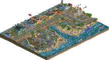
This is where I get really pissed off. For starters, no-one is allowed to make flat-rides like that without them glitching/crashing/looking-shit/making-a-stupid-noise. Got that, RRP? Secondly, big architecture doesn't deserve to be so understated and i'm almost certain that little-spheres-with-yellow-bits-sticking-out are illegal in most countries. Also, that wooden coaster corner used as an overhang is ridiculous, man. Get your act together and put something more-conventional-but-less-good! I can only mutter that The Legacy looks a bit weird...but those single raised yellow land squares with one corner bent down at either side of the area make up for it.
Katanga
I've already made my thoughts clear on this one. Although the glass-floor hack is fantastic, the flowers a welcome addition and Aqua Dome Circus a pleasant addition, this island in no way matches up with the volcanoes that once resided here. However, I should judge the park on what is, and not on what was.
As such, I hate this park in the same way that I hate all good parks: with an undying passion. I guess it's what they call envy.
If i'm allowed to use such an overused term, this park is possibly the best example of the fabled 'rct-perfection'. Of course it's not quite perfect, but nothing is. So this will have to do.
Well Done RRP, you've driven me into an interminable rage borne out of sheer jealousy.
Great, great park. Brilliant.
my next park (that will be finished in less time than SWA) should be even more creative seeing as im working with fatha and not against him.I might release a screen once ive checked with dad.
Absolutely amazing. Just amazing.
If only it were in time for the awards.
Aérôglòbe
$Hevydevy
My favourite area is the entrance. I think it has the strongest atmosphere and the most impressive architecture, together with the pirate area to the right.
I'll try to only say things others haven't said yet.
What I love about the park is the huge amount of effort that was put into it. It has alot much more details than other parks. "Roarin' Rapids" is probably a prime example. Who would've bothered to put cycle monorails around it as restraints? Who would even have had that idea? And RRP does things like that to almost every ride. "Creature" has propably the best custom supports I've ever seen. The coaster itself didn't do it for me though. I sort of didn't like it's layout but that doesn't matter.
There were ladders down to the docks. That probably takes 30 minutes and alot of effort to do. The product is awesomeness in my opinion. All of these things, together with RRP's unique RCT style and skill make him and the park my #2 at the moment.
About the middle island. I personally like it better than what he had before because that was just cramped jagged rocks hills. Now it's a cute thing that shows the latest version of what RRP's style has developed to. I love it.
A truly well deserving spotlight. Congratulations RRP. Now bury all your thoughts of retirement!
P.S.: I'm looking forward to the RRP&Fatha' collabo v2.0
The detail in this park will keep me coming back for a very, very, very long time. How can nobody have mentioned the beautifully themed underwater ride? There is just so much to enjoy and marvel at in terms of detail hacks all within a beautifully executed atmosphere. Simply Beautiful and the best spotlight I've seen in a very long time! Definitely among my top 5 parks ever!
As for "the best park ever", I must concure. There is nothing in this park that makes it stand above any other high rated current superpark (AB, TH, DDI, ect.). If it was finished a year ago, oh yes. Definetly. Even just a few months ago, yes. But now? Two years after the park was started? Sorry, but I think that this parks glory has dwindled away over the years. And to think, most people even now consider it #1. Think of all the fame it could have achieved if just released half the time earlier!
As I expected, SWA didnt live up to its name. I never doubted that the park would be nice, even amazing, but by no means did I expect to see it as the best park ever. Its still great and all. The detail, atmosphere, themeing........ its all quite impressive. Its nothing I havent seen before though, naturally.
I feel the same way, but the park has something which makes it special and different although it uses the same things which other parks have. I think its the detail which helps it mostly.
I think it's a bit of the FDS syndrome. I hated FDS at first cos I thought it was fucking boring. But now I think it's pretty damn awesome.
That's me, anyway.