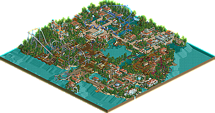
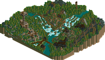
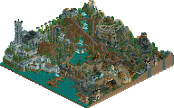
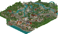
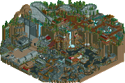
Seems heavily inspired by Turtle's work, which is a good thing. Nice use of grass. I like the buildings and there's good atmosphere going. Overall, great work, other than the corkscrews seem slightly under supported.
Yeah turtle and artist have really influenced my work. Thanks for the comments so far i'll see about adding more supports to the corkscrews and more support on that tunnel.
the top of that tunnel looks a bit artificial though, maybe make it a tad bit more structured/random.
Interesting choice of words. The screen does look very well done, but like JKay said, the corkscrews are very under-supported. I also agree with "Master Jay" about the land-arch. It think it looks out of place besides looking artificial. Perhaps connect it more to the other two arches (which are well done)?
The waterfalls don't make too much sense to me either. White makes it too bright, so it doesn't fit, imo. Not to mention the water appears to be flowing from nowhere...
Otherwise a very well done screen. Coaster looks well done. Keep it up.
It's good to see signs of some talent here. You're still learning proper landscaping and foliage and how to compose areas better together but still, I'd say keep it up. I can imagine you being on a high level in the future.
Wow, nice work. I usually try to stay away from "buzzwords" when giving feedback, but if anyone ever asked me what 'atmosphere' means, I would show them this picture, because that's it.
Yeah i am still learning and improving as i have only been playing the game for 5 months. I need to improve on landscaping foliage and my coasters but im sure that will come with practice. A new screen will be coming soon. Again thanks for the feedback.
I REALLY hope you aren't looking at other parks to learn and improve. I REALLY hope not. Best way to learn is to just keep building....just keep building.
Beautiful landscaping and it creates a nice atmosphere. I like the footpath layout too. The waterfalls also look very nice. The rock formations on left side of the screen do kind of look artificial. Try some hanging vines or something. Other than that I think it's perfect.
The water comes from a waterfall, but i might change that im not sure yet. No i don't look at parks to get ideas, but i do get inspiration from a select few. I usualy build what i want, however i want. As long as it looks alright and blends in with the theming, im happy.
J K junior sounds good to me
Cheers for the comments. A screen will be on its way shortly
74 Comments
J K Offline
The guests can either dine in the nicest restaurants on the sikinos shore, or ride Zeus's bolt, the parks custom arrow multilooper.
JK
Guest_Hawk_ Offline
JKay Offline
Hey, nice name buddy.
Junya Boy Offline
X250 Offline
-X-
J K Offline
JK
Edited by J K, 04 November 2005 - 10:09 AM.
RCTCA Offline
Keep it up.
-PM-
hobbes Offline
Interesting choice of words.
The screen does look very well done, but like JKay said, the corkscrews are very under-supported. I also agree with "Master Jay" about the land-arch. It think it looks out of place besides looking artificial. Perhaps connect it more to the other two arches (which are well done)?
The waterfalls don't make too much sense to me either. White makes it too bright, so it doesn't fit, imo. Not to mention the water appears to be flowing from nowhere...
Otherwise a very well done screen. Coaster looks well done. Keep it up.
inVersed Offline
CoasterForce Offline
Coaster Ed Offline
J K Offline
Ge-Ride Offline
JBruckner Offline
JKay Offline
Its J K junior!
I think your screen screams talent...please show more man
Junya Boy Offline
tracidEdge Offline
matze Offline
Xenon Offline
J K Offline
J K junior sounds good to me
Cheers for the comments. A screen will be on its way shortly