Park / Discovery Bay Bridge
-
 24-July 05
- Views 4,073
- Downloads 528
- Fans 0
- Comments 26
-
 No fans of this park
-
 Download Park
528
-
 Objects
121
-
 Tags
Tags
![park_3371 [H2H7 R5] Universal Studios](https://www.nedesigns.com/uploads/parks/3371/aerialt3057.png)
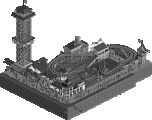
This was part of a solo project from many months ago that I modified to fit this event but may soon be apart of another solo sometime down the road.
Download Here!
Thanks, James
p.s. I'll post some SS's once I finish cleaning out my obj folder
Thanks to ImageShack for Free Image Hosting
Personally I would have crowned this one the winner. It's not only different, but it's executed brilliantly. And those two things are extremely difficult to accomplish at once. There is not as much architecture/structuring as in Magnus' entry, but it's the simplicity here that gives the bridge that realistic modern feel. It's just very well made. Great work rctnw, and I'm sorry you keep getting screwed over so many times.
But don't let it get you down and keep trying.
Fantastic entry, even if it wasn't technically entered.
Why didn't you wait until the Create Any of the Above catagory?
Probably becuase a coaster would beat it out, as you said in the other topic...
GuestGRIDE Offline
Fucking brilliant.
Thanks guys for the support. This was a fun one to build and I hope others enjoy it.
James
inVersed Offline
Shouldnt this be in the Place to Release Park forum?
the screens shows the best part of the bridge but ingame it is far too long. this makes it very repetetive. the monorail was a nice idea. maybe even better than a railway, cause everybody is going to put a railway on a bridge.
then only thing i don't like about the railway is how it overlaps with the actual bridge. so maybe you should have placed it higher or lower or whatever.
the surrunding of the bridge was really bad. didn't like the foilage and landscaping, but same goes for my entry. As it was a bridge contest this shouldn't matter too much anyways. it's make a bridge and not make the foilage arround a bridge.
the cables from those towers (you could have made those much better. more details and so on) seem to be much too steep. ok i know there is no other object you could have used, but it was the main reason for me not to make a rope bridge like this.
some road signs and such would be good aswell to make it more interesting.
also the objects at the root of the bridge are really ugly. (where the bridge hits the water)
with some changes i think you could have won, but what we can see here just has very much potential, but it missing something to make it look really good.
and i wondered about the fact that you placed all the black background pieces by hand. that's really stupid work and the reason i made 3x3; 5x5 and 7x7 background pieces.
so yes that's what i think, but it was really a close race.
I was going for a different approach for this bridges from what we have seen in rct before. Most every bridge I have seen as the basic two or single tower design. I went with a different approach and was inspired by two bridges in particular. One was the new bridge in Boston for the basic support design and the other was the San Francisco Bay Bridge which is also very long and as you say, repetitive.
I tried several combinations but this was the best compromise. I hate elevation changes for monorail tracks and I did not want the station to tall.
I agree although that will be changed when this becomes part of a solo down the road.
The only thing I regret about these cables was that they were a tad to thick yet the original game version was far to thin. Again a compromise that I had to go with.
Tried a few combinations but did not like any of them so I scrapped them. Looking back, I should have added some and again, they will be added for the solo.
I guess we will agree to disagree on this one.
Ah but this is where you were wrong. I did not place them 1x1 by hand. Remember that the game has a useful feature of saving a track designs with surrounding objects. I created a straight monorail track with the black tiles under it. Save the track with the tiles. Then all I need to do is place the track (with the tiles) and then remove the track and it’s done. Yes I had to do this several times but it works very fast and gives a “clean†look to it when you look at the map with the object “invisible†as there are no “black splotches†all over the place from overlapping the tiles. Just a small detail for me that I make sure takes place. I also used this technique for part of the towers also and I must say it saves a lot of work.
Thanks
Also, I'm curious about RCTM. How are things with that Disney park you guys started? I've been waiting for that... well, a new picture of it anyway. Where's Kai.
that works? i tried it several times and only got this white picture of the object when trying to place a ride like this somewhere in a park. i don't know why and i know the technique works fine ordinary. i used it in life is a rollercoaster.
anyways. my object work fine and it's still less work i think
on the other points i agree with you, or can at least see you points. doesn't mean i must love it
Whatever can be said afterwards, still a shame that it could not be in the competition!
Hope you'll go on building such amazing things, and enjoy it, and getting the appreciation it deserves!
and thanks for sharing
Magnus - I know what you mean about the "white" squares that can show up but I found away around that a number of months ago.
Emergo - It was eventually judged but was not up to the standards of what Iris was looking for.
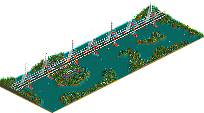
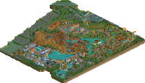
Here is the overview for those that do not want to d/l the map.
Thanks to ImageShack for Free Image Hosting