Park / Superman: Krypton Coaster (SFFT Recreation)
-
 29-July 10
- Views 10,502
- Downloads 1,410
- Fans 2
- Comments 17
-
-
 65.77%(required: 65%)
 Design

Kumba 90% CedarPoint6 80% Xcoaster 80% posix 75% 5dave 70% Casimir 70% Liampie 70% Evil WME 65% RCTCA 60% Six Frags 60% SSSammy 60% ][ntamin22 60% geewhzz 55% turbin3 50% RCTNW 40% 65.77% -
2 fans
 Fans of this park
-
 Full-Size Map
-
 Download Park
1,410
-
 Objects
222
-
 Tags
Tags
![park_3327 [H2H7 - The Rat Pack] San Fransokyo](https://www.nedesigns.com/uploads/parks/3327/aerialt2927.png)
![park_3201 [MM2014 R2] Comic Con Miami](https://www.nedesigns.com/uploads/parks/3201/aerialt3050.png)
![park_2824 [PT4 R2] Drop of Doom](https://www.nedesigns.com/uploads/parks/2824/aerialt2482.png)
i didn't think this was going to get design, really well done! i liked it for what it was, and however much i didn't think it was design worthy, it just broadcasts how much of an excellent player you're sure to become. btw, NEVER hesitate to ask me about anything, wether it be beta testing or just general stuff, i'm always here to help!
congrats again.
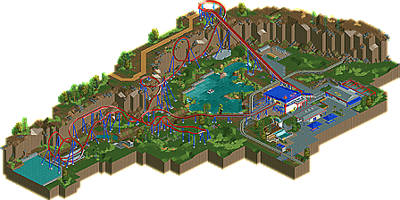
Oh well, I won and I'm pretty proud of it. I guess the biggest thing about this is that it it was built in about 26 hours excluding testing and stuff. Overall I'm pretty happy, The foliage was my main focus here, along with landscaping, layout, supports, and very little focus on architecture.
It was very stressful watching people vote on this, I think with 14/15 points it was like a 64.45 then Kumba got the last vote and pushed me over.
Thanks to Nin and SSSAmmy for helping me with feedback and Thanks to Chapelz, Kumba, Posix and Gee for helpin get it released.
Yes, but still a hell of a lot better then other failed designs
Good job, and congratulations!
There are some issues -- leaving in white-glitched supports is just sloppy, and that transfer mechanism would not work properly -- but overall very solid.
-ACE
Grreeaatt job!!
Brent-Really? I must have just missed you then. What day were you there?
To be honest, I didnt like the actual ride as much as I thought I would. The cliff dive was fun and the Zero-G roll was sweet, but it was kindoff mediocre to me. I liked Rattler the best
A few things that I think could have been improved. The unsightly ride entrance/exit huts could have been made invisible since the hack for that is now common knowledge here. Also, there were several spots that seemed to be missing some parts like the stairs on the station needed some more hand rails and supports. One or two more times of zero clearance could have made that look more finished. Also I'm not a big fan of the standard queue lines, but that's just my preference when building for realism.
Enough criticism, time to focus on the positives. You seem to have nailed the layout and custom supporting. That's always been one of the hardest things for me and it's always good to see a full size custom supported coaster that looks nice at the same time. Your architecture quality has definitely been on the rise as I've seen from you in the AD. Now I've never seen this in real life, but what you got for the station and queue area is pretty damn good.
BTW, great idea with the steeplechase track for the chain return.
Looking forward to seeing more from you later on here.
FK